Medovent Website Design
Want to win a job like this?
This customer received 72 web designs from 14 designers. They chose this web design from pb as the winning design.
Join for free Find Design Jobs- Guaranteed
-
 US$610
-
 72 designs
-
 14 designers
Web Design Brief
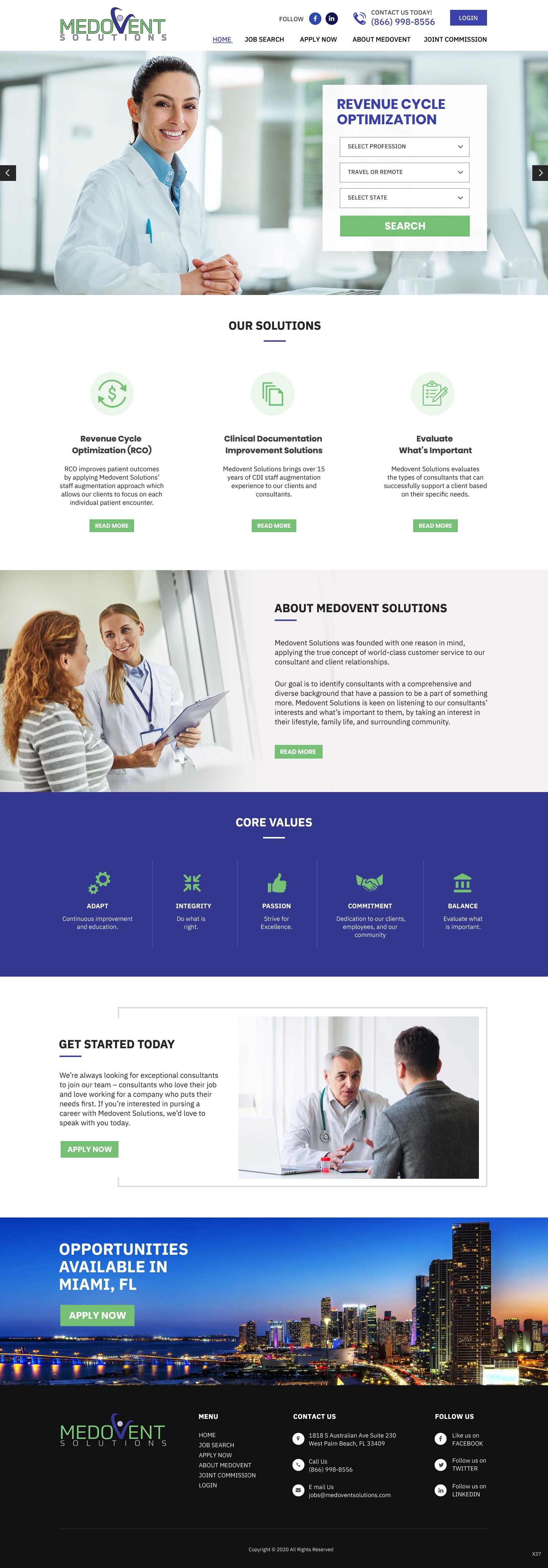
Medovent Solutions. http://medoventsolutions.com is looking to redesign our current website with a modern feel and added functionality.
The winning design will be coded in HTML 5 and be responsive built for mobile. You can use bootstrap, jquery.
Wordpress or wix will not be accepted.
Page 1
http://medoventsolutions.com/
Page 2
http://medoventsolutions.com/who_we_are.php
Page 3
http://medoventsolutions.com/solutions_offered.php
Page 4
http://medoventsolutions.com/faq.php
Here are some pages from our competitors. Please see notes of our likes and dislikes of each page.
https://www.maximhealthcare.com/
Likes: Ability to explore opportunities / “Community Connections” Highlighting involvement in the community.
Dislike: Layout not very interactive. Feels clunky
https://www.cioxhealth.com/
Likes: Visually appealing. Using nice images.
Dislike: Not very intuitive. You need to read a bit to figure out what they do and what they’re about.. Not overly interactive either.
https://uasisolutions.com/
Likes: Clean, Using a puppy as part of marketing, highlights Stability and Quality
Dislikes: All services offered are further down and requires you click and drill down to get info
https://www.aviacode.com/
Likes: Has video about Improving Coding Accuracy which is important to clients. Their “Our Solutions” Section is clear and not too wordy. Once you click on Learn More it provides good info.
Dislikes: Not as visually appealing. No wow factor. Seems a bit basic.
https://trusthcs.com/
Likes: Section that allows clients to request facility analysis. Has easy to find menu dropdowns at the top of page.
Dislikes: Boring site. Nothing special at all.
https://harmony.solutions/
Likes: I actually like this site overall
Dislikes: It is a little busy, but other than that it’s pretty nice.
https://meleeo.com
Likes: although their choice of doodle graphics is overly busy, I like that it’s different from every other vendor. To me, it stands out. I also like how when you scroll, it pops up a new highlight and keeps the watermark in the background.
Dislikes: Choice of font is a lil hard to read and not easy on the eyes. I believe the bold and color of the font make it appear too busy.
https://brundagegroup.com/
Likes: Probably my favorite. Very professional and interactive. I like how it scrolls through images at the top with links to allow you to dive in further. I also like the interactive photo blocks towards the bottom and how they use photos from past speaking events that give them credibility and highlight Dr Brundage speaking.
Dislikes: Nothing specific
Updates
Do to the ongoing Corona Virus here in Florida we have been dealing with that. Most will be working from home this week and plan to focus on finalizing this project. Thanks
Please extend this. With the current COVID19 stuff this is kind of been put on the back burner.
Coding
Coded - Design and coding required
Number of Pages Required
5+ page