Conversion rate optimization consulting firm needs a logo design
Want to win a job like this?
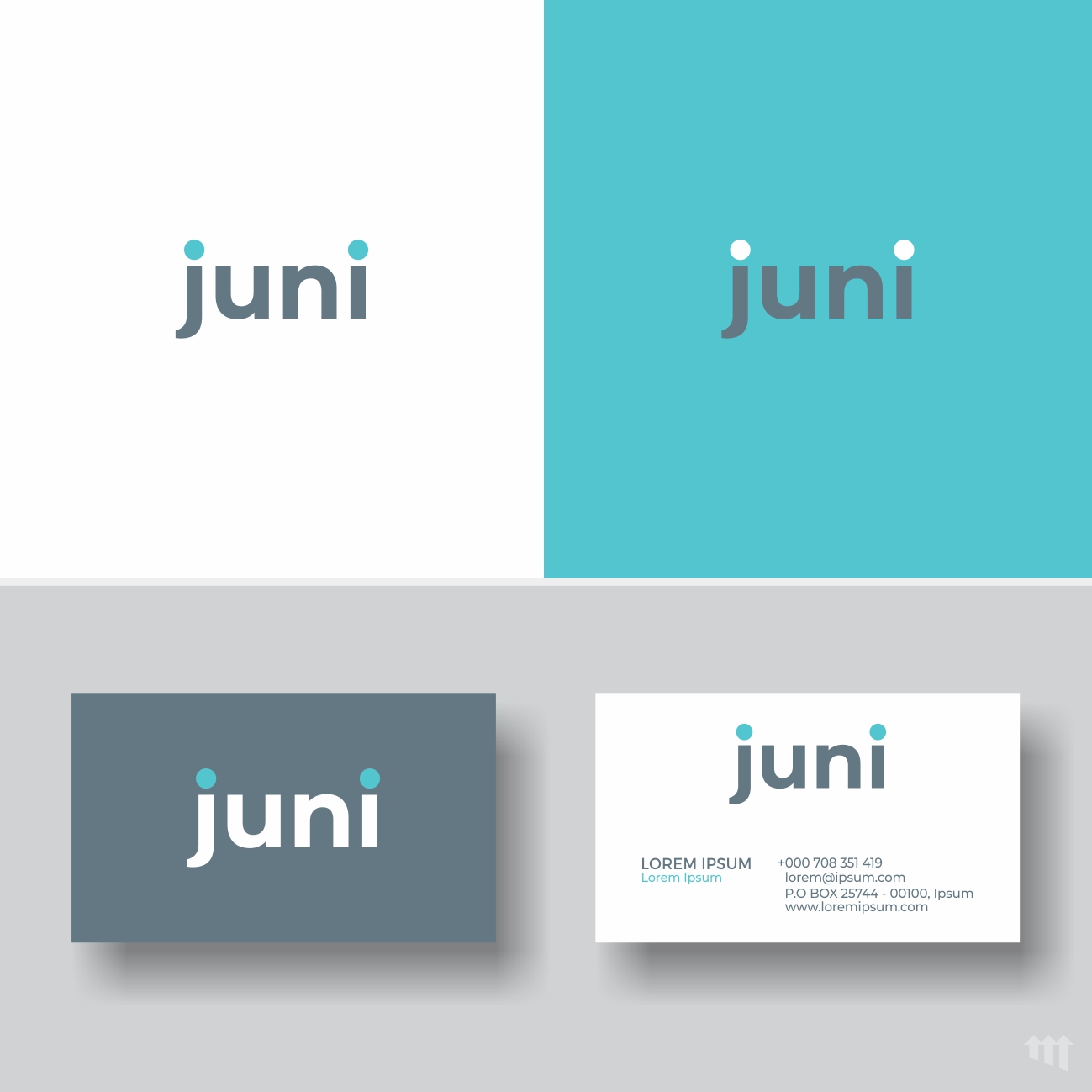
This customer received 187 logo designs from 95 designers. They chose this logo design from MBARO as the winning design.
Join for free Find Design Jobs-
 US$300
-
 187 designs
-
 95 designers
Logo Design Brief
We are Juni, a CRO firm based in São Paulo and we need a new logo.
Our clients: Big and medium online retailers.
So, what is CRO?
CRO stands for Conversion Rate Optimization.
Conversion
Generally of products into money (meaning: sales)
Rate
Simply put, if 100 people get in your website and 10 of them buy something, your conversion rate is 10%
And many things can make a website sell more or less. If you change the color of a button or the position of a page, it will sell differently. Maybe more, maybe less, but almost surely a little different.
So how do we work? We research all website pitfalls and test hypothesis. Let’s say we consider the current site as variant A that have 2 small pictures and in a variant B, with only one big picture, we see which version sells more. That’s an AB testing. Pretty simple, right?
Now imagine dozens of changes in hundreds of combinations. That’s what we do. And that’s why we have a team of both designers and technical/ statistical professionals.
Other main product of ours is the personalization of websites, made in a way in which each group of people will see the things that interest them the most.
And all of this is always followed by a great deal of analysis.
Very important:
We would like the design of the logo to communicate:
- “TRUE PARTNERSHIP” as all our clients appoint that as our main characteristic
- “DYNAMISM”
- and “DEEPNESS”. As we dive deep in our analyses.
In addition, as we are targeting big companies and have a lot of market know-how, we don't want to be seen as a startup.
Therefore, we are avoiding "fun" logos that could match the stereotype of the garage startup made by young professionals, passionate about what they do, but lacking the security of having made that before (which we have done, many times)
Even though we have creative people on our team, we see our selves not as an agency, but as a consultancy firm and we would like the logo to reflect that.
So please avoid yellow, orange and red, as those are the typical colors of digital ad agencies in São Paulo.
Target Market(s)
Big and medium size companies that are interested in boost their conversion rates
Logo Text
JUNI - optimization always on
Logo styles of interest
Pictorial/Combination Logo
A real-world object (optional text)
Abstract Logo
Conceptual / symbolic (optional text)
Wordmark Logo
Word or name based logo (text only)
Colors
Designer to choose colors to be used in the design.
Look and feel
Each slider illustrates characteristics of the customer's brand and the style your logo design should communicate.
Elegant
Bold
Playful
Serious
Traditional
Modern
Personable
Professional
Feminine
Masculine
Colorful
Conservative
Economical
Upmarket
Requirements
Nice to have
- We would like the design of the logo to communicate:
- - “TRUE PARTNERSHIP” as all our clients appoint that as our main characteristic
- - “DYNAMISM”
- - and “DEEPNESS”. As we dive deep in our analyses.
- In addition, as we are targeting big companies and have a lot of market know-how, we don't want to be seen as a startup.
Should not have
- Therefore, we are avoiding "fun" logos that could match the stereotype of the garage startup made by young professionals, passionate about what they do, but lacking the security of having made that before (which we have done, many times)
- Even though we have creative people on our team, we see our selves not as an agency, but as a consultancy firm and we would like the logo to reflect that.
- So please avoid yellow, orange and red, as those are the typical colors of digital ad agencies in São Paulo.
- We would the design to avoid colors as yellow, dark blue and black as they are related to traditional consulting firms or advertising companies as Accenture Interactive, Delloite or Mckinsey.
- Be similar to the current logo.