Harmony Community Church logo
Want to win a job like this?
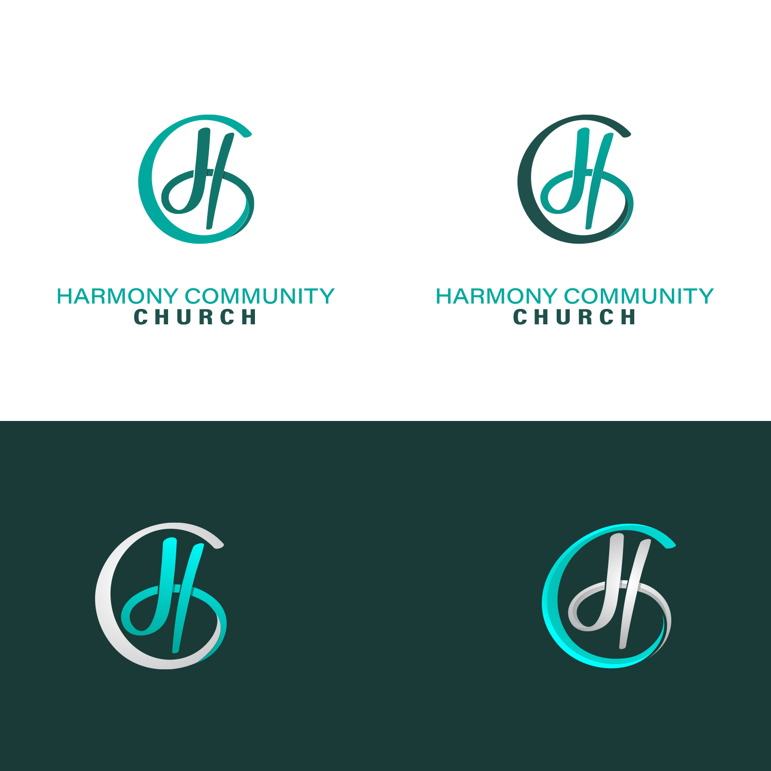
This customer received 387 logo designs from 133 designers. They chose this logo design from GenArt as the winning design.
Join for free Find Design Jobs- Guaranteed
-
 US$150
-
 387 designs
-
 133 designers
Logo Design Brief
Need a vector-based logo. We are a Community Church in Florida-serving less than 100 but wanting to modernize logo for web presence and have fresh look for badges on cups, t-shirts, etc. Target market is mixed-age community, but would love more in the 28-45 age demo. One option for the graphic would be to include “H” and “C” stylized somehow, but that isn’t a requirement. We want something fresh looking (blues, grays, etc. is one color scheme but I have seen lots of unique colors in designs and I like those fresh unique colors also). Only color to stay away from is green. We are very open.
Target Market(s)
25-50 demographic, singles/families.
Industry/Entity Type
Religious
Logo Text
Harmony Community Church
Logo styles of interest
Emblem Logo
Logo enclosed in a shape
Pictorial/Combination Logo
A real-world object (optional text)
Abstract Logo
Conceptual / symbolic (optional text)
Character Logo
Logo with illustration or character
Font styles to use
Colors
Designer to choose colors to be used in the design.
Look and feel
Each slider illustrates characteristics of the customer's brand and the style your logo design should communicate.
Elegant
Bold
Playful
Serious
Traditional
Modern
Personable
Professional
Feminine
Masculine
Colorful
Conservative
Economical
Upmarket
Requirements
Must have
- We are open. We want modern/fresh look and color scheme. We are looking for church name as part of logo but would like just the visual of the logo to be able to stand-alone on shirts or mugs as well.
Nice to have
- Clean modern design for logo and font. Don’t want/need overtly religious symbols in logo. Would like the graphic in logo to be able to be stand-alone as representative of our church, even if we used it without the church name. I have seen some softer options in font and graphic lettering and those have been nice as well. Too corporate looking is coming off as too harsh.
Should not have
- Please stay away from greens in the color palette.