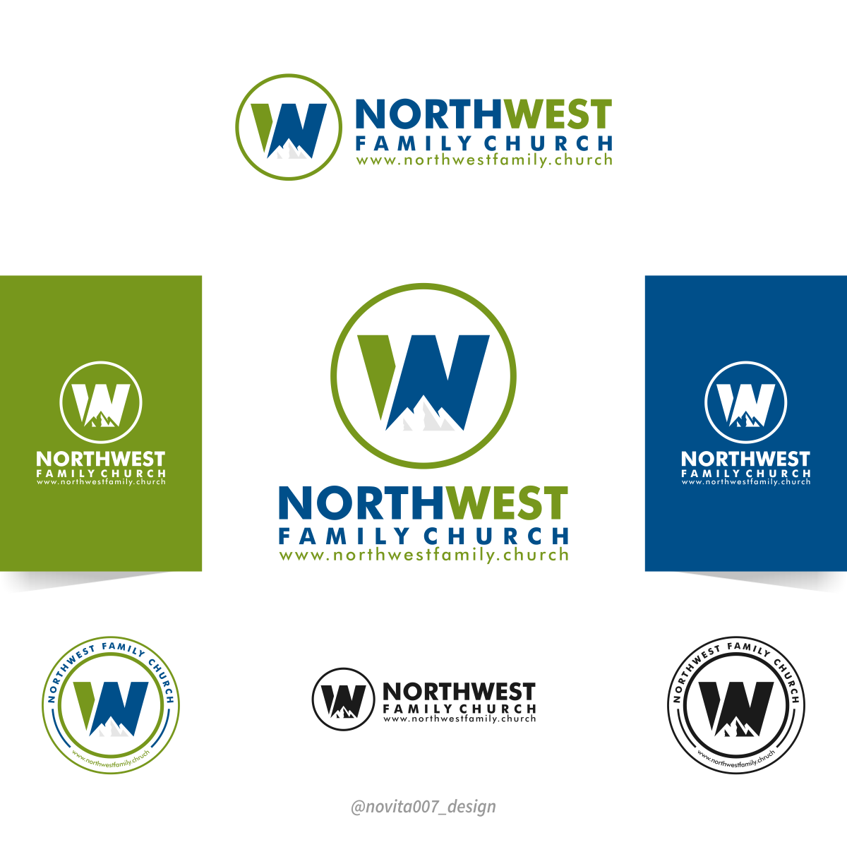
Northwest Family Church Logo Update

Want to win a job like this?
This customer received 119 logo designs from 36 designers. They chose this logo design from novita007 as the winning design.
Join for free Find Design JobsLogo Design Brief
We are looking revise our church logo. Would like to see spin offs using current logo as well as open to designs that go a new direction. Our name is our website so would like to see if there is a logo that can integrate text as northwestfamily.church - current logo is acre and logo mark is the w flipped upside down to make mountains -
Updates
Gathering more feedback
Target Market(s)
Young men in late 20’s to Early 30s
Industry/Entity Type
Church
Logo Text
northwestfamily.church
Logo styles of interest
Pictorial/Combination Logo
A real-world object (optional text)
Font styles to use
Colors
Designer to choose colors to be used in the design.
Look and feel
Each slider illustrates characteristics of the customer's brand and the style your logo design should communicate.
Elegant
Bold
Playful
Serious
Traditional
Modern
Personable
Professional
Feminine
Masculine
Colorful
Conservative
Economical
Upmarket
Requirements
Must have
- Clean appearance- not too busy - easy to read font (don’t use script fonts please)
- Would be interested in seeing reworks on current logo - font is acre - but - am interested in seeing new directions as well. Chose acre because w had some uniqueness to it.
Nice to have
- Church name listed as northwestfamily.church but can be split into individual words if needed for the design
- It would be nice if the current mark could be revised a bit - but shoes to have to be used. We share at the base of mountains so that was what we were going for with flipping the w in our current logo.
Should not have
- too much busy layering. Some is fine - not too simple necessarily but not to busy.
- No cross needed. We are a Christian church, proud of Jesus, but don’t need a cross in logo.