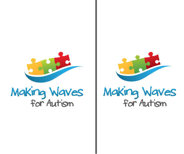
design a logo for a new autism charity Making Waves for Autism

Want to win a job like this?
This customer received 56 logo designs from 23 designers. They chose this logo design from Stephanie Soon as the winning design.
Join for free Find Design Jobs- Guaranteed
Logo Design Brief
Making Waves for Autism is a new charity which needs an identity. We raise funds to purchase educational resources to support children with autism in schools. We have a new and innovative concept to bring together public services and private money for the benefit of children with complex needs. We are a rural Devon (UK) based charity, founded by parents of autistic children who got fed up with complaining in support groups and decided to do something about it!
Updates
please see our website www.makingwavesforautism.org.uk for more info.
Target Market(s)
Mainly other parents, individuals with children/families. Mostly middle class and educated, socially aware, who value education. Also grant making organisations in the public sector.
Industry/Entity Type
Charity
Logo Text
Making Waves for Autism
Logo styles of interest
Pictorial/Combination Logo
A real-world object (optional text)
Look and feel
Each slider illustrates characteristics of the customer's brand and the style your logo design should communicate.
Elegant
Bold
Playful
Serious
Traditional
Modern
Personable
Professional
Feminine
Masculine
Colorful
Conservative
Economical
Upmarket
Requirements
Must have
- the logo must carry reference to 'waves' or 'a wave'. The name was inspired by local Devon coastline and beaches. We also want to be indentified as a children's charity, so it must have a clear reference to children. Must have a distinctive font. Not too abstract.
Nice to have
- primary colours. The classic autism symbol is a puzzle with primary coloured (red, blue, green, yellow) puzzle pieces linked together, it might be nice to have the puzzle in the design somehow. The font could be child-like (as in child's handwriting). We favour handwritten fonts in general, our website currently has our name in Child's Play which we like, but we are open to suggestions. Avoid cartoon-like fonts - we fundraise for a serious issue, and while we like to be fun in the way we get our message across, it is not a joke!
Should not have
- must not be boring, corporate, and definitely not use plain fonts like arial or futura or similar, or serif fonts (look old). Previous attempts at this ended up with designs that looked like that of a washing machine, or management consultancy! Should not be too abstract, we want a symbol that is clearly identified.