Web design for community centre - bright colours (provided) and matching existing logo
Want to win a job like this?
This customer received 29 web designs from 5 designers. They chose this web design from Roy as the winning design.
Join for free Find Design Jobs-
 A$150
A$150
-
 29 designs
-
 5 designers
Web Design Brief
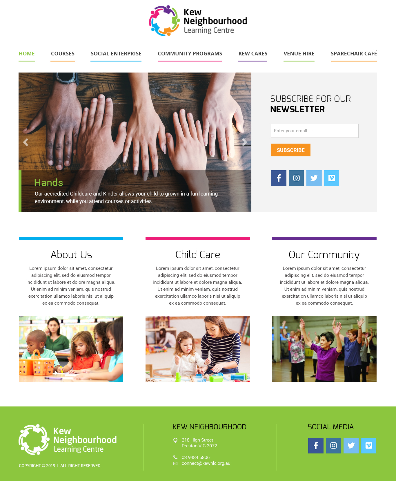
Website based on a provided logo and existing website template skeleton (it is a Wordpress theme we must use that is already installed)
Basically, see if you can improve the existing theme skeleton at https://kewnlc.org.au/redesign/. Mostly we are looking for a much nicer menu that works with the logo, and a nice font/design for text content.
We have a developer who will work your design into the Wordpress theme – so you can get creative in a graphic software app and our developer can most likely implement your ideas.
The website ideally will include design ideas from the logo (e.g. the idea of people with their arms around each other, colours).
Improvement to the text displayed on the photo slider (e.g. a colour border or other decoration) is also needed.
It needs a 'community' feel.
Target Market(s)
Parents (provides childcare), older people, people with disabilities, recent migrants
Industry/Entity Type
Community Center
Number of Pages Required
1 page
Font styles to use
Colors
Designer to choose colors to be used in the design.
Look and feel
Each slider illustrates characteristics of the customer's brand and the style your logo design should communicate.
Elegant
Bold
Playful
Serious
Traditional
Modern
Personable
Professional
Feminine
Masculine
Colorful
Conservative
Economical
Upmarket
Requirements
Must have
- A very aesthetic top menu. Nice use of spacing, negative space etc.
- Fonts need to be legally available without a pageview fee (one off purchase OK). You need to provide proof we can use the font legally.
- See https://www.bridge.org.au/ for an example of a menu we like.
- Must use the existing logo, provided in this brief.
- Needs to use colours from the logo but do not need to use all of them!
- Must be workable into the theme already installed at https://kewnlc.org.au/redesign
Nice to have
- Maybe some kind of shapes attached to each menu link (top menu0
- A use of all 5 colours on the top menu, when you hover on it
Should not have
- Serif fonts