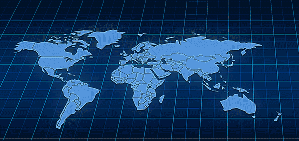
Global Trade Map Graphic
Want to win a job like this?
This customer received 12 graphic designs from 5 designers. They chose this graphic design from DesignConnection Impressive Sol as the winning design.
Join for free Find Design Jobs- Guaranteed
-
 S$100
S$100
-
 12 designs
-
 5 designers
Graphic Design Brief
I would like to have an animated dynamic world map that depicts changes in world trade from heavily dominated by developed countries to a "noodle bowl" of trade between developed and smaller countries, but also with exports from large countries increasing to small countries, especially Asia and Africa. I would like it to be on about a 10 second loop for presentations. I've uploaded a sample of what the basic map might look like. So, lines of trade would start thick between, say, US and China and EU and US and a few small lines elsewhere, and would then gradually shift to smaller lines with many more connections between countries until it looks like a jungles of fiber optics zooming everywhere.