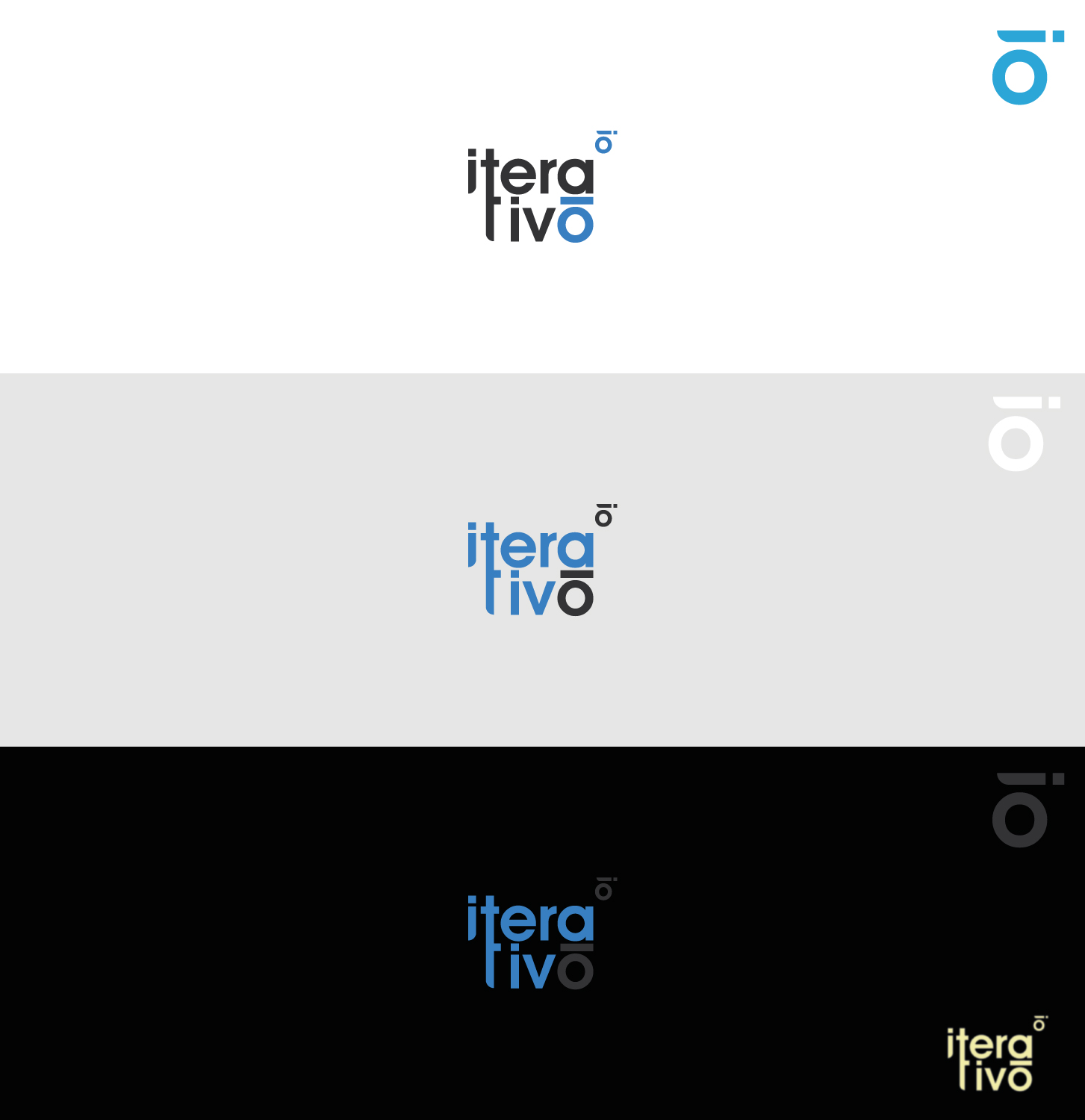
Logo Redesign for Advisory Firm

Want to win a job like this?
This customer received 526 logo designs from 241 designers. They chose this logo design from ros-michael as the winning design.
Join for free Find Design Jobs- Guaranteed
Logo Design Brief
We're looking to have our logo redesigned. We'd like to have a more balanced design, easier to apply and with a simple application (usage) guidelines.
If it helps, we're an Advisory Firm oriented mostly in providing ERP (Enterprise Resource Planning) software to companies. We also provide advisory for process automation, digital transformation and Information Technology.
e're aiming to be a company like Deloitte, PwC, KPMG, Vuo, Grant Thornton.
iterativo word comes from iteration (repetition of a process in order to improve on every new cycle). Most of our work is based on projects.
Updates
Designs look the same
Target Market(s)
Small to large companies. No specific niche.
Industry/Entity Type
Business Consultant
Logo Text
iterativo
Logo styles of interest
Pictorial/Combination Logo
A real-world object (optional text)
Abstract Logo
Conceptual / symbolic (optional text)
Character Logo
Logo with illustration or character
Wordmark Logo
Word or name based logo (text only)
Font styles to use
Colors
Colors selected by the customer to be used in the logo design:
Look and feel
Each slider illustrates characteristics of the customer's brand and the style your logo design should communicate.
Elegant
Bold
Playful
Serious
Traditional
Modern
Personable
Professional
Feminine
Masculine
Colorful
Conservative
Economical
Upmarket
Requirements
Must have
- Similar colors (blue, dark gray) but more vivid. Any other tones and tendencies are allowed. Text (company name) is also a must. Something that may show more dynamic.
Nice to have
- Have a nice identifiable symbol which could be easily identified as our company. Currently we use the last O which doesn't look that nice when used alone.
Should not have
- Arrows and bars graphics as we're not a financial, trends or statistics company. Same blue tone.