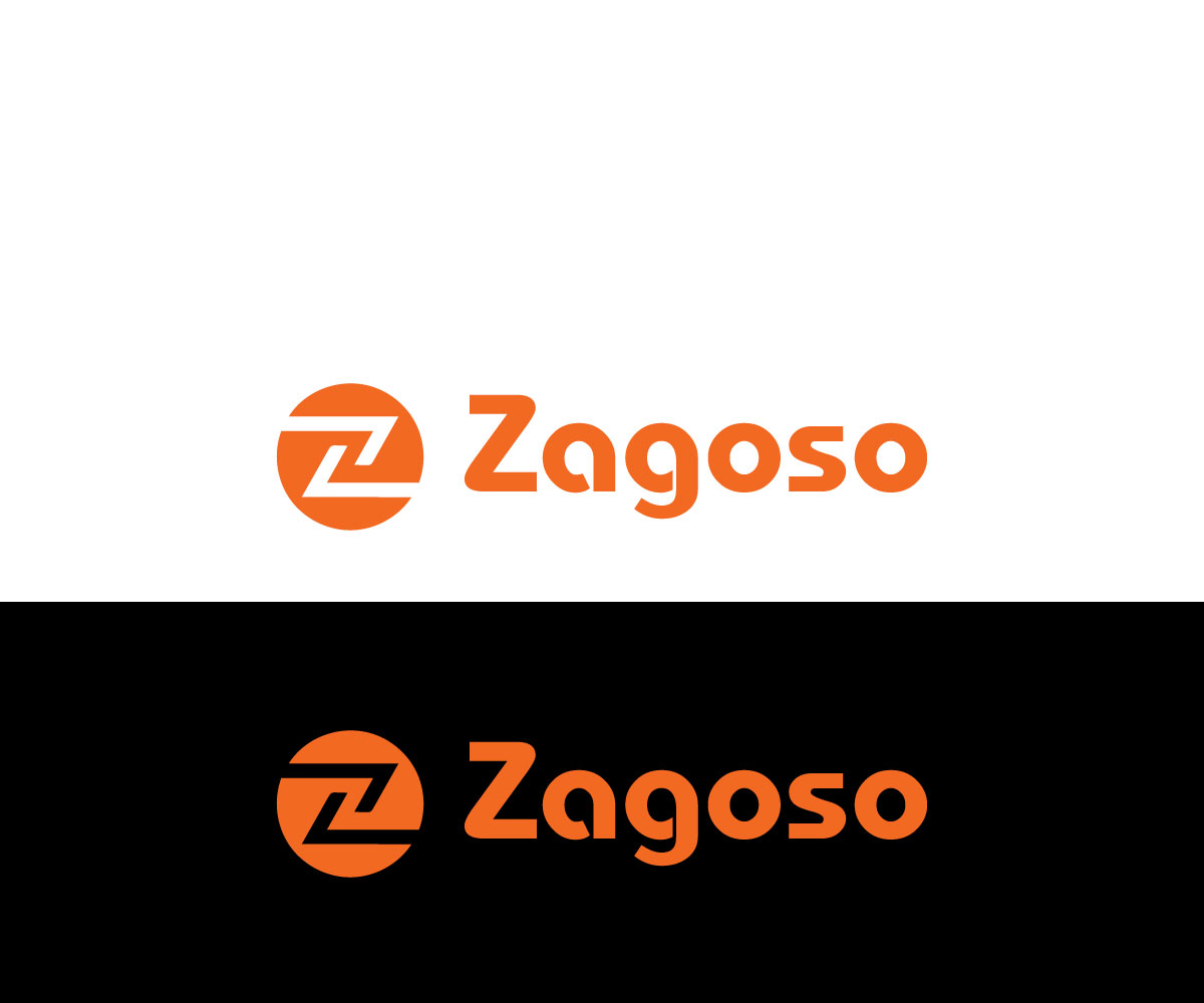
Digital Magazine Helping Active & Healthy Parents needs a logo!

Want to win a job like this?
This customer received 98 logo designs from 52 designers. They chose this logo design from MAH designer as the winning design.
Join for free Find Design Jobs- Guaranteed
Logo Design Brief
We need a logo design for a new company called Zagoso. Zagoso is a digital magazine focused on making active parent lives healthier and happier by infusing knowledge and recommendations into relateable story telling. We provide guidance on how to stay healthy (mentally and physically) from how to apply a diet you’re thinking about to how to handle your five year old son’s latest breakdown. As a part of our mission of being healthier and happier - we’ll give you an easy way to find recommendations for that next adventure, birthday or fix-it-up project. The name 'Zagoso' came together by thinking about 'zigzag' (I zig - you zag ... movement / active) and 'oso' is bear in Spanish. I don't necessarily want to have a bear in the logo but am open to it. When I look at the logo, it would be great if I could see some type of movement or feeling. An example of that is the new 'Alaska Airlines' logo and the 'Alaska' portion of it. I see a subtle feeling of movement which makes me think of being on a flight. I'd like to see some creativity around how to incorporate 'active' or 'activity' with a feeling of healthy / happy. I don't necessarily need the logo to speak to me and tell me it's about parents . The most important piece of this for me is the active/healthy lifestyle as the core of this.Color: A few potential options here that I'm open to using. Green: Gives me the feeling of organic greens and outdoor adventures. Yellow: Reminds me of the sun, open-ness and clarity White: Makes me calm Red: Energy and Active and attention getting Black: Powerful and Clean I'm open to having multiple colors above but I've found a single color with white can be a very powerful way of creating simplicity, clarity and a great UI when incorporated into the rest of the website. I will be using whatever is built here and incorporating the color palate into the UI/UX of the site created. The Z: I'd like to be able to turn the 'Z' in Zagoso into a symbol that is unique and recognizable when it lives on it's own. When I see the Z - I recognize it as Zagoso similar to how I recognize the 'G' in Google and white 'f' in the blue facebook box or the Pinterest 'P'. I'm really looking forward to seeing what you are able to come up with! Thanks for the consideration.
Logo Text
Zagoso
Logo styles of interest
Abstract Logo
Conceptual / symbolic (optional text)
Wordmark Logo
Word or name based logo (text only)
Lettermark Logo
Acronym or letter based logo (text only)
Look and feel
Each slider illustrates characteristics of the customer's brand and the style your logo design should communicate.