Calorie website redesign while keeping current structure
Want to win a job like this?
This customer received 54 web designs from 15 designers. They chose this web design from Ma_lau as the winning design.
Join for free Find Design Jobs- Guaranteed
-
 US$230
-
 54 designs
-
 15 designers
Web Design Brief
****UPDATE****
Dear designers!
I'd really appreciate to see new color ideas.
The green-red-yellow scheme is the old scheme, and I want to change it. I asked for new colors with same structure, but I get designs with old colors and new structure. :(
My goal is to get a design with a good overall impression.
I need new color ideas where colors are in harmony and gives pleasant OVERALL impression to the eyes.
Your tools again:
1. you can use any colors (i prefer green and blue variations as the most dominant color)
2. you can use gradients
3. you can use transparency.
4. you can use background images.
5. you can change font type (but stay compatible with other languages like Hungarian)
All designs I got so far was not usable because they were not compatible with the site structure.
It was written in description we have fixed sizes, and what you can change and what you CANT change.
To make it more clear what I need I attach a picture now: understand_the_structure.jpg
Note: i dont like white color. It looks empty and it doesnt give a character to the site.
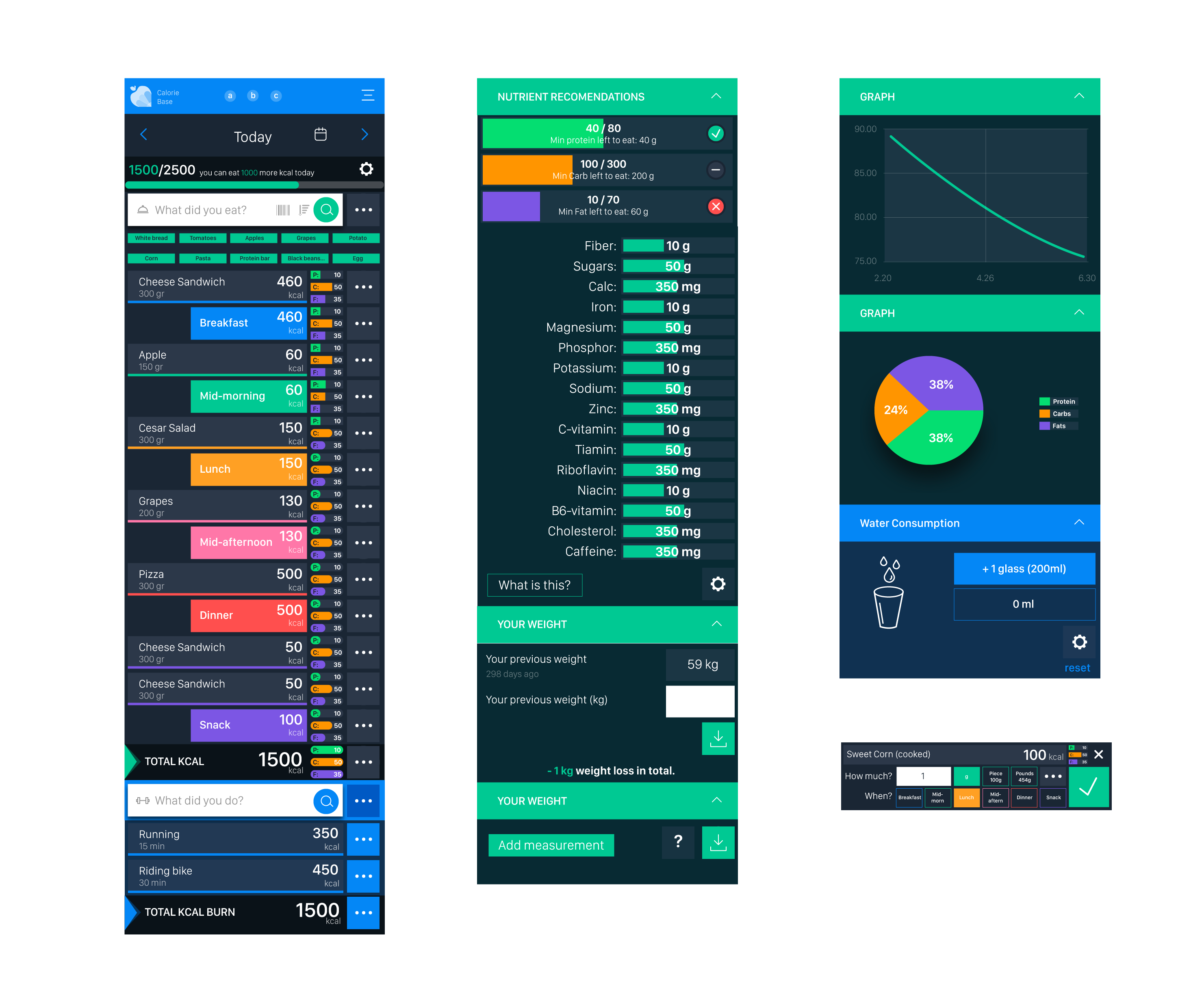
Separation: it's important the site parts to be easily separated by the eye. The site consists of 4 main parts: menu, what did you eat, what did you do, and yellow calculation boxes. They should be separated easily by looking at it.
*****END OF UPDATE****
DEAR DESIGNERS!
My name is Mate, I run this website kaloriabazis.hu which is the most popular calorie counting website in Hungary with 500.000 users. It has also an English version, caloriebase.com (started not long ago). Now you have to focus only on the mobile version main page:
https://caloriebase.com/?layout=m
There a lot of other urgent tasks about the site and I had no chance to improve the design in the last years . But I'm aware of the problem: the website doesn't look good enough to be appealing for new users. So now I decided to run a contest to see if you can help me with this.
UNDERSTANDING CURRENT DESIGN CONCEPT:
1. The original concept of the site was that calories are "bad" so they are red color, and sport activites are "good", so they are green color. Red and green is very different color (which is advantage in separating those sections), but they don't look nice together, so I'm ready to change the colors but somehow we still need to show that calories are "bad" and sports are "good". The yellow boxes are showing calculated numbers.
2. The original concept was that I wanted the whole site to have a "calculator feeling": the message is that it is not made to attract people by fancy design, but it's strongness is it's knowledge and usability, same as a hand calculator. I want to maintain this concept, but with a more modern design.
3. Another concept is that I want to make the usability easier for long time users instead of first time users. It means I prefer to show more options/buttons on the screen (which can be frightening to new users, but it's okay), instead of having a very easy-to-use feeling when you first visit our site (but later you need to click a lot to reach functions). Number one priority is still long time usability.
4. I want to emphasise I love to use colors to separate parts.
SUMMARY:
i know it's not easy to make it look better AND compatible current structure, it's a big challenge. Be creative and use your imaginations. It's possible that I will need further adjustments from winning designer in the future, so it's a plus if you will be available to work.
You can see in my_try.png what I was trying by adding some shades, but I failed. I realized that I'm not able to create a new look (as my mind is limited to my current scheme, and I need a fresh mind for this :)).
Thanks,
Mate Magyar
Updates
I got a car accident, and couldnt leave the countryside. i cant view and review works from here. I will send u an image tomorrow afternoon showing the fixed structure, to avoid misunderstandings in future.
so far none of the design is usable, because they were NOT created in our 40px size/5px space structure as i requested in posting
thanks for understanding
Added Saturday, June 29, 2019
Received designs were not compatible with structure. It was written in the description, but now I also I updated the description to give a more clear view what I need.
Target Market(s)
weight-loss
Industry/Entity Type
Weight
Number of Pages Required
1 page
Font styles to use
Colors
Designer to choose colors to be used in the design.
Look and feel
Each slider illustrates characteristics of the customer's brand and the style your logo design should communicate.
Elegant
Bold
Playful
Serious
Traditional
Modern
Personable
Professional
Feminine
Masculine
Colorful
Conservative
Economical
Upmarket
Requirements
Must have
- WHAT CHANGES AM I EXPECTING FROM YOU?
- PLS see attached file: understand_the_structure.jpg
- 1. you can use new colors totally freely along all site.
- 2. You can add some color overlays, gradients, backgrounds, to different sections.
- 3. You can add new edges (delete /increase edges) to buttons/rows (without changing the size).
- 6. If you use new font, then it should be 100% compatible with different languages (for example: Hungarian characters like ö, ő, ü, ű, etc).
- 2. I need better design for input fields (currently inactive is red, and active is white, but you can change it)
- OTHER IMPORTANT NOTES:
- 1. Be careful with technologies which could cause performance issues, as site speed is very important.
- 2. The main goal now is NOT to get new images on buttons (it's perfectly okay if you dont touch them), but an overall better and consistent look. However if you want to achieve this goal by also redesigning buttons and rows (new color, new active/press effect, ), you can do this too. In current version buttons are 40x40, but in new design they will be 80x80.
- 3. The new color concept needs to be compatible with meal colors like breakfast, dinner, etc.
- 4. I love flat design, but I want to encourage you not to limit your imagination. I really appreciate creative ideas, flat or not.
- 5. I want a mobil app athmosphere. Most of the similar sites use so simple designs that they look like settings menu of your phone. I find them very boring, I want to separate sections with nice colors (maybe backgrounds).
- 6. Clear visibility is also important so try to avoid hurting it with too many new design elements.
- 7. First I need only a picture about the new design showing the main page with added meal rows. But of course in the end I need the winning design in a format which I we can use also to sub-menus and desktop version of the site.
Should not have
- WHAT YOU SHOULD NOT CHANGE:
- The menu structure, positions, the buttons sizes. The button animations and sub-menus are all based on this structure, where we use 5px spacing, and 40px rows, and buttons (however we want to double the resolution for these ones: 10 and 80px). We cannot change this basic structure, because it needs a lot of programming, so you need to be creative to make it look better with current structure.