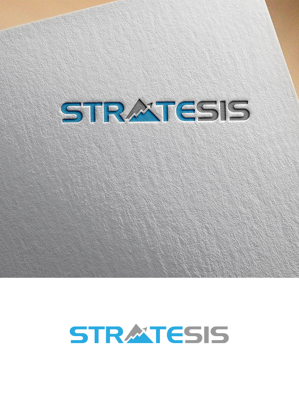
Stratesis Investment Fund Company Logo

Want to win a job like this?
This customer received 406 logo designs from 127 designers. They chose this logo design from Creative Eliza as the winning design.
Join for free Find Design Jobs- Guaranteed
Logo Design Brief
We are looking for a great logo design expressing who we are to investors and employees. We expect to use it on letterhead, email tag, business cards, apparel, presentations, etc. The most important audience for this logo are first our investors (who are our clients/customers/partners) and second our employees who are young technologists (data scientists, computer programmers, financial analysts).Stratesis = Strategic Analysis. Stratesis is a technology quantitative event-based hedge fund, small in size. We use big data analytics, machine learning (a subset of artificial intelligence) and similar advanced technologies to create investment strategies. We are not like other investment funds. The founders are industry outsiders. We are unique in this space. Honestly, most people don't understand what we do or how we do it. The name (Stratesis) itself is a bit confusing, but once they understand more, it makes sense.The final design should communicate:IntrigueEnigmaStrategyTechnology, Machine Learning, Artificial IntelligenceQuantitative AnalysisConfidenceWe are open to conservative colors that fit well with the above words.See our linked in page for more information on Stratesis Technologies:https://www.linkedin.com/company/stratesis/about/?viewAsMember=true
Updates
I added a photo of my current business card to show my favored font style on the project brief. Please see that photo. Feel free to submit other font styles, but this is my favorite font style so far.
Added Saturday, June 15, 2019
Target Market(s)
Investors in our fund - mostly older, men and women but more men, they like that we are different from other funds.
Young employees who are technologists - they want to work for a company with a cool techie logo, to put on company apparel, etc.
Logo Text
Stratesis or STRATESIS
Logo styles of interest
Emblem Logo
Logo enclosed in a shape
Pictorial/Combination Logo
A real-world object (optional text)
Wordmark Logo
Word or name based logo (text only)
Lettermark Logo
Acronym or letter based logo (text only)
Font styles to use
Other font styles liked:
- Block modern or similar
Colors
Colors selected by the customer to be used in the logo design:
Look and feel
Each slider illustrates characteristics of the customer's brand and the style your logo design should communicate.
Elegant
Bold
Playful
Serious
Traditional
Modern
Personable
Professional
Feminine
Masculine
Colorful
Conservative
Economical
Upmarket
Requirements
Must have
- I added a photo of my current business card to show my favored font style. Feel free to submit other font styles, but this is my favorite so far.
- We are currently settling on logo designs that are integrated into the letter A in STRATESIS. If you want to resubmit something creative like that, we plan to keep this open until Thursday night / Friday morning with the listed deadline.
- Thank you for all your submissions! We are impressed with what we've seen so far!
Nice to have
- We would like to have some sort of logo graphic along with the STRATESIS words. But not required - it can be just the words STRATESIS with lettermark/similar built into the text itself, if only text then it needs to really good.
- Some logo ideas - stock chart looking graphic, technology looking graphic, or both melded in some way. We apply technology to investing. Try dots/dashes, stock chart bars, stock line chart going up, digital circuits, and other technology and investment designs. If you start with those and then make it subtle, that has worked well.
- For colors:
- Blue/grey conservative hues seem to work best.
- Blue/green can work too.
- Try blue/grey and blue/green in 2 iterations of your design.
- Conservative hue colors are best. Too bright or loud is not conservative enough.
- For STRATESIS text:
- Blue text with green or grey font seems to be our favorite.
- Try making the STRAT blue, SIS a different color (green or grey), and the E blend from blue to green/grey. Use the same blue/green or blue/grey combo for the log. This is our favorite so far.
Should not have
- Many designers have included an S in the logo graphic. We prefer not to have a prominent S in a logo graphic. If the 'S' is used in a logo graphic outside of the STRATESIS words, then we want any S in a logo graphic to be nuanced, slightly hidden or in the background. Otherwise a big pronounced 'S' looks like Superman's logo which we do not want.
- For example, one designer has a stock chart looking logo, and an S is hidden in the shadow of the stock chart. That looks great - you have to look for the S, but it's not pronounced. You feel it before you see it. It makes the whole design coherent, but not shocking.