Videnpunkt
Winner
Want to win a job like this?
This customer received 239 logo designs from 132 designers. They chose this logo design from Mylogo 3 as the winning design.
Join for free Find Design Jobs- Guaranteed
-
 €110
€110
-
 239 designs
-
 132 designers
Logo Design Brief
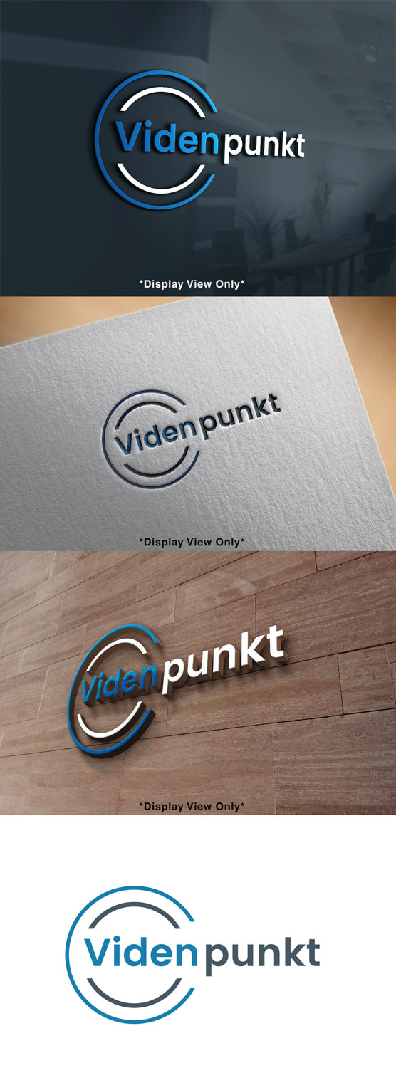
"Videnpunkt" is a blog for business people in Scandinavia. Directly translated "Videnpunkt" means "Knowledge Point" - or the place to go to find business knowledge.
Logo Text
Videnpunkt
Logo styles of interest
Wordmark Logo
Word or name based logo (text only)
Lettermark Logo
Acronym or letter based logo (text only)
Font styles to use
Serif
Sans Serif
Look and feel
Each slider illustrates characteristics of the customer's brand and the style your logo design should communicate.
Elegant
Bold
Playful
Serious
Traditional
Modern
Personable
Professional
Feminine
Masculine
Colorful
Conservative
Economical
Upmarket
Requirements
Must have
- We prefer the letters/logo to have black/grey (#455661) and blue (#177DAD).
- This is to match the colours in our other businesses e.g. https://flexkom-solutions.dk/
Nice to have
- Ideas could be to write "viden" in a circle. The circle signals the point to go ("punkt"). Or the dot/circle could be the dot over the i in "Viden".
- Another idea could be to signal some kind of knowledge symbol in one of the letters.
Payments
1st place
€110