New and exciting family health hub needing equally exciting catching new logo
Want to win a job like this?
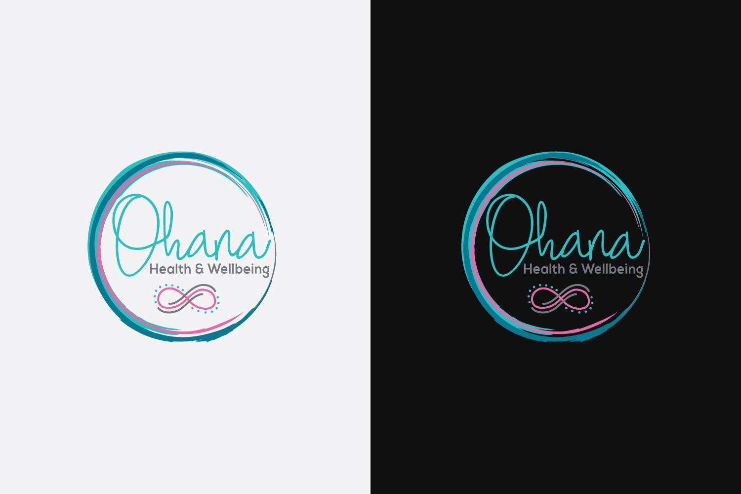
This customer received 110 logo designs from 37 designers. They chose this logo design from AbdullahDesigns™ as the winning design.
Join for free Find Design Jobs-
 A$150
A$150
-
 110 designs
-
 37 designers
Logo Design Brief
Ohana Health and Wellbeing is the collaboration, expansion and re branding of a family chiroprctic business plus yoga studio plus several smaller natural therapies. We are a work family of professionals and friends providing the best services for families to maintain their ability to move, think, eat and feel well and go forth and live their best lives.
Updates
Gathering more feedback
Target Market(s)
Suburban families
Industry/Entity Type
Health And Wellness
Logo Text
Ohana Health and wellbeing
Logo styles of interest
Abstract Logo
Conceptual / symbolic (optional text)
Font styles to use
Colors
Colors selected by the customer to be used in the logo design:
Look and feel
Each slider illustrates characteristics of the customer's brand and the style your logo design should communicate.
Elegant
Bold
Playful
Serious
Traditional
Modern
Personable
Professional
Feminine
Masculine
Colorful
Conservative
Economical
Upmarket
Requirements
Must have
- Infinity symbol as that is the traditional Ohana symbol
- If you go to Ohanahealthandwellbeing.com.au you will see the style and colour of Ohana that I like.
- Turqoiuse, teals and aquas favourable colours
- Pink/purple tones and greys other favourable colours
- Circular designs seem to be my re occurring favourites
- Would like to see watercolour versions
- Swirly writing font for Ohana preferable
Nice to have
- Have uploaded pictures of things I like
Should not have
- Not to chunky/thick in fonts and designs