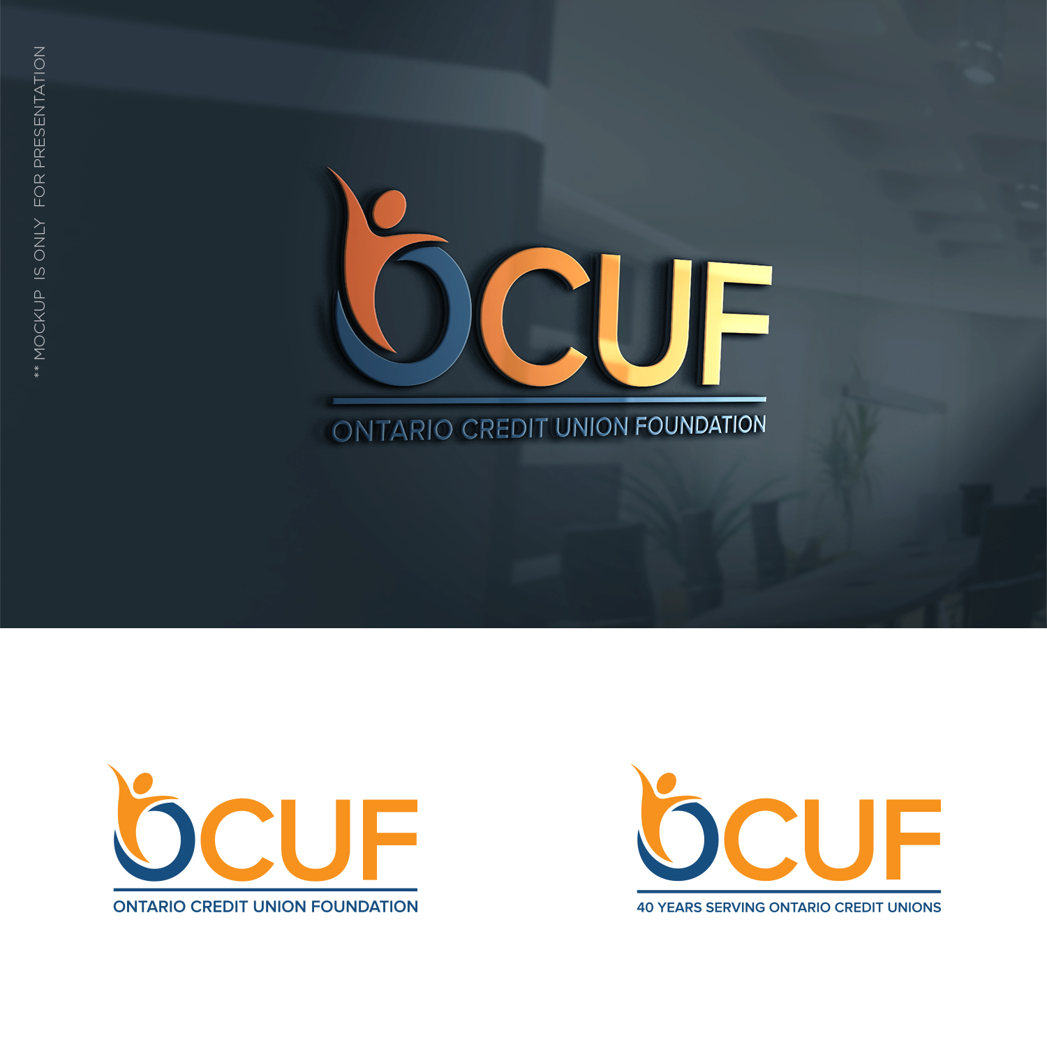
Credit Union Foundation logo refresh.
Want to win a job like this?
This customer received 154 logo designs from 41 designers. They chose this logo design from designbysy as the winning design.
Join for free Find Design Jobs- Guaranteed
-
 C$150
C$150
-
 154 designs
-
 41 designers
Logo Design Brief
Looking for an update of our logo. It is a bit conventional and still usable, but because we turn "40" this year (1997 - 2019) we were thinking we might do a logo "refresh". Ideally you could incorporate reference to the "40 years serving Ontario Credit Unions" that would come off in 2020 and revert to a standard (new) logo. Hopefully that makes sense. A new logo with a 40 year application that returns to the new logo (without the 40) in 2020.
Target Market(s)
Ontario (Canada) Credit Unions are our members.
Industry/Entity Type
Financial Service
Logo Text
Ontario Credit Union Foundation (or if OCUF is in logo) could be "Serving Ontario Credit Unions"
Colors
Colors selected by the customer to be used in the logo design:
Look and feel
Each slider illustrates characteristics of the customer's brand and the style your logo design should communicate.
Elegant
Bold
Playful
Serious
Traditional
Modern
Personable
Professional
Feminine
Masculine
Colorful
Conservative
Economical
Upmarket
Requirements
Must have
- Colours we have used are #1f4d7f and #F99106 (not stuck on these but would provide some continuity perhaps, or surprise me!
Nice to have
- We have use "peeps" in our current logo, can be viewed at www.ocuf.org. It was a take off of the international credit union symbol of people holding a globe (which we don't want). This worked well as we were able to make icons using them. Again not a must have - wanted to give as much info as possible.