Embedded Reporting/Analytics Dashboard Design
Want to win a job like this?
This customer received 19 web designs from 4 designers. They chose this web design from MIND as the winning design.
Join for free Find Design Jobs- Guaranteed
-
 US$230
-
 19 designs
-
 4 designers
Web Design Brief
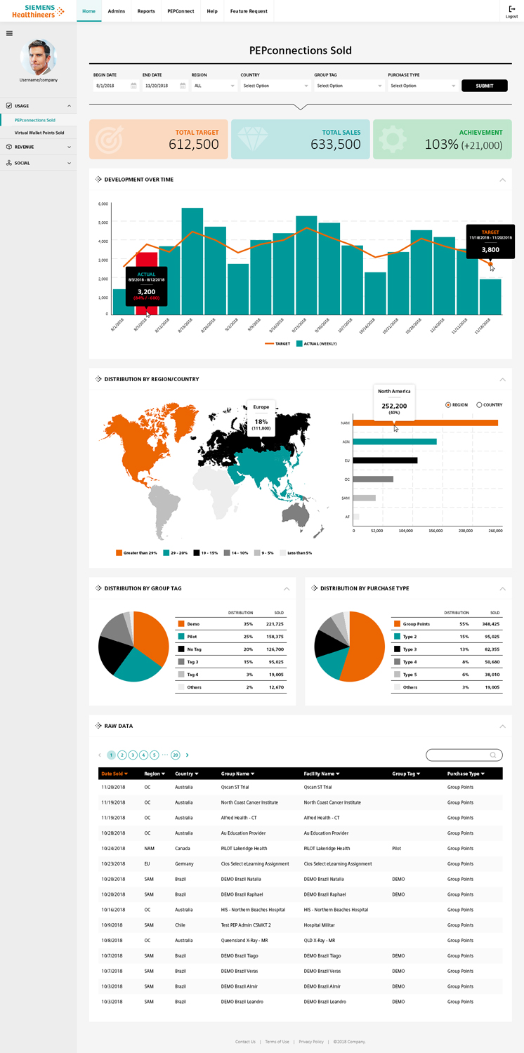
We have a customer that has contracted us to integrate a third-party reporting/analytics platform into their learning platform (which we build/maintain for them). We are seeking design assistance to "beautify" the dashboard which will be the visual representation of this feature add-on -- Taking the elements that are possible and creating a mock-up of the design and specifics regarding the CSS that our developers should use (i.e., font types and sizes, colors, button styles, etc.). This is for a large corporate customer with pre-existing design guidelines available (which can be provided as/if needed). That said, we do have flexibility in "bending" the rules of those design standards - As long as they retain the general spirit of them. We are not after anything too flashy or over the top - Just good quality of design that is intuitive and helps the user to focus on the data and not be distracted by inconsistencies in the UI/UX. We are using the third-party reporting/analytics platform Logi Analytics, so the designs produced will need to be relative to the capabilities of what the GUI offers from this vendor. https://www.logianalytics.com/analytics-platform/We are embedding their solution into our existing application via iframe. Here is the samples gallery from the vendor (for reference): https://www.logianalytics.com/visual-gallery/Attached are a few screenshots to provide reference and get you started:* Screens 1A-1B are screenshots of what we have built to date. We are only a week into our second sprint, so not much is built yet, and very little styling beyond the default (out of the box) styling is in use. Note, what we have so far is only a table-view of data. As we proceed with the development, additional reports will be added to the dashboard that will include graphs, maps, and other data visualization components - Please consider this. For example, the next reports we will build will be map based (i.e., showing activity on a country by country basis using a map visualization). * Screens 2A - 2G Are screenshots of another analytics platform that the client is using external to the application we are working on. They have indicated they like this solution, so it would be ok to leverage some of the aspects of these into our solution. * Screen 3A - 3E are sample screens of the application that this analytics component is being added to (to get a sense of the general design language at play). You can also view more by going directly to the public site here: https://pep.siemens-info.com/en-usPlease reach out to brant@knowledgeanywhere.com with any questions you have or items you would like to clarify.
Industry/Entity Type
Healthcare
Number of Pages Required
1 page
Font styles to use
Look and feel
Each slider illustrates characteristics of the customer's brand and the style your logo design should communicate.