Family-centered business brand needs a logo
Want to win a job like this?
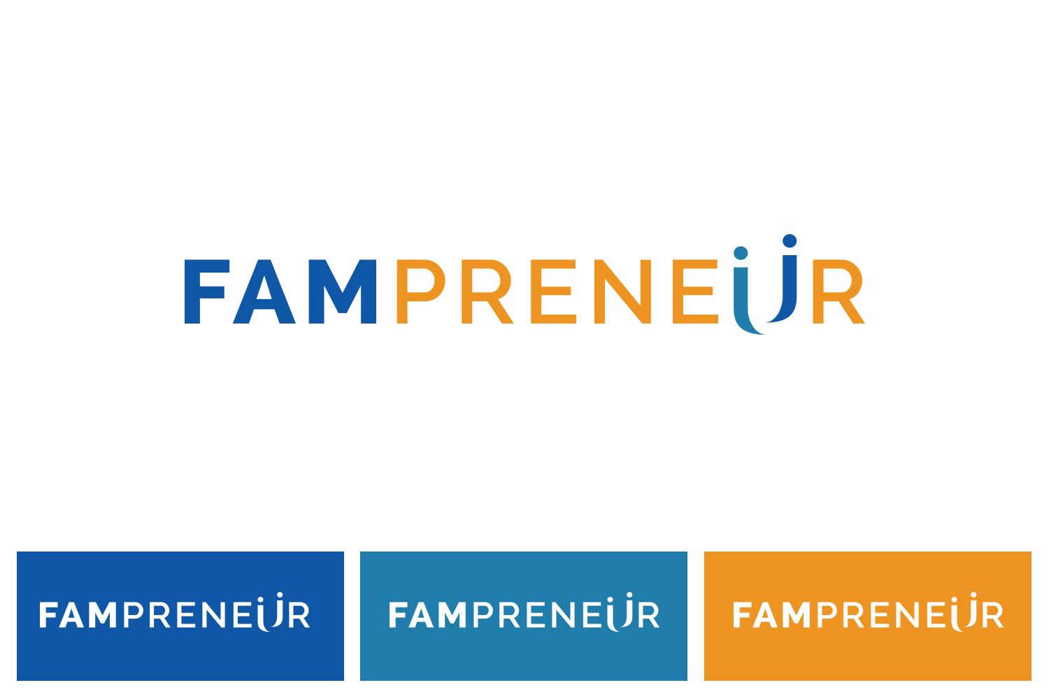
This customer received 188 logo designs from 90 designers. They chose this logo design from zingodesigns258 as the winning design.
Join for free Find Design Jobs-
 US$150
-
 188 designs
-
 90 designers
Logo Design Brief
I am looking for a logo to represent a business brand that's all about balancing family and business. It is for entrepreneurs who run a successful business but don't want to sacrifice their family time since they value time with their spouse and kids. This will be for a podcast, website, and community as well as printed products such as journals and t-shirts. Should represent both business and family since that's the target audience: family-centered business owners/entrepreneurs.
It should be a logo that people love wearing on t-shirts, hats and other wearables representing a community / cause they are passionate about.
Target Market(s)
Entrepreneurs and business owners between 25-50 who value family and business. They are married and have children.
Industry/Entity Type
Community
Logo Text
Fampreneur
Logo styles of interest
Abstract Logo
Conceptual / symbolic (optional text)
Wordmark Logo
Word or name based logo (text only)
Lettermark Logo
Acronym or letter based logo (text only)
Font styles to use
Look and feel
Each slider illustrates characteristics of the customer's brand and the style your logo design should communicate.
Elegant
Bold
Playful
Serious
Traditional
Modern
Personable
Professional
Feminine
Masculine
Colorful
Conservative
Economical
Upmarket
Requirements
Must have
- I am looking for a design that features both an icon and a strong font for the brand name. The icon should be able to stand on it's own and give people an idea of what the Fampreneur (family entrepreneur) movement is all about. The icon may be integrated with the letters/text as long as it's legible. The word Fampreneur should also be able to stand on it's own based on the font used.
Nice to have
- I've done some versions of the logo where the "Fam" part is some form of script font and the "preneur" part being a bold font so it's professional. Doesn't have to be used this way but just a thought.
Should not have
- I've included some examples of previous logos for reference, but they weren't quite right. Notice there was an element that represented the family part (fam) and an element that represented the business part (preneur).