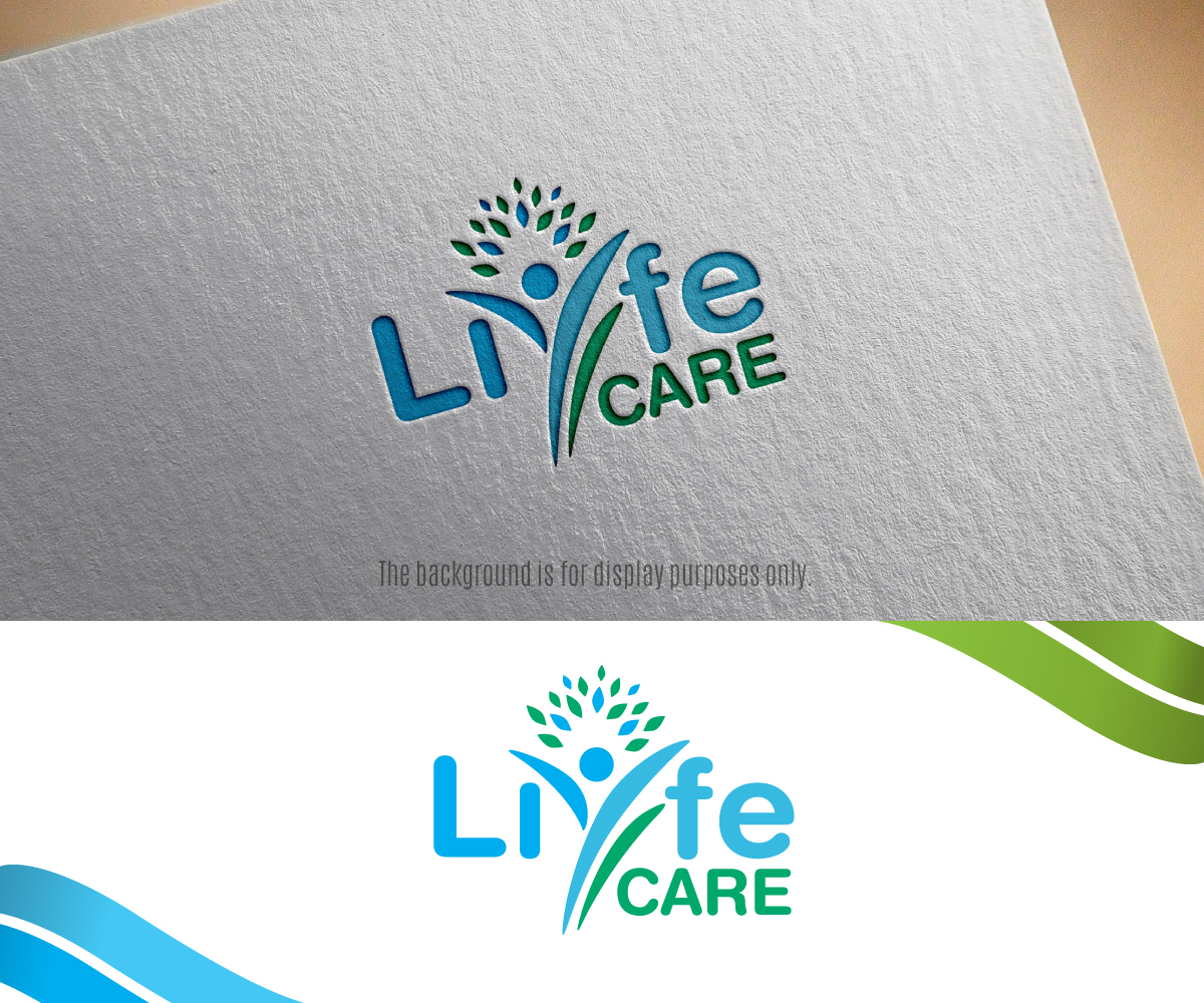
Online Health and Wellness brand needs a professional logo.

Want to win a job like this?
This customer received 147 logo designs from 62 designers. They chose this logo design from edwinnegz1 as the winning design.
Join for free Find Design JobsLogo Design Brief
Our mission is to provide products, education and solutions to assist our customer partners to make positive daily improvements in the health and wellness area. Our target customers are people who want more in life. We attract curious individuals who seek change. Typically our clients are frustrated and want to move personal growth, health and wellness and education higher up on their priority list. The logo we are anticipating should communicate the fact that we are here to assist our customers to place more emphasis on themselves and their lives so that they can live the best life they can.
As the word Life in or brand incorporates the letter Y (LiyfeCare) we would like for the Y to be a differentiation factor. For example we are supporting the real Why “Y” in your life = You. So highliting and bringing focus on the Y within the word Liyfe would be advantageous.
Target Market(s)
People who are looking to improve their lives daily. People who are interested in key areas such as health and well-being and personal development to enable them to live the best life that they can.
Industry/Entity Type
Health And Wellness
Logo Text
Liyfe Care
Logo styles of interest
Emblem Logo
Logo enclosed in a shape
Pictorial/Combination Logo
A real-world object (optional text)
Abstract Logo
Conceptual / symbolic (optional text)
Font styles to use
Look and feel
Each slider illustrates characteristics of the customer's brand and the style your logo design should communicate.
Elegant
Bold
Playful
Serious
Traditional
Modern
Personable
Professional
Feminine
Masculine
Colorful
Conservative
Economical
Upmarket
Requirements
Must have
- The Y in the word Liyfe being highlited
- Usage of images that have rounded edges
- Open to colour schemes but we do prefer some calming colours (blues, greens, a quad etc)
Nice to have
- Inclusion of a tag line something along the lines of - Supporting You - your real Why
Should not have
- A logo with jagged edges
- A logo that is simply the brand name without an image