Depict the human being as a new platform; "The Human as Data Platform"
Want to win a job like this?
This customer received 35 illustration designs from 5 designers. They chose this illustration design from Eric Gooch as the winning design.
Join for free Find Design Jobs- Guaranteed
-
 US$190
-
 35 designs
-
 5 designers
Illustration Design Brief
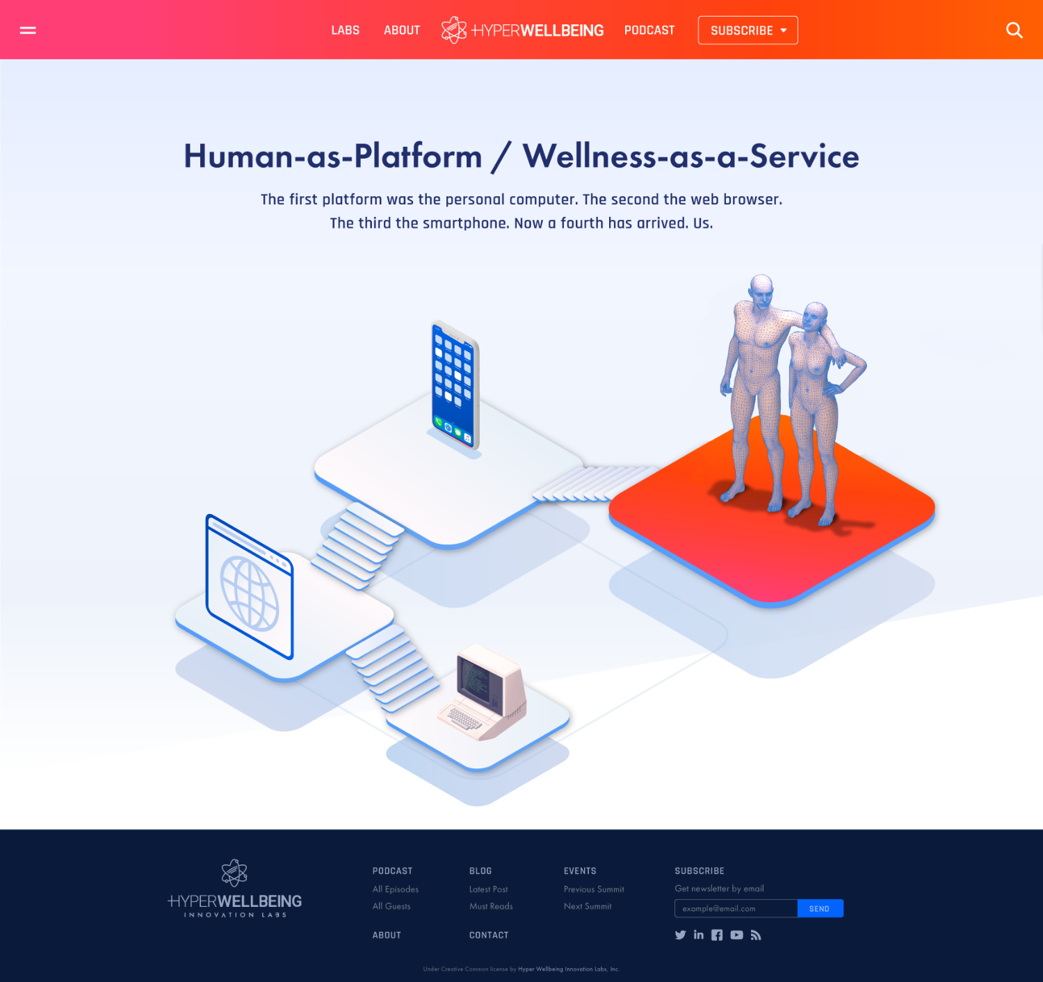
The first platform was the personal computer. The second, the web browser. The third, the smartphone. Now a fourth is upon us, the human being. The best use of the platform, is for Wellness-as-a-Service (WaaS)[1]. It’s emerging as devices, apps, mobile, biology, health and wellness converge.
In short, humans and computers are converging. We can use that for “bad” and we can use that for “good”. WaaS is a new industry sector based upon using it for “good”. We need to depict that convergence and with a positive “feel”.
However depicting human-computer convergence or what we’ll term the human as platform, and it leveraged for health and wellness may be a challenge. For more industry background maybe listen/read this podcast [2][3].
Sometimes people try to represent man-machine, by producing a cyborg looking thing, however this is not about adding parts to a human (artificial limbs etc). Besides cyborgs look scary and not “positive”/well.
Sometimes people try to just throw 0s and 1s over the human, to somehow make the human look “techno”, but this looks like 1995. Or they throw electronic circuit boards on the human or elements into the design and this also can look 1995.
Computers (wearables/mobile/etc) are knowing us ever more intimately. Our physical & sexual activities, motion & gestures, sleep & reproductive cycles, nutritional intake plus increasing physiological measurements. More recently our moods, emotions, thoughts, intentions & speech. They are also poised to know us from birth to death. The human is becoming the largest data platform. This project is to depict that.
We need a man and woman depicted and as that fourth platform. Choosing both genders should steer the image away from looking aggressive (or like Blade Runner), and give it more of a feel of “humanity” rather than dystopia.
UPDATE 30 OCT, 2018
--------------------------------
The two figures (male and female) should probably be isometric [4] (30deg angles on each side) - file ‘file-002-isometric-male-female-figures.png’ has been attached to show this. The two human figures in that file would be OK but would better if their hands looked more relaxed rather than straight by their sides, i.e. a more natural hand position.
The fill should probably be polygon; file ‘file-001-isometric-oscar-statue.png’ has been attached to show this. Polygons may be enough to indicate “data” (human-computer convergence), but maybe not.
In order to provide more aid, a quick hack of how the male/female figures will be used has been attached as file ‘file-003-homepage-hacked-idea.png’. For this 10 minute mockup, an illustration by Dmitrii Kharchenko [5] was quickly lifted and modified only to give an idea.
We will have a large homepage illustration showing four “platforms”, and on each of the four, we will have an illustration. On platform 1 we will have the “personal computer”, on platform 2 the web browser, on platform 3 the smartphone and on platform 4 the human.
This contest is to design the illustration to sit on platform 4. To show platform numbering the file ‘file-004-homepage-4-platforms.jpg’ has been attached. Note to make the quick mockup of homepage the existing items were left on “platforms” in the original illustration, but these will be replaced I.e. platform 4 with the male/female figures produced in this contest.
UPDATE #2 30 OCT, 2018
--------------------------------
For utmost clarity on usage case, the file “file-003-homepage-hacked-idea.png” has been iterated (just 30 minutes spent on it) to more accurately depict usage context for the two human figures, see file “file-005-homepage-4-platforms-iteration2.png” attached.
[1] https://blog.hyperwellbeing.com/the-3-pillars-of-wellness-as-a-service/
[2]
https://podcast.hyperwellbeing.com/episode/001-brad-perkins-a-new-healthcare-industry-emerging-from-computing/
[3]
https://blog.hyperwellbeing.com/001-brad-perkins-a-new-healthcare-industry-emerging-from-computing/
[4] https://en.wikipedia.org/wiki/Isometric_video_game_graphics
[5] https://dribbble.com/DmiT
Updates
DesignCrowd said I'd get at least 50 designs when I paid. So far 9! Plus it's not been iterated to a conclusion yet.
Industry/Entity Type
Data Science
Look and feel
Each slider illustrates characteristics of the customer's brand and the style your logo design should communicate.
Elegant
Bold
Playful
Serious
Traditional
Modern
Personable
Professional
Feminine
Masculine
Colorful
Conservative
Economical
Upmarket
Requirements
Must have
- Human figure must be anatomically correct, outline of human body must have right size legs/arms, not stretched out arms etc. Not sure if human should be filled, polygoned, mixed, other etc.
- Must include both a man and a woman. Must be on a white background.
Nice to have
- Would be nice if it was “simpler” so it can work in various sizes. Flatter, limited number of colours. Not overburdened with complexity.
- The colour should be mostly blue/s (maybe some green/s), maybe some other colours too - a good guide would be the colours used in the illustration here https://www.atlassian.com/software/jira