Fork in the Road

Want to win a job like this?
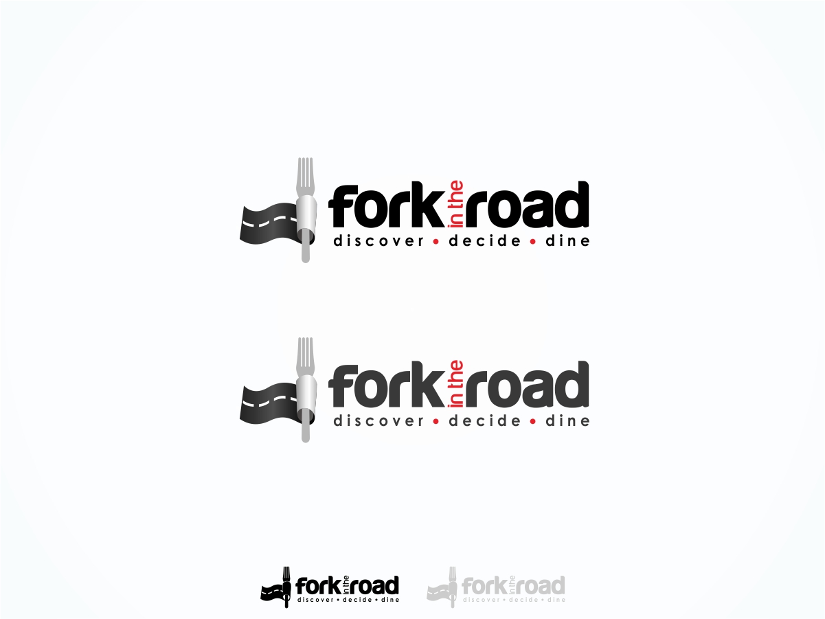
This customer received 95 logo designs from 30 designers. They chose this logo design from Robby SC as the winning design.
Join for free Find Design Jobs- Guaranteed
Logo Design Brief
Fork in the Road is being launched in Charleston, South Carolina as the "The course to moveable feasts;" a highly interactive dining guide in both print and a full platform of digital tools. We would like to see the logo as just the name (Fork in the Road) as well as with the tag line, which is still subject to slight modification.
Charleston has become nationally / internationally recognized as the #1 city in the US and the "Best City in the World" for several years by Conde Nast Traveler, and is known for its evolving food scene.
This initial project is for a logo design, which should achieve several things. "Fork in the Road" is a tool for both restaurant owners and eaters, and will be more robust than any competition in the local market. Therefore, the logo should be "smart" and relate instantly to what we are. It could be a forked road, a fork (utensil), or a combination of both.
The fork in the road may represent the notion that with us, either decision you make will be the right one. Similarly, the road's fork (if used) could be inverted and show that indecision (the two roads before they fork) are consolidated and lead the diner to THE decision. We generally like the use of the utensil, as it gives instant recognition to the fact that we are a FOOD publication.
Each of us must eat, every day. We are appealing to the 4.5 million visitors that come to Charleston every year. With so many burgeoning restaurants, locals must choose from a wide array as well, and our online reviews, and chefs' opinions will aid them with that.
Fork in the Road will be fun, but should first be serious and not too cartoonish. We will play with the logo in a variety of ways once created, and can dress it up or down, depending upon the campaign. We like the idea of the words standing on their own also. We do not have any thoughts or preferences on color schemes, but importantly, the logo must work for print, digital, magazine and in a very small size, for a variety of promotional items.
The logo should communicate professionalism and "trustworthiness." On line and in print, we will be using rich photography, editorial content and human interest to draw people in.
Target Market(s)
4.5 million annual tourists who we are going to reach through semi-annual printed publications (magazine) and locals. Both groups will also be trained through a variety of measures to utilize our online services.
Logo Text
Fork in the Road - The Course to Moveable Feasts
Look and feel
Each slider illustrates characteristics of the customer's brand and the style your logo design should communicate.