Album Artwork for Re-Release of Original Country Music CD "Lonely Tears"
Want to win a job like this?
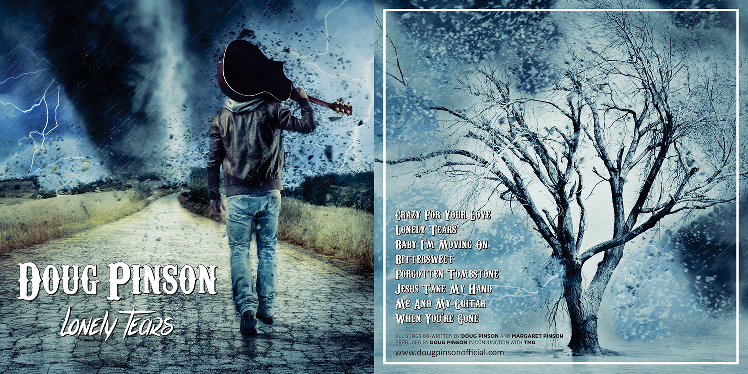
This customer received 116 CD cover designs from 17 designers. They chose this CD cover design from alhemique1 as the winning design.
Join for free Find Design Jobs- Guaranteed
-
 US$160
-
 116 designs
-
 17 designers
CD Cover Design Brief
I need a fresh CD cover design for my album "Lonely Tears".
This is a re-release on an older project, and I am looking for album artwork that inspires hope in the midst of sorrow.
I am uploading the backside that I had begun to create - I felt this was a nice concept, as the small group of trees in the midst of the storm that were together had a beam of light shining upon them, which spoke hope to me in the midst of sorrow.
I have also uploaded the original front album artwork. It wasn't that it was bad, but I don't have access to the original files, so I am seeking for a fresh start.
I don't yet have a concept for the cover of the CD itself, but I assume that we would use a derivative work from the front cover that would be designed.
The submissions do not have to mirror my ideas, but I hope my ideas convey the general concepts I want this album imagery to convey.
Here are links to listen to the tracks, if you want to get a feel for the general sounds of the album:
Spotify - https://open.spotify.com/album/3eLoK14KkLI6TdNESueuaD
Target Market(s)
Country Music, Ages 25-55
Font styles to use
Other font styles liked:
- The font on the back imagery is Sveningsson. It doesn't have to be that font - just something that captures the spirit of the album.
Colors
Designer to choose colors to be used in the design.
Look and feel
Each slider illustrates characteristics of the customer's brand and the style your logo design should communicate.
Elegant
Bold
Playful
Serious
Traditional
Modern
Personable
Professional
Feminine
Masculine
Colorful
Conservative
Economical
Upmarket
Requirements
Must have
- My name on the front of the album, as well as the album title.
- On the back, it must list the information provided in the picture I uploaded of what I was creating for the back of the album.
Nice to have
- I prefer fonts that encapture the spirit of the album concept. This album has many somber songs within it, so the fonts and the color patterns that are chosen should reflect a spirit of hope in the midst of suffering (or despair).
Should not have
- Happy imagery is obviously not a part of this project. I want it to retain a somber feel, yet still be appealing to the eye of any buyer.