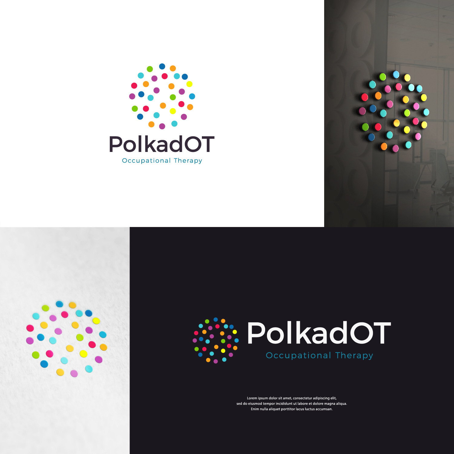
Polka dOT Occupational Therapy
Winner
Want to win a job like this?
This customer received 111 logo designs from 44 designers. They chose this logo design from shakuna as the winning design.
Join for free Find Design Jobs-
 A$150
A$150
-
 111 designs
-
 44 designers
Logo Design Brief
We need a logo for a paediatric occupational therapy practice based in Adelaide, Australia. We provide occupational therapy to children (boys and girls) aged between 2 and 16 years old, with special needs. We would like the logo to be stylish but fun. The name of the business is 'Polka dot' occupational therapy, but the OT in 'dot' would be good to be in capitals, as it is the abbreviation for occupational therapy.
Logo Text
Polka dOT Occupational Therapy
Logo styles of interest
Pictorial/Combination Logo
A real-world object (optional text)
Abstract Logo
Conceptual / symbolic (optional text)
Font styles to use
Serif
Sans Serif
Look and feel
Each slider illustrates characteristics of the customer's brand and the style your logo design should communicate.
Elegant
Bold
Playful
Serious
Traditional
Modern
Personable
Professional
Feminine
Masculine
Colorful
Conservative
Economical
Upmarket
Requirements
Should not have
- No hands on the logo please.
Payments
1st place
A$150