Redesign Tier rating icon for fund ratings
Want to win a job like this?
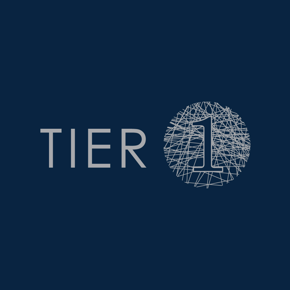
This customer received 98 logo designs from 23 designers. They chose this logo design from Kreative Fingers as the winning design.
Join for free Find Design Jobs- Guaranteed
-
 US$150
-
 98 designs
-
 23 designers
Logo Design Brief
We are a financial services company that rates funds. When we reach a conclusion on a rating we give it a Tier 1, Tier 2 or Tier 3. Tier 1 being the best.
This is then used on our website, at the top of a rating report, in the media and on other fund list provider websites.
For reference I have attached:
- our style guide. This includes 4 colours that we use.
- current tier icon versions
To explain our brand and what the icon must represent:
Our intention is to provide our clients with investment clarity. To do this, we rely on detailed research, relevant experience and expertise, and clear communication. Many factors influence investment decisions. Information is everywhere and everyone has an opinion. This is what is often referred to as the “noise” in the market.
We work through the “noise” to find the data points that really do matter, to develop an informed and independent opinion and to provide our clients with a clear picture of what is relevant. We strive to achieve investment clarity, a non-negotiable for effective investment decisions.
We've unsuccessfully gone down the road of trying to create this icon a few times and have a few points worth noting:
- The icon doesn't need to be all 3 in one image, we prefer them separate.
- The word "Tier" and the number of the rating must be included in the design
- Please don't use rev counter type images, as these are not appropriate
- no traffic light type icons (green, orange, red)
- the animal line drawings in our style guide are going to change over time so we can't rely on any one of them in the icon. The underlying theme here is connecting the dots.
- Icon needs to be smart and tailored to the industry (i.e. serious)
- On the colours, we have 4 colours and open to using black aswell if necessary. We are not closed to allowing a new colour but in the past this hasn't worked out. So would need to be amazing. Note that this can't be red/orange as these are negative colours, and similarly green.
- The tier ratings next to each other must be obvious that Tier 1 is the best and Tier 3 is the worst
So while we are looking for a single icon design we are actually needing all 3 as they will slightly differ from each other.
Please can you put forward options that show all 3.
Target Market(s)
corporate
Industry/Entity Type
Financial Service
Logo Text
TIER 1
Logo styles of interest
Emblem Logo
Logo enclosed in a shape
Abstract Logo
Conceptual / symbolic (optional text)
Font styles to use
Other font styles liked:
- RAWENGULKSANS
Look and feel
Each slider illustrates characteristics of the customer's brand and the style your logo design should communicate.
Elegant
Bold
Playful
Serious
Traditional
Modern
Personable
Professional
Feminine
Masculine
Colorful
Conservative
Economical
Upmarket
Requirements
Must have
- logo text in it
- look different from each other (tier 1/tier 2/tier 3)
Nice to have
- I've included the main font below, but it doesn't have to be used. it might be a little too thin/light in order to use on the tier icon
Should not have
- red/orange/greem colouring
- rev counter or traffic light (green, orange, red) type images