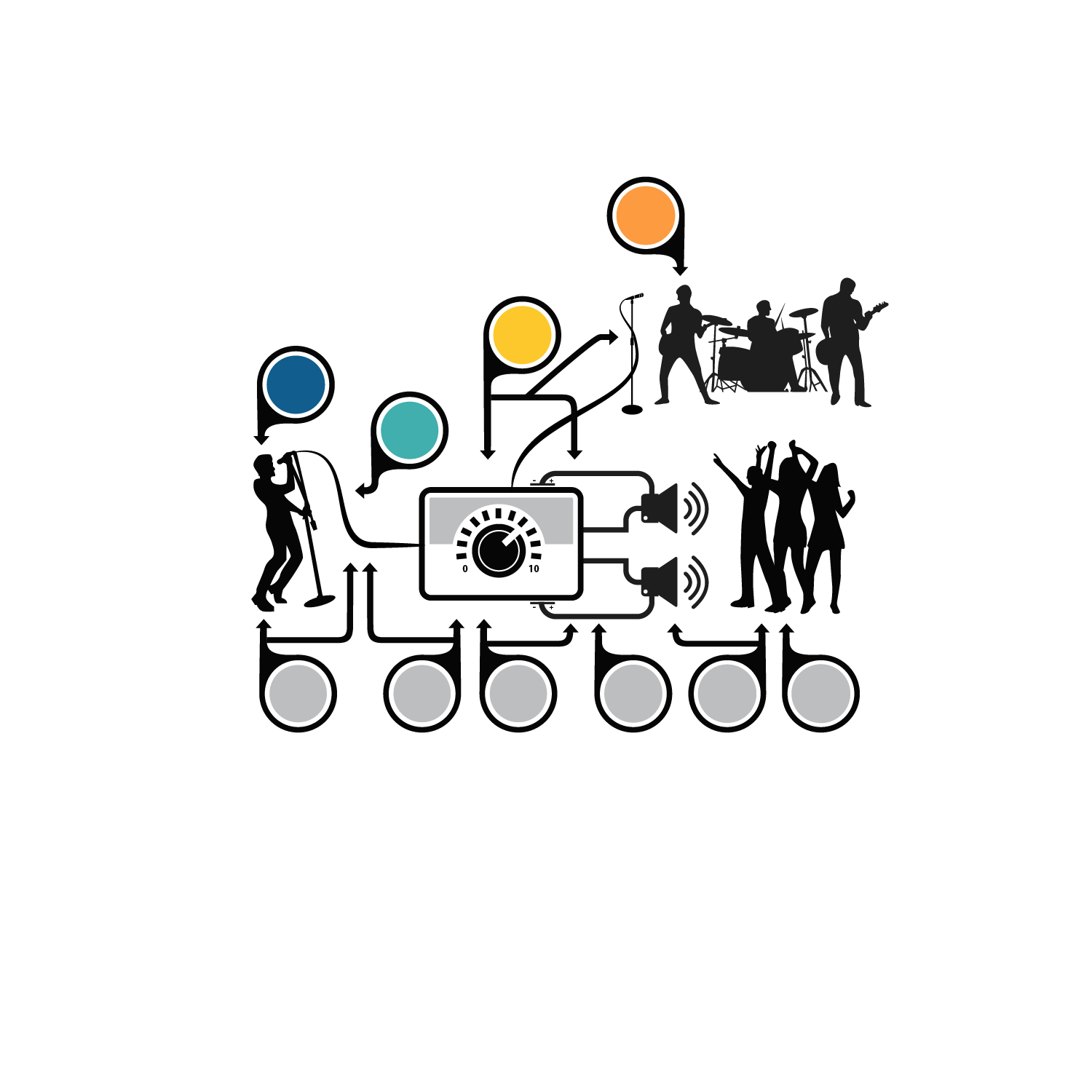
Pain as a sound system analogy diagram

Want to win a job like this?
This customer received 30 graphic designs from 5 designers. They chose this graphic design from kinan3 as the winning design.
Join for free Find Design Jobs- Guaranteed
Graphic Design Brief
I am doing a talk this week. I have previously done it using hand drawings and Prezi, but I would like to get the hand drawings done so they don't look like rubbish. The Pictures attached are what I need and this is a link to a version of the talk. https://prezi.com/wecyppgfaoas/?utm_campaign=share&utm_medium=copy&rc=ex0shar
What I need is
1. Make the picture look professional (Version 1)
2. A version with no bubbles (Version 2)
3. A version of the picture with no connecting lines (Version 3)
4. A version of the picture with no orange bubbles (Version 4)
5. A version of the picture with no blue bubbles (Version 5)
6. Each of the components of the picture as individual pictures
I have included a diagram called "explanatory diagram" that labels each picture so it is hopefully clear what my bad drawings are. Please add your style to the pictures.
Thanks
Dan
Target Market(s)
The target audience for this talk will be people suffering chronic pain and doctors that look after them
Colors
Designer to choose colors to be used in the design.
Look and feel
Each slider illustrates characteristics of the customer's brand and the style your logo design should communicate.