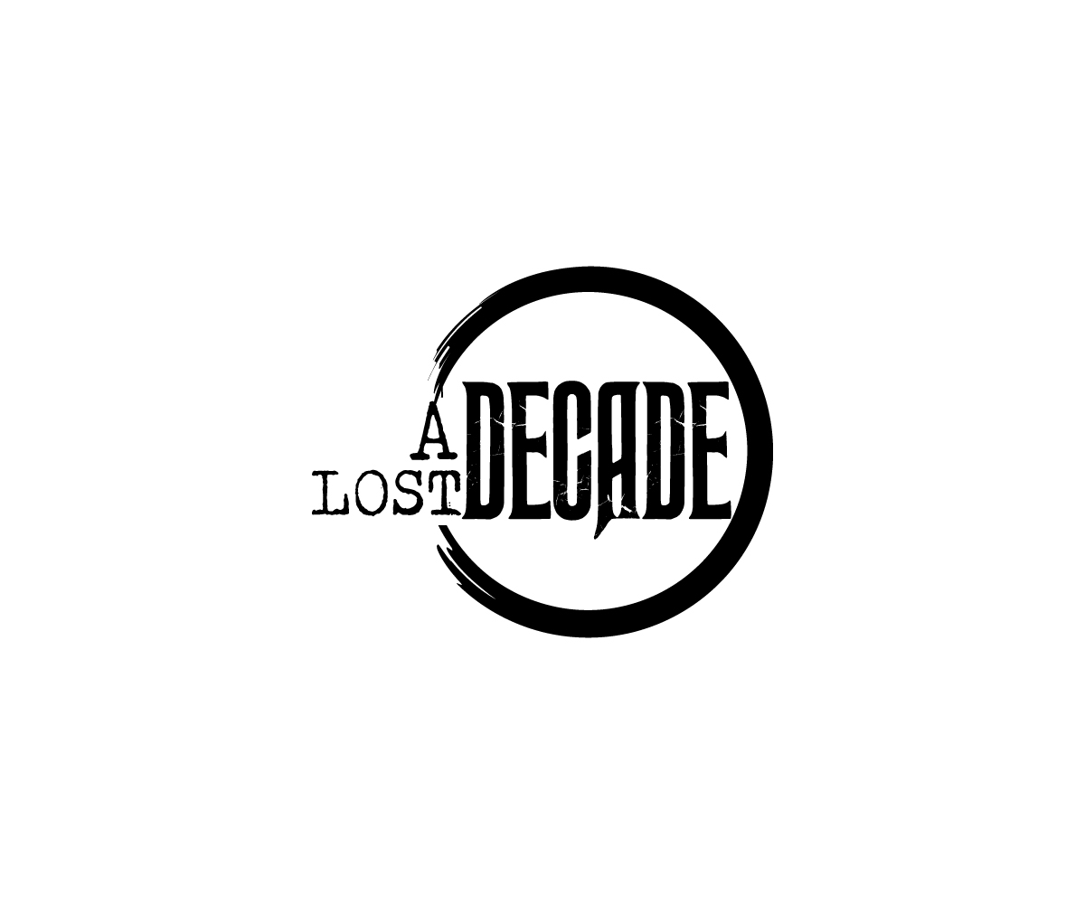
Logo for a music band lost decade
Want to win a job like this?
This customer received 99 logo designs from 44 designers. They chose this logo design from Samuel paul as the winning design.
Join for free Find Design Jobs- Guaranteed
-
 €210
€210
-
 99 designs
-
 44 designers
Logo Design Brief
a lost decade is a new musical project, we have just finished the production of our first album as well as our first video. outings are scheduled for September. - it is simply a logo for a music band rock influences are varied (The Strokes, Foo Fighter etc ...) - It is necessary that the name appear in full (see logo example the stokes) with a typo type typewriter style drawing effect (see second example) - The rest is quite free, the name can appear on an object (kind K7 or others) but in no way it is an obligation. It should use little color can be three black and white plus another color point. (same remark nothing is required)
Target Market(s)
fans of music, something of rather identity
Logo Text
a lost decade
Logo styles of interest
Emblem Logo
Logo enclosed in a shape
Colors
Designer to choose colors to be used in the design.
Look and feel
Each slider illustrates characteristics of the customer's brand and the style your logo design should communicate.
Elegant
Bold
Playful
Serious
Traditional
Modern
Personable
Professional
Feminine
Masculine
Colorful
Conservative
Economical
Upmarket
Requirements
Must have
- the name of the group has lost decade with a typo type typewriter
Nice to have
- some things with a drawing effect (see examples)
Should not have
- All ideas are good to take