GS Light bulb
Want to win a job like this?
This customer received 140 logo designs from 57 designers. They chose this logo design from StudioTech as the winning design.
Join for free Find Design Jobs-
 US$170
-
 140 designs
-
 57 designers
Logo Design Brief
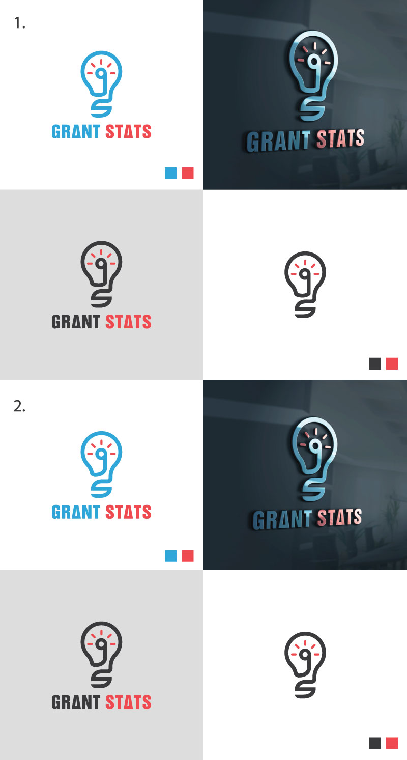
I have drawn a light bulb with the letters g and s in the design, but it is not pretty. I like the concept of what I have created, but it is not worthy of a logo. The lower case 'g' is in the middle of the bulb, with the circle of the bulb showing as the filament, and the 's' is the bottom of the light bulb, where it screws in. I would like the very bottom of the logo (below the s) to include a look of an actual light bulb. Maybe how the left side of the 'g' end with a thin curved break in the line to show the end of the g but continuing on to the bulb, and the other side replicates the look with the start/end of the s. I would like an artist to clean up the design for me to use on a web site, business cards, brochures, shirts (embroider) etc.
Logo Text
One with just the light bulb with the g and s; one with Grant Stats underneath the light bulb, one with Grant Stats in a arch type style over the top of the light bulb
Colors
Colors selected by the customer to be used in the logo design:
Look and feel
Each slider illustrates characteristics of the customer's brand and the style your logo design should communicate.