Movie Showtimes Website needs an updated new look
Want to win a job like this?
This customer received 75 web designs from 25 designers. They chose this web design from Ananya Roy as the winning design.
Join for free Find Design Jobs- Guaranteed
-
 C$370
C$370
-
 75 designs
-
 25 designers
Web Design Brief
Website = www.cinemaclock.com
We want to update the look of our website. We want our website to look modern, trendy, something that was designed in 2018.
We don't need any HTML or CSS or web development. All we need is the graphical prototype, preferably in Photoshop with layers.
Most of our visitors use mobile devices. Our website is RESPONSIVE -- it is flexible to fit all screen sizes.
We will use this new logo (designed on DesignCrowd):
https://www.designcrowd.com/design/18181387
Thank you for your kind consideration.
Please find attached 3 PDF files with the current webpages:
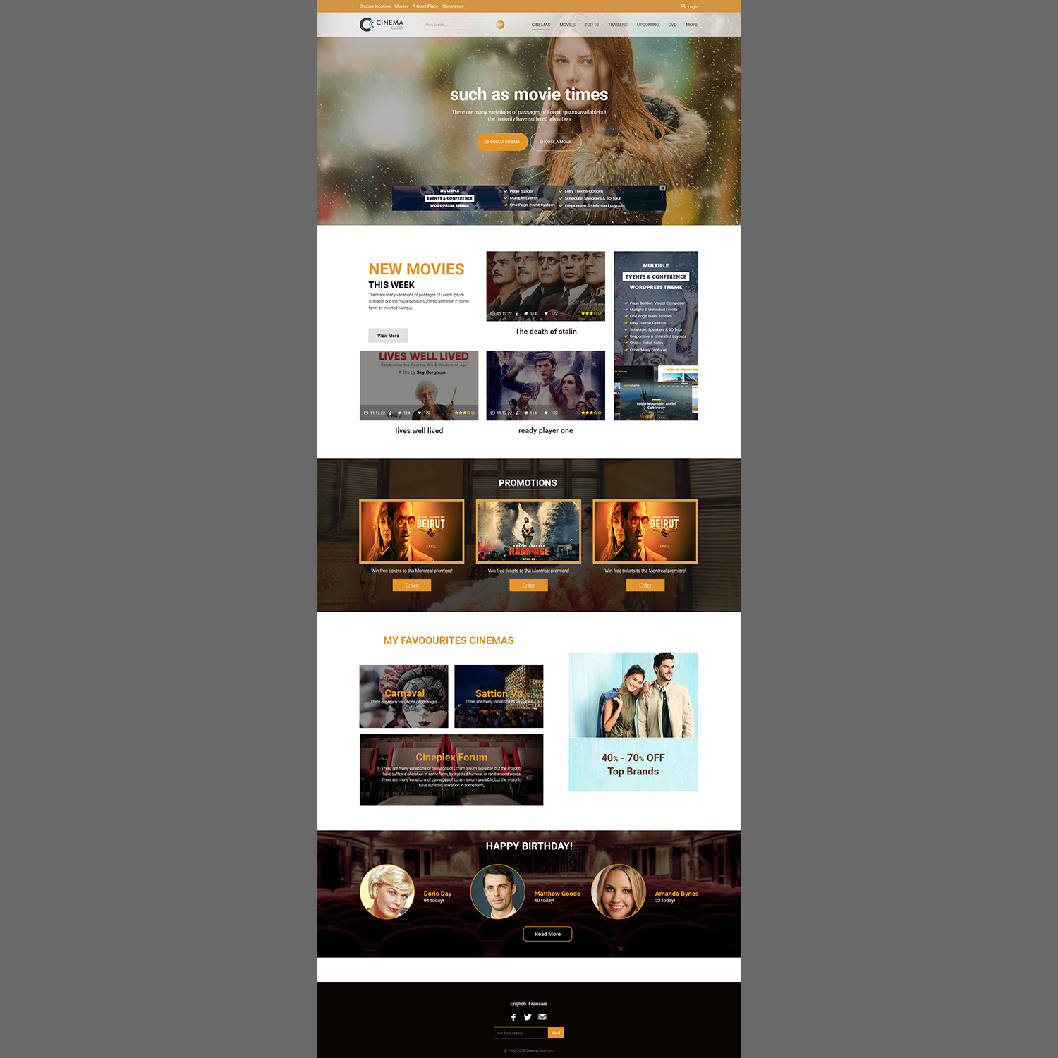
1. Each city location has its own HOME PAGE like this:
https://www.cinemaclock.com/ont/ottawa/
2. The most visited pages have movie SHOWTIMES and look like this:
https://www.cinemaclock.com/theatres/cineplex-lansdowne-vip
MOVIE TITLE (poster + basic info + 4 buttons)
-- the type of the screening (ex. Regular, IMAX, 3D, etc.)
-- individual days and showtimes
3. INFORMATION about movies:
https://www.cinemaclock.com/movies/ready-player-one-2018
Thank you.
Updates
Low design quality
Target Market(s)
Canada and USA, target audience = ages 13-50
Industry/Entity Type
Movie
Number of Pages Required
3 page
Font styles to use
Colors
Designer to choose colors to be used in the design.
Look and feel
Each slider illustrates characteristics of the customer's brand and the style your logo design should communicate.
Elegant
Bold
Playful
Serious
Traditional
Modern
Personable
Professional
Feminine
Masculine
Colorful
Conservative
Economical
Upmarket
Requirements
Must have
- - For the main body text (such as movie times, description, information) we prefer dark text on a light background.
- - We will use the new logo https://www.designcrowd.com/design/18181387 -- but the text Cinema Clock in the logo doesn't have to look exactly like that, it can be on the same line and have the same or different size
Should not have
- No more than 2 different fonts (ex. one font for headers and titles, another one for text)