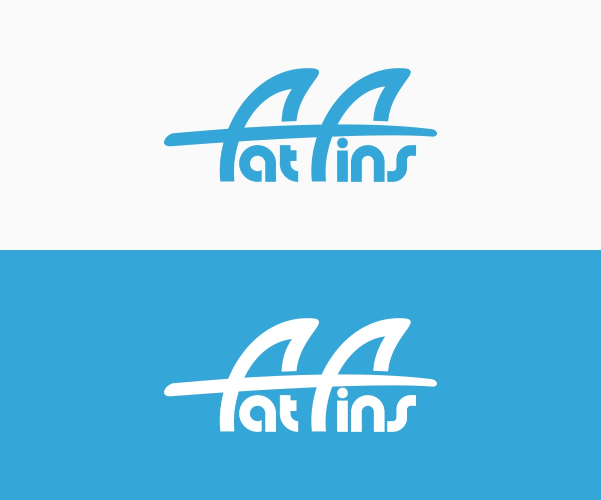
Graphic logo design for fat fins a surfing brand
Want to win a job like this?
This customer received 119 logo designs from 30 designers. They chose this logo design from B8 as the winning design.
Join for free Find Design Jobs- Guaranteed
-
 A$120
A$120
-
 119 designs
-
 30 designers
Logo Design Brief
Fin design company looking for a logo, fins are used on surfboard. The fins are safer and less likely to hurt than other fin designs, making it safer and more fun. Brand is called fat fins as the contact area is fatter than normal fins therefore preventing severe liaisons.
Would like to incorporate fin siluettes or surfboards into the wording. Eg top of the “f’s” for fat fin representing thrusters from a surfboard.
Would prefer custom typography.
Ultimately the logo will be used for merchandise branding and marketing so want to keep simple and timeless
Thank you and good luck
Industry/Entity Type
It Company
Logo Text
Fat Fins
Look and feel
Each slider illustrates characteristics of the customer's brand and the style your logo design should communicate.
Elegant
Bold
Playful
Serious
Traditional
Modern
Personable
Professional
Feminine
Masculine
Colorful
Conservative
Economical
Upmarket
Requirements
Must have
- Incorporate fins and surfboard into design
- It is also going to be a logo on cap and T-shirts needs to be cool, or retro
Nice to have
- Try and create a feeling of movement. Surfing is dynamic. And fun.
- It’s that energy that can hurt.... fat fins save you
- Maybe word “fat” is wider bigger than “fins” like a bigger fin?!
Should not have
- Should not look like a Shark