Costume Store Needs Redesign/Modern Website
Want to win a job like this?
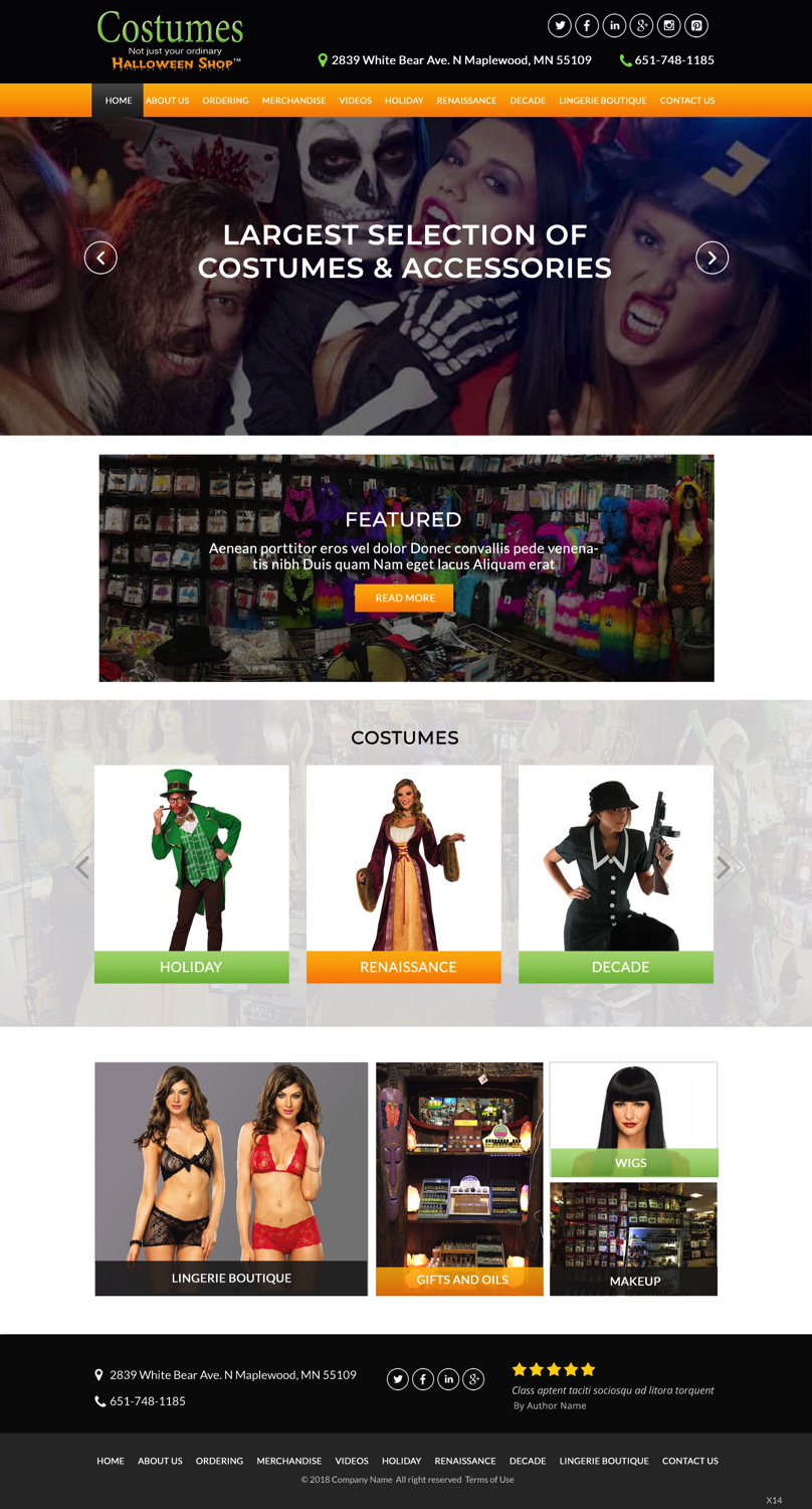
This customer received 14 web designs from 6 designers. They chose this web design from pb as the winning design.
Join for free Find Design Jobs- Guaranteed
-
 C$230
C$230
-
 14 designs
-
 6 designers
Web Design Brief
We have a local retail store of costumes, accessories, wigs, makeup, masks, etc.
The original idea behind the website was to give people an incentive for coming to the store by giving them an idea of the size of the store, the large variety of products and the overall appeal of the store.
While pursuing this objective, however, the website became too cluttered and hard to navigate. We would like to keep this original goal but have a much cleaner & professional presentation.
At this point we don't sell online, so showing a clear picture of what a customer could find here in the store is really what we want to accomplish.
With that in mind, I would like to add a section in the navigation menu titled "Ordering". Customers often get confused on the website and end up calling the store asking where the "cart" is and they can't figure out how to order online because it's not clear enough that we only sell in store. Here's an example of a website I found that doesn't sell online but has an "Ordering" link that explains the options for the customer: https://www.habitathousewares.com/ordering/
Another thing I would like for the homepage, is some google reviews to be featured as a slideshow. I found an example here at the bottom of the page: http://www.eleniviolaris.com/
I like the overall look of that website as well.
Here is one more example of a website I really like the design of: http://www.midwestmtn.com/.
What I like about it is the big slideshow of pictures at the top of the homepage, the simplicity, and the navigation.
We need to try to get attention with pictures and fewer words, especially for the Homepage. Keep the longer descriptions inside the specific sections.
For the Homepage, I'd like a few main categories listed as picture links, with a few words to the right of the image to describe what they will find in that section.
The categories I'm thinking for the homepage are,
1. “Featured" this section would change seasonally but at the moment St. Patricks Day would be what that section would link to.
2. Next would be "Costumes" and once you click that picture have it link to a page that lists the categories of costumes we feature on the website ( holiday, renaissance, decade, etc.).
Other main categories for the homepage could be "Lingerie Boutique", "Gifts and Oils", "Wigs", "Makeup". Even with the picture links, I would still like to keep the navigation links at the top of the page even if they are duplicate to the pages we are linking to through the pictures on the homepage. This is just an idea, I would like to see your takes as well I'm open to suggestions for an outside perspective.
The main idea though is to make the homepage less wordy and less confusing.
Updates
Low designer entries
We would like to see a design that looks like this; http://www.eleniviolaris.com/ With this Image as the background; https://www.dropbox.com/s/89h2ox43eomjsdx/311991_2018-Store-front-New-Final.jpg?dl=0
Target Market(s)
Local costume buyers
Industry/Entity Type
Store
Number of Pages Required
5+ page
Colors
Designer to choose colors to be used in the design.
Look and feel
Each slider illustrates characteristics of the customer's brand and the style your logo design should communicate.
Elegant
Bold
Playful
Serious
Traditional
Modern
Personable
Professional
Feminine
Masculine
Colorful
Conservative
Economical
Upmarket
Requirements
Must have
- I would like these 5 pages designed: Home, About us, Ordering, Merchandise, Videos