UI design for Fast Food Restaurant Self-Order App
Want to win a job like this?
This customer received 36 app designs from 10 designers. They chose this app design from MIND as the winning design.
Join for free Find Design Jobs- Guaranteed
-
 S$460
S$460
-
 36 designs
-
 10 designers
App Design Brief
Background:
App purpose: for fast food restaurant customers to self order food/drink by choosing item image, and make payment by tapping the credit card on the card terminal.
Reference: https://www.nextepsystems.com/product-overview/self-order-kiosks/
Attachment:
Wireframes. (wire frames provide general idea and the information to display, they are not a strict guideline for layout design.)
Mcdonald's Self ordering app.
Intro:
We have built a (for restaurant and cafe) Self Ordering and Payment app, similar to Mcdonald's self ordering software in most of their new restaurants. Our app will be placed in a Microsoft Windows 10 OS touch screen Kiosk(screen size 4:3 or Portrait 16:9) within the restaurant/cafe premise.
Pages to be designed:
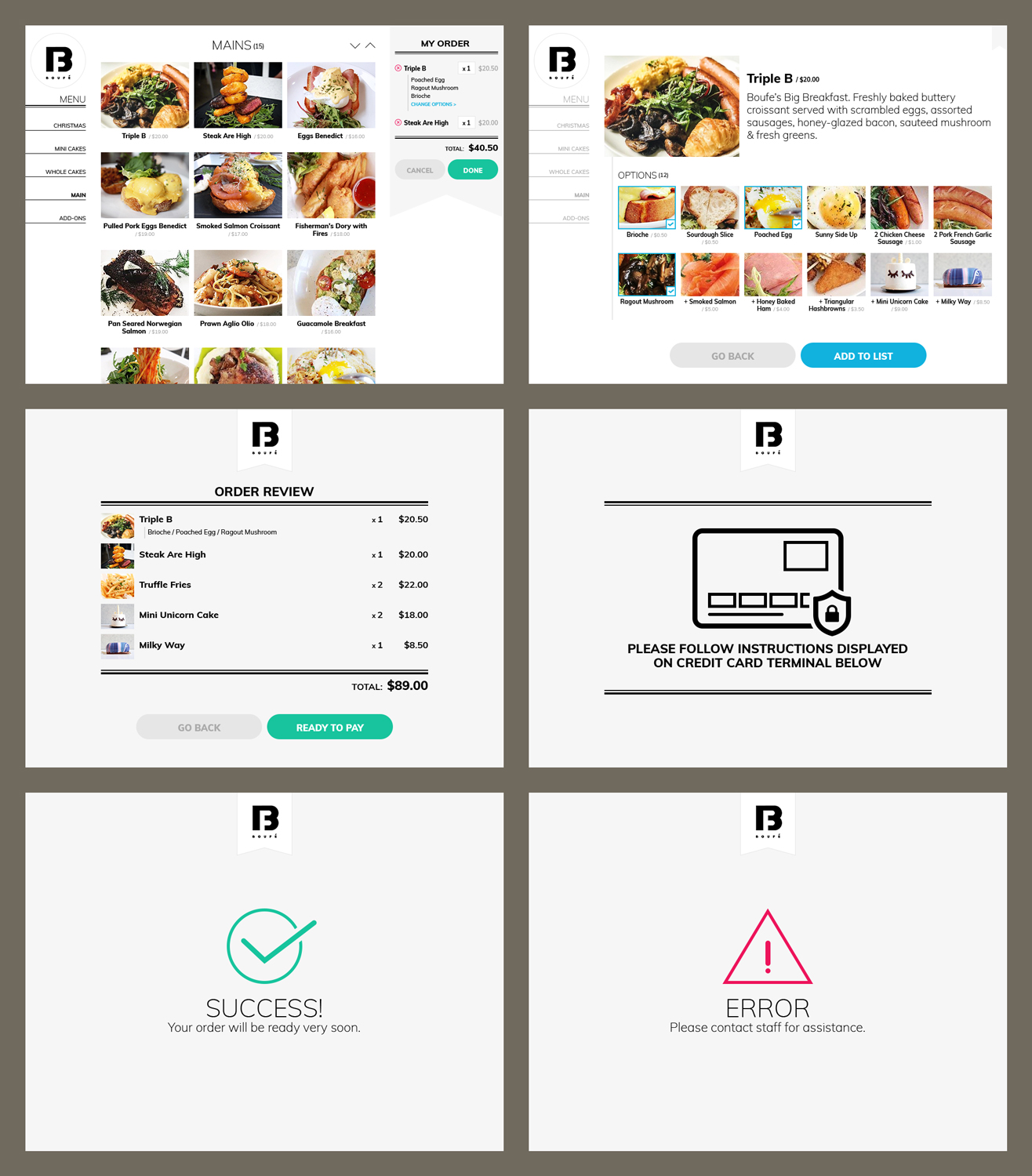
Page 1. Food Browsing Page. displays all food images(to be provided by cafes) by categories, and displays the Cart. This page will lead to Page 2 or Page 3.
'Cart' section should include:
'cart items/selected items', its quantity and price. like Mcdonalds' app.
When click on a Cart Item, we need to allow to change quantity or 'change Choice'. The UI handling these change requests with ease will be one deciding factor for us to choose your design.
Fact: up to 10 food categories, and 10 - 25 food items under each categories.
When click on one item image, it goes to Page 2.
Page 2. Item Detail/Description Page. Shows description of the food, and its available Choice(other food items or Special Request, up to 12) will also be displayed. 'Add item to cart' action(Button Name: ADD) will happen here and go back to Browsing Page 1.
e.g. Item 'Fried Rice' Page. the Choice could be 'Add Egg', 'Add Meat', 'No Chilli' etc.
Page 3. Order Review Page. No edit features allowed on this page, only two buttons: 'No' to go back to Browsing Page, or 'Yes' to proceed to Payment Page 4. Check Mcdonald's screen.
Page 4. Payment Page - Prompt user to Insert or Tap credit card on the credit card terminal. (Exact wording: PLEASE FOLLOW INSTRUCTIONS DISPLAYED ON CREDIT CARD TERMINAL BELOW)
Page 5. Payment status. Successful / Failed.
Our considerations to pick the winner:
1. In terms of design for this task, we look out for page layout, effects, fonts, button style and overall colour scheme. the design should present itself in a clean and modern look, with minimum clicking or scrolling. The app aims to help customers choose and pay for their items quickly.
2.we need to handle both 4:3(as shown in wire frames) and 16:9 screens(like Mcdonald's). there will be a lot more vertical space to utilise when it is in 16:9, resulting less scrolling than 4:3. tell us what you think.
All questions are welcome.
Winner has opportunity to work on a few more app UI. Cheers!
Industry/Entity Type
Fast Food Restaurant
Font styles to use
Look and feel
Each slider illustrates characteristics of the customer's brand and the style your logo design should communicate.
Elegant
Bold
Playful
Serious
Traditional
Modern
Personable
Professional
Feminine
Masculine
Colorful
Conservative
Economical
Upmarket
Requirements
Must have
- Button colour differentiation - helps people know what to click next.
- best use of screen space. minimum click and scrolls.
Nice to have
- any personal touch.
Should not have
- unrelated design pattern, e.g. a cute animal or flower pattern in the layout.