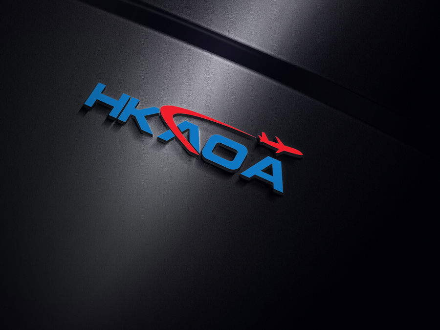
Hong Kong Aircrew Officers Association Logo Update

Want to win a job like this?
This customer received 211 logo designs from 59 designers. They chose this logo design from LinneX as the winning design.
Join for free Find Design JobsLogo Design Brief
We require a modern, updated logo to replace an older existing logo.
We would like to have concepts of unity, leadership, command, authority, while being understated and secure, with an aviation theme.
hkaoa.org/public/home/ is our website and can be visited for inspiration.
Our association represents 2400 pilots in Hong Kong with our airline.
Our employer is Cathay Pacific https://www.cathaypacific.com/cx/en_HK.html
Additionally, our sister union has recently completed a logo project which can be drawn on for additional inspiration. https://logo.designcrowd.com/contest.aspx?id=1486122
Other Aircrew union logos for reference.
http://www.alpa.org/
https://www.alliedpilots.org/
https://www.balpa.org/
Target Market(s)
Pilots and media
Industry/Entity Type
Leadership
Logo Text
AOA
Logo styles of interest
Emblem Logo
Logo enclosed in a shape
Pictorial/Combination Logo
A real-world object (optional text)
Character Logo
Logo with illustration or character
Font styles to use
Colors
Colors selected by the customer to be used in the logo design:
Look and feel
Each slider illustrates characteristics of the customer's brand and the style your logo design should communicate.
Elegant
Bold
Playful
Serious
Traditional
Modern
Personable
Professional
Feminine
Masculine
Colorful
Conservative
Economical
Upmarket
Requirements
Must have
- HKAOA
Nice to have
- Hong Kong Aircrew Officers Association
- Aviation-themed items, airplane (B777, B747, A350 [see attached images]) Runway, Pilot hat, Aircraft engine, Fan blades perhaps
- Consider making use of the HK Flag as an accent
- Consider HK skyline as a accent - but possibly difficult as it will become cluttered.
- Consider Cathay Pacific green in the logo somehow
Should not have
- Be careful with the pilot wings please.... We need to ensure we are projecting a professional image. Many of the logo submissions with "wings" seem to be having a childish appearance.