New Optician shop in friendliest borough of London - Greenwich needs new website!
Want to win a job like this?
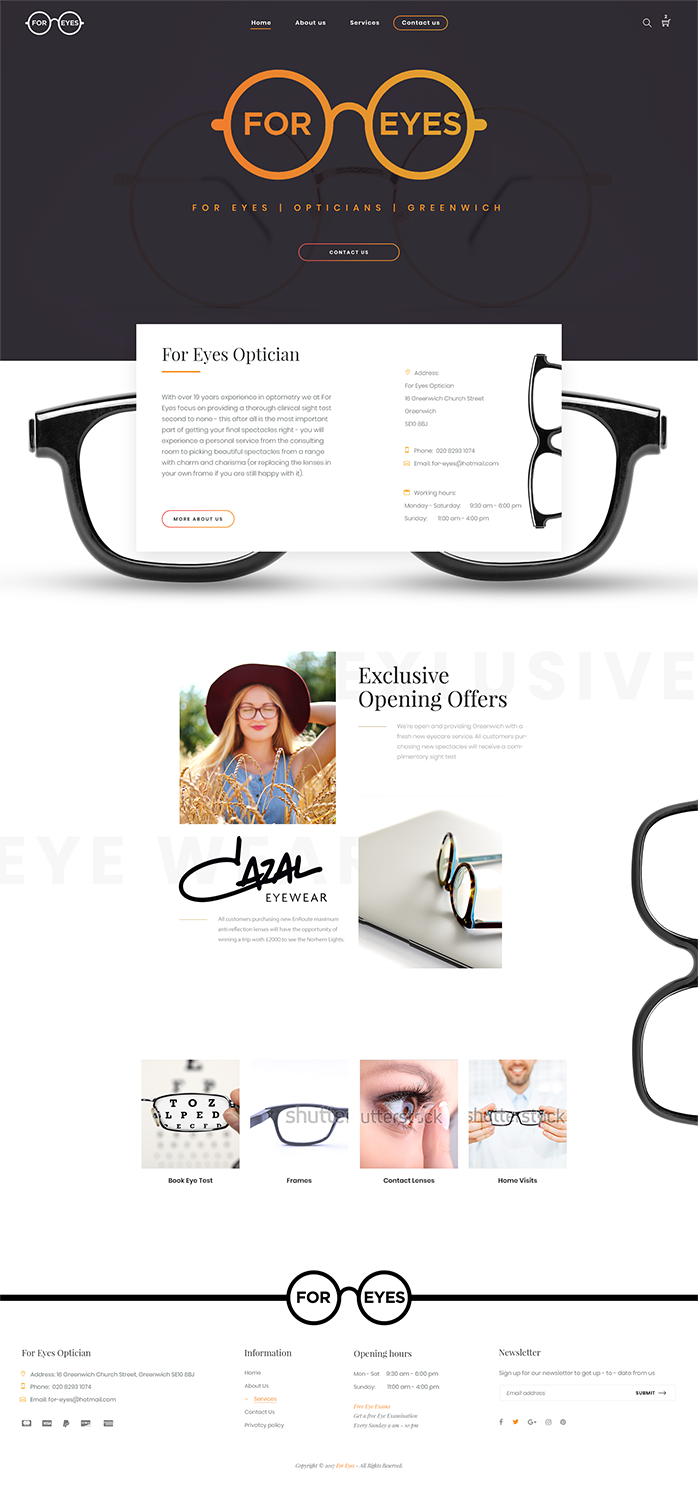
This customer received 15 web designs from 8 designers. They chose this web design from Flowful as the winning design.
Join for free Find Design Jobs-
 £120
£120
-
 15 designs
-
 8 designers
Web Design Brief
We are looking to update our current website design to make it look more professional, modern and informative, maybe with a funky twist. I love Scandinavian designs, also Dutch designs. Our current website we did it ourselves ( foreyesoptician.com ) it doesn't look great. We just moved our optician shop to Greenwich - one of the most historically rich area of London, famous for Greenwich Meridian ( 0 longtitude), historic maritime quarter, beautiful Greenwich park, artisan shops. The premises we are currently located at used to be a pharmacy. The area has close community feel, lots of young professionals and families live here, there is also lots of students. It would be nice if anything of this could reflect on our website.
Please have a look at our facebook page:www.facebook.com/foreyesopticiangreenwich
Us on google:
https://www.google.co.uk/search?source=hp&ei=S58aWqffLMyHgAby3bnoAg&q=for+eyes+greenwich&oq=for+eyes+greenwich&gs_l=psy-ab.3..0.40546.42839.0.43083.18.15.0.3.3.0.165.1407.6j7.13.0....0...1c.1.64.psy-ab..3.15.1324...0i131k1j0i22i30k1j0i22i10i30k1.0.i7mfCfWET2Y#spf=1511694285510
Target Market(s)
professionals, families, students - it's a rather wide range of people living in the area
Industry/Entity Type
Optician
Number of Pages Required
5+ page
Font styles to use
Colors
Colors selected by the customer to be used in the logo design:
Look and feel
Each slider illustrates characteristics of the customer's brand and the style your logo design should communicate.
Elegant
Bold
Playful
Serious
Traditional
Modern
Personable
Professional
Feminine
Masculine
Colorful
Conservative
Economical
Upmarket
Requirements
Must have
- 'Make an appointment to come and see us' link on the first page.
- It also needs to be easy to use on the mobile phone.
- The structure of the page :
- 1. Home
- 2.about us
- 3. Services :
- How can we assist you?
- A) Frames b)eye tests c)contact lenses d) lenses e)home visits
- 4. Contact us
Nice to have
- The colours I selected is more optional -if you look at our pictures , we have those colours in our shop interior, but I am open to options.
Should not have
- not too busy looking page - less is more.