True Dank Logo and Sign - I want to use it for a sign outside of my business, like a lit up sign.
Want to win a job like this?
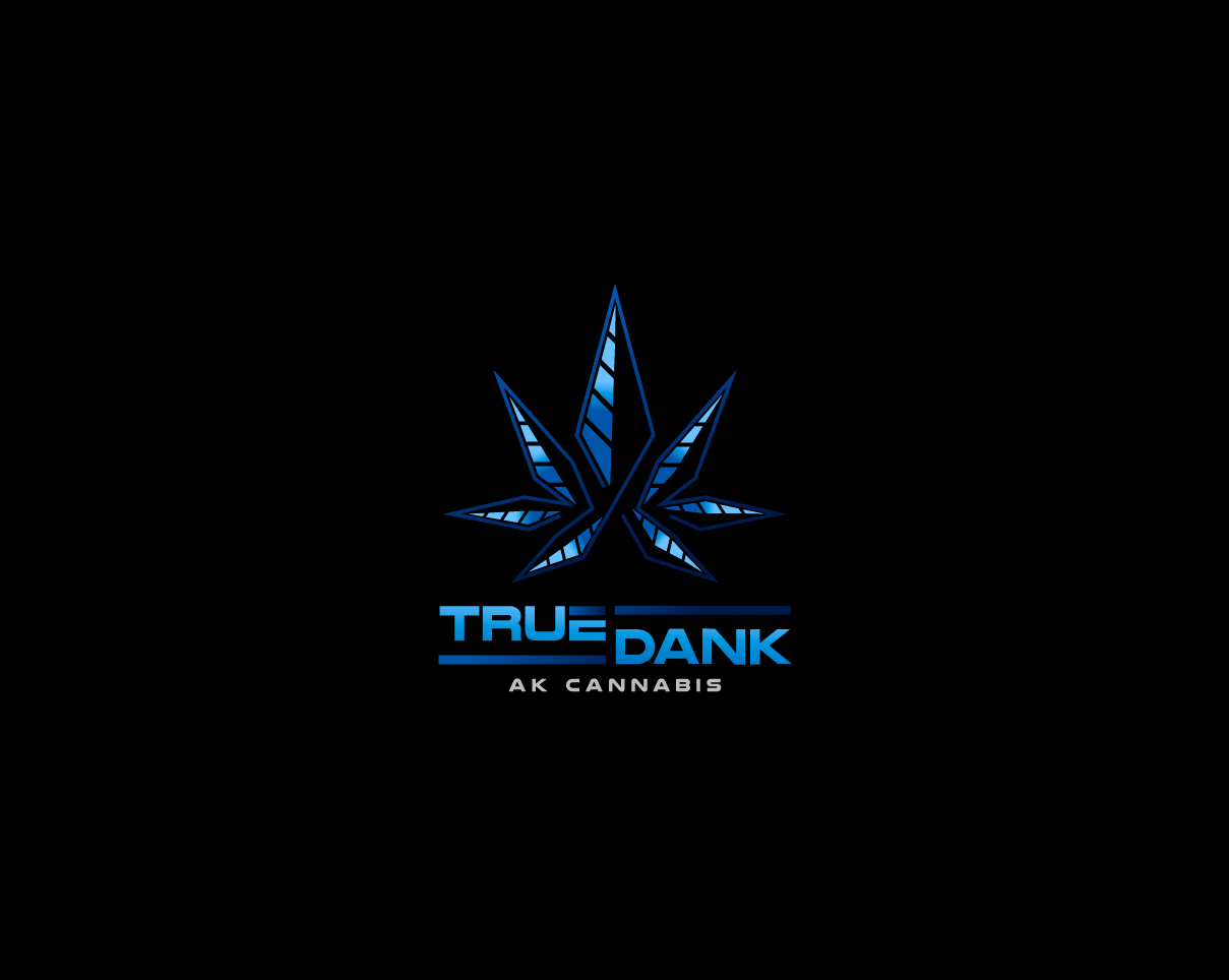
This customer received 275 logo designs from 102 designers. They chose this logo design from MrBranding as the winning design.
Join for free Find Design Jobs-
 US$300
-
 275 designs
-
 102 designers
Logo Design Brief
I need a logo to go on a sign on our building for my business. I have a marijuana retail business in Alaska.
I would like the name True Dank beneath a design that resembles a “seven leaf” marijuana leaf. The leaf should not have a lot of detail, I would like three long diamond “leaf” shapes on either side, with one bigger diamond like shape in the center (total of seven leaf marijuana symbol). I am picturing the outline of the leaf being grey, and the full for each leaf split in the center lengthwise, one half black, the other half two separate shades of ice blue.
Think of a symbol where a cannabis business was trying to emulate the symbol an oil company would use. We are an Alaskan business, we want to embody energy, the frozen north, and sleek professionalism in our logo.
Target Market(s)
Professionals in their 30s and 40s
Industry/Entity Type
Business
Logo Text
True Dank
Logo styles of interest
Pictorial/Combination Logo
A real-world object (optional text)
Font styles to use
Other font styles liked:
- Capital letters, slightly rounded
Colors
Colors selected by the customer to be used in the logo design:
Look and feel
Each slider illustrates characteristics of the customer's brand and the style your logo design should communicate.
Elegant
Bold
Playful
Serious
Traditional
Modern
Personable
Professional
Feminine
Masculine
Colorful
Conservative
Economical
Upmarket
Requirements
Must have
- The name True Dank and a sleek and professional image of a pot leaf.
Nice to have
- I am also toying with the idea of having AK Cannabis on the logo in addition to our name True Dank. All written text should be in capital, with the first letter a bigger capital letter than the subsequent letters in the word. For font I like something letters slightly rounded.
- For the True Dank title, I would like True to be above Dank with ice blue lines next to them, similar to the image attached. For AK Cannabis, it can be all on the same line.
- The grey outline might also look good in green. Again, think energy company or oil company meets Cannabis company.
- The background behind the emblem and name may be black or dark blue.
Should not have
- No real can’t haves, be creative! For the marijuana leaf I am not interested in a ton of leaf detail.