My Vitality Physio Brand design
Want to win a job like this?
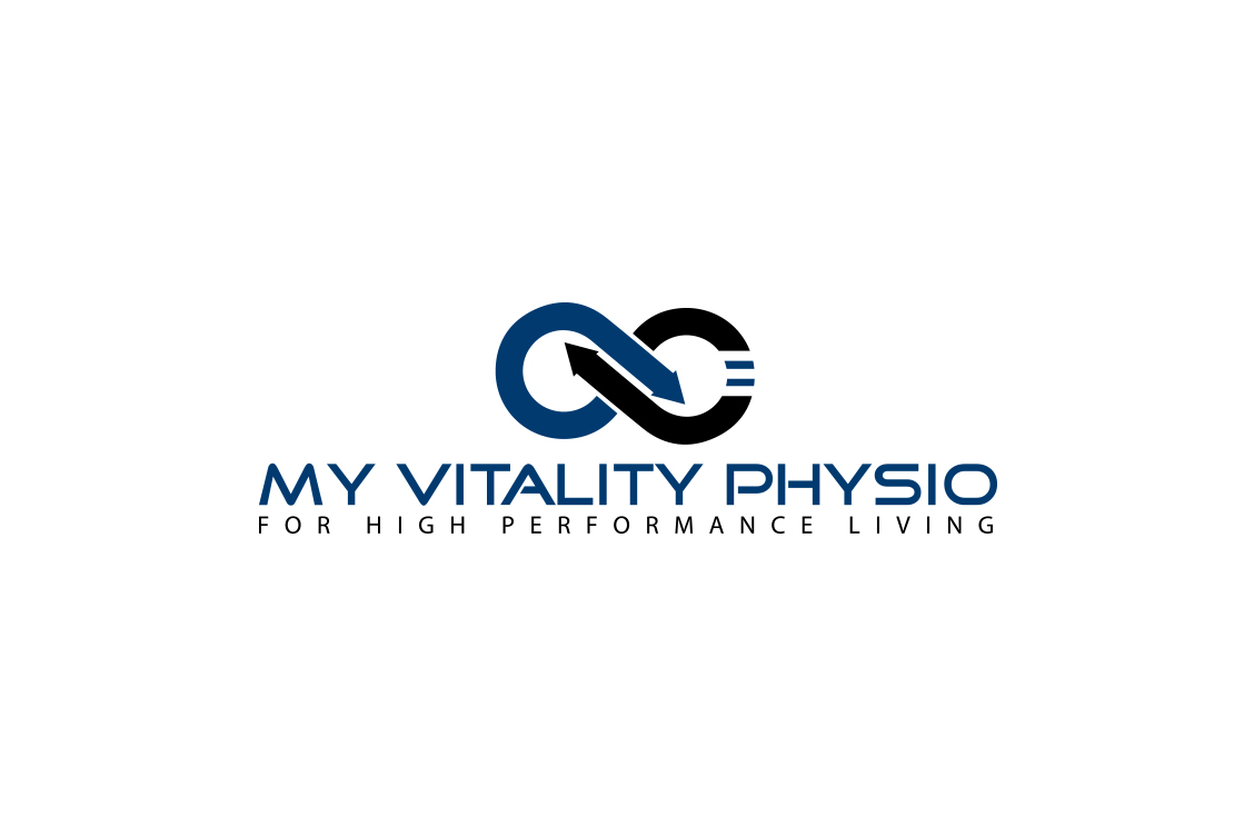
This customer received 172 logo designs from 50 designers. They chose this logo design from tinuqazI as the winning design.
Join for free Find Design Jobs- Guaranteed
-
 A$150
A$150
-
 172 designs
-
 50 designers
Logo Design Brief
I need a modern stylish logo design for a start up Physiotherapy and allied health rehabilitation, and performance training centre. The clinic will have treatment rooms and a well equipped gym for rehabilitation, functional strengthening, sports and work specific strength and conditioning.
The logo needs to suitable for internal and external signage, as well as for business cards, stationary and merchandise. Because there will be a range of different types of professionals working the original name of My Vitality Physio does not cover it all. So I was thinking of using the abbreviation MVP+. To indicate it is My Vitality Physio + all the extra services we have. I am open to suggestion on that front. Kind Regards, Damon
Target Market(s)
People from primary school age to the elderly who need help to reduce and overcome pain, and/or to improve functional strength and conditioning. To recover from injury, prevent or reduce recurrences, and/or to maximise their physical potential for work, sport or life in general. Elite athletes, weekend warriors, non athletes all welcome.
Industry/Entity Type
Physical Therapy
Logo Text
MVP+, My Vitality Physio+, then considering a strap line
Logo styles of interest
Emblem Logo
Logo enclosed in a shape
Wordmark Logo
Word or name based logo (text only)
Lettermark Logo
Acronym or letter based logo (text only)
Font styles to use
Colors
Designer to choose colors to be used in the design.
Look and feel
Each slider illustrates characteristics of the customer's brand and the style your logo design should communicate.
Elegant
Bold
Playful
Serious
Traditional
Modern
Personable
Professional
Feminine
Masculine
Colorful
Conservative
Economical
Upmarket
Requirements
Must have
- We have chosen blue as our main feature wall and would like this colour or colour range in the logo. The feature wall at the front desk is shown in the word document attached. I like blues, aquas, black, white, grey/Silver. We want the logo to look cool and modern enough to have on clothing and merchandise as well as the usual internal and external signs and stationary etc. The logo needs to have feeling of energy and movement.
Nice to have
- I like the idea of the infinity symbol as part of the logo to signify the infinite human potential for improvement.
Should not have
- Any stylised symbol of a person. That has been done to death in the health industry!