Redesign of physical therapy company logo
Want to win a job like this?
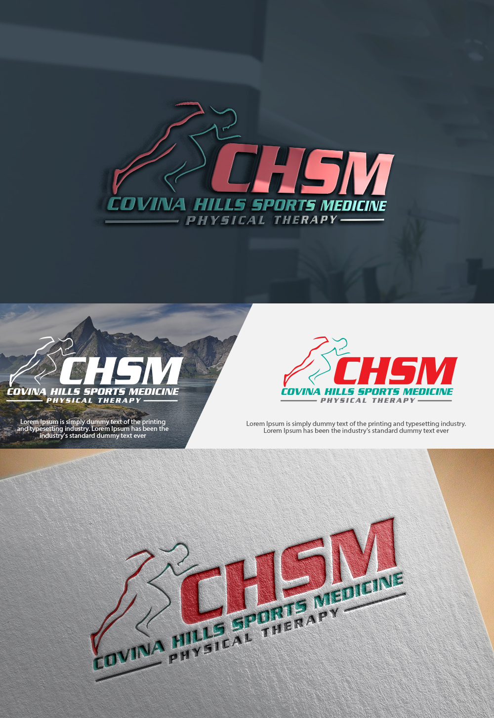
This customer received 215 logo designs from 66 designers. They chose this logo design from :) as the winning design.
Join for free Find Design Jobs-
 US$150
-
 215 designs
-
 66 designers
Logo Design Brief
logo for a physical therapy company called Covina Hills Sports Medicine, something sporty/ movement based/ modern/ athletic
Our current color scheme is based around Navy Blue but we are open to other options
Currently we use our company initials with athlete silhouettes but we are looking to re-vamp our look to reflect our increasing use of movement and biomechanical assessment in medical management. We want to attract athletes (both high level and recreational) as well as preserve our identification as a regional physical therapy provider.
Target Market(s)
Athletes, recreational athletes, sports teams, competitive culture, triathlon, everyday population seeking physical therapy
Industry/Entity Type
Physical Therapy
Logo Text
We are open to incorporating "physical therapy," our initials (CHSM), our name Covina Hills Sports Medicine
Logo styles of interest
Pictorial/Combination Logo
A real-world object (optional text)
Lettermark Logo
Acronym or letter based logo (text only)
Colors
Designer to choose colors to be used in the design.
Look and feel
Each slider illustrates characteristics of the customer's brand and the style your logo design should communicate.
Elegant
Bold
Playful
Serious
Traditional
Modern
Personable
Professional
Feminine
Masculine
Colorful
Conservative
Economical
Upmarket
Requirements
Must have
- Company identifier- show our initials and name, represent movement/ biomechanics, be professional
Nice to have
- We are open to anything having to do with body, biomechanics, movement, sports
Should not have
- We don't have any "should not haves"