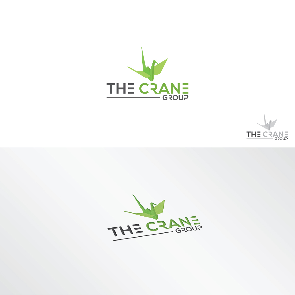
The Crane Group
Winner
Want to win a job like this?
This customer received 173 logo designs from 59 designers. They chose this logo design from 3Guys as the winning design.
Join for free Find Design Jobs-
 US$150
-
 173 designs
-
 59 designers
Logo Design Brief
Name change from Arynne Crane to The Crane Group. I've attached images of the old designs for some guidance, but ultimately we want to maintain the green crane, however create a more sleek and fresh logo overall. We are open to changing the font to more closely resemble the image i've uploaded for DCRE. Please see website for additional research: http://arynnecrane.com
Target Market(s)
We are a group of real estate agents in the fast paced urban city of Washington DC
Industry/Entity Type
Real Estate Agent
Logo Text
The Crane Group
Colors
Colors selected by the customer to be used in the logo design:
abd036
Look and feel
Each slider illustrates characteristics of the customer's brand and the style your logo design should communicate.
Elegant
Bold
Playful
Serious
Traditional
Modern
Personable
Professional
Feminine
Masculine
Colorful
Conservative
Economical
Upmarket
Requirements
Must have
- The origami crane is important. It represents innovation, making a flat piece of paper into a 3-d object.
Should not have
- No actual construction cranes please.
Files
Download all files - 0.2 MBPNG
Screen Shot 2017-09-22 at 12.02.52 PM Monday, 25 September 2017 14:10:30
Monday, September 25, 2017
PNG
Screen Shot 2017-09-21 at 1.16.39 PM Monday, 25 September 2017 14:10:30
Monday, September 25, 2017
JPG
logo thumbnail Monday, 25 September 2017 14:10:30
Monday, September 25, 2017
JPG
New Logo 1 Monday, 25 September 2017 14:10:30
Monday, September 25, 2017
JPG
New Logo 2 Monday, 25 September 2017 14:10:30
Monday, September 25, 2017
JPG
Arynne_300x250 Wednesday, 27 September 2017 03:08:15
Wednesday, September 27, 2017
Payments
1st place
US$150