Gnarbot a progressive fusion band needs a logo design
Want to win a job like this?
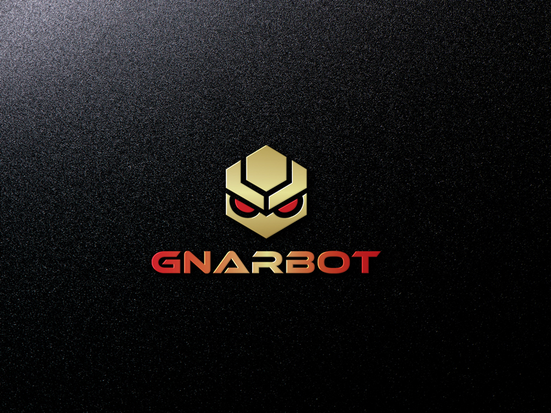
This customer received 97 logo designs from 26 designers. They chose this logo design from JoyAhmad as the winning design.
Join for free Find Design Jobs- Guaranteed
-
 US$150
-
 97 designs
-
 26 designers
Logo Design Brief
We need a new logo design to put on our merch, poster designs, social media and video water mark. We're a band with many influences but we focus on making progressive music that is light hearted, groove heavy and musically challenging with a deep sense of melody. The logo design we want is a robot/sprite face with a "G" on it or a G being the robot face itself would also be interesting (open to having a full robot illustration but may be harder to scale). Looking for a bit of psychedelic anime flare to it and a serious demeanor. Not particular about profile or full face. We want the logo to be the beginning of our branding therefore we really need it to be scalable and digitally malleable. This is why a monochromatic design may be the best option for the time being.
I've included some illustrations from the artist Rodger Binyone who most accurately approximates what we want for our first Album cover just so there's a point of reference to the art style we generally like. The other illustrations are just rough examples of what we want our logo to look like.
***LISTEN to the music we make and let it guide your creation: https://www.youtube.com/watch?v=pTcRZXSYsG4
Industry/Entity Type
Progressive
Logo Text
Gnarbot
Logo styles of interest
Pictorial/Combination Logo
A real-world object (optional text)
Character Logo
Logo with illustration or character
Font styles to use
Colors
Designer to choose colors to be used in the design.
Look and feel
Each slider illustrates characteristics of the customer's brand and the style your logo design should communicate.
Elegant
Bold
Playful
Serious
Traditional
Modern
Personable
Professional
Feminine
Masculine
Colorful
Conservative
Economical
Upmarket
Requirements
Must have
- Anime robot feel. Strong font.
Nice to have
- If the actual logo can double as a "G" to begin the word "Gnarbot" with that's a plus. That way it doesn't have to be a logo with Gnarbot at the bottom.