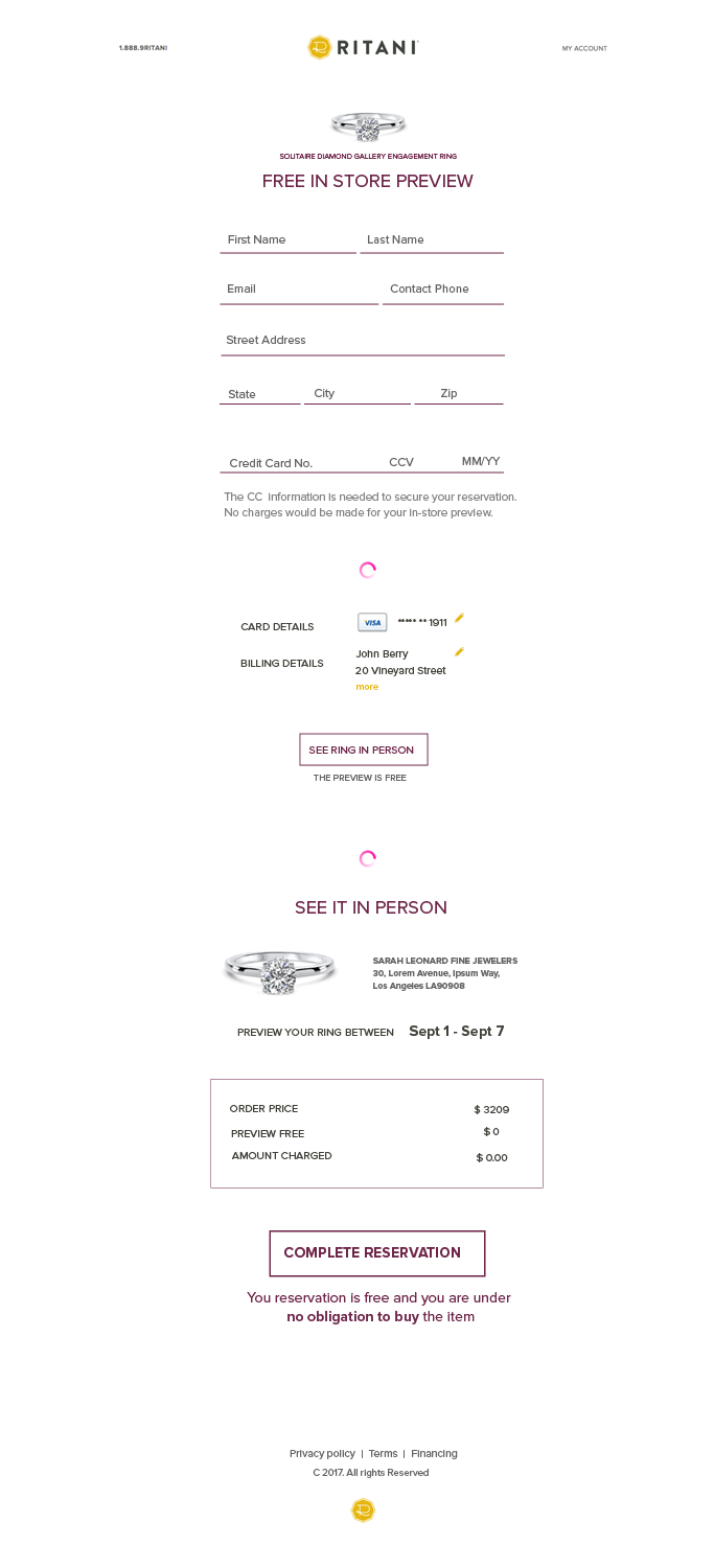
Wireframes of In Store Preview

Want to win a job like this?
This customer received 30 web designs from 5 designers. They chose this web design from Ogamedia as the winning design.
Join for free Find Design Jobs- Guaranteed
Web Design Brief
We need to simplify our in store preview capability. For this particular project what I really need are wireframes for the in store preview form, which is currently several pages - but needs to be condensed. The current Free In-Store Preview process is divided over five pages and is closely tied to the process of purchasing a product. This project simplifies the process and highlights the “no obligation to buy” value proposition of the feature.
Objectives
Simplify the Free In Store Preview (FISP) reservation process. We believe that reducing the number of pages required to complete the reservation process will reduce abandonment. Currently there is a 80+% drop off between the FISP - Edit page and the FISP - Review page. Some of this is to be expected, but we feel that if we can do the following that we can reduce some of that drop-off:
1. highlight the “no obligation to buy” and “see it in person” aspects of FISP
2. Remove the Synchrony Financing option from the payment method form - the CC is only needed to secure the reservation, so having this option here implies that this method is the final form of payment. During the final purchase the customer can choose to use Financing instead.
3. Remove selection of Protection Plan, deferring that to the post-reservation sale, which can provide a better hands-on, concierge experience.
4. reduce the steps from 5 steps to 2.
Here is the current flow:
1. Click Free In Store Preview on the PDP
2. A pop-up displays with the ring size and insurance option - the customer has to choose to preview it again 😔 Edit, Review and then Thank you) to 2 steps (edit/review and then thank you)
3. the form is displayed with the store location and credit card information
4. the review page is displayed on which the customer needs to finalize
5. the thank you page displays
Here is the new flow I’d like to get wireframes for:
* Click Free In Store Preview on the PDP (I don’t need a wireframe for this)
* the form is displayed with the store location and credit card form - once the customer enters their information they can finalize the reservation
* the thank you page displays
I’ve included screenshots of the current flow here. Also - FYI - as an example, I think Warby Parker does a good job of communicating that their Home Try On option is free even though they do require a credit card authorization to complete the transaction. Also, their core user base is Millenial - just like ours. (I know, you wouldn't know it from our current website! :-) Anyway - I like their cleaner more tech saavy form behavior. So, don't be shy about moving away from the overcrowded multi-step form pages we have now.
Lastly - if you want to try the flow yourself - you can follow these steps:
1. Click here: https://www.ritani.com/engagement-rings/solitaire-diamond-gallery-engagement-ring-in-14kt-white-gold/19815
2. On the setting PDP page here - click the CHOOSE THIS RING button.
3. That will take you to the diamond inventory where you need to select a diamond. Choose any diamond and “add it to your engagement ring” - this will take you to the configured ring PDP
4. Click the FREE IN STORE PREVIEW option on the configured ring PDP - a pop up will display
5. On the pop up, select the ring size (I know, I know - even if you selected one before you’ll need to select it again, this is a bug) and then click the PREVIEW THIS RING button. This will take you to the Free-in-store preview page form.
6. On the free in store preview page, enter a credit card payment method and hit the CONTINUE button. I promise - your card will NOT be charged if you hit this button. This will take you to the Review page.
7. On the Review Page you should STOP. PLEASE DO NOT PROCEED PAST THIS POINT. Please refer to the comp for the thank you page.
Thanks!
Updates
Project Deadline Extended
Reason: extending to give some designers additional time to provide submissions
Added Friday, August 25, 2017
Target Market(s)
Millenial Engagement Ring Shoppers
Industry/Entity Type
Store
Number of Pages Required
2 page
Look and feel
Each slider illustrates characteristics of the customer's brand and the style your logo design should communicate.