Makeup for Men - Logo, Brand Platform
Want to win a job like this?
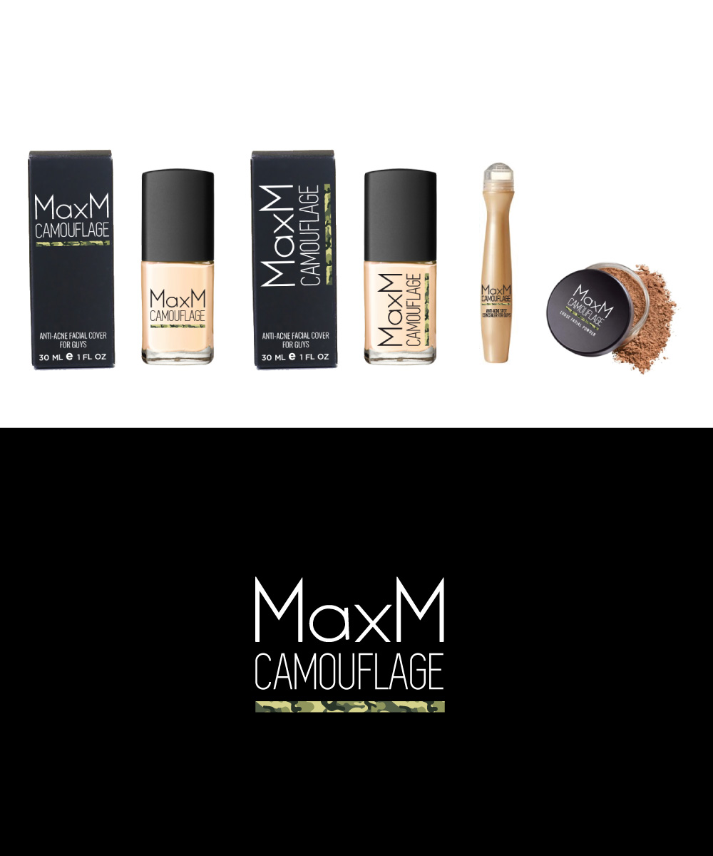
This customer received 191 logo designs from 49 designers. They chose this logo design from Sergio Coelho as the winning design.
Join for free Find Design Jobs- Guaranteed
-
 US$300
-
 191 designs
-
 49 designers
Logo Design Brief
We need an attention getting brand platform for "MaxM Camouflage", a makeup brand for men. The execution we need will start with a logo and brand colors based on our intended brand personality and target consumer. An element of camouflage (see attachments) must be part of the design. For final selection, we need to see the brand platform executed across a few packaging options.
Brand Overview:
MaxM Camouflage is a makeup brand for men. It will offer anti acne and skin improving formulas for young men that double as makeup with the traditional covering benefits of women's makeup. The underlying idea is to make the target comfortable buying makeup through the anti-acne position, but many of the real benefits they seek will be traditional makeup-driven benefits. The challenge is coming up with a creative execution that ideally targets the primary demographic while also targeting ancillary demographics. The primary target is straight men 15-25 as that is where the widest market is. However, it is critical that the creative also appeal to:
1. gender neutral men
2. gay men
3. women
So it can't be cartoonishly manly (we're not going GI Joe) in appealing to straight men, but must appeal to that demographic in a way that is not exclusive to them. It must target them in a way that is at least very acceptable to groups 1 and 2 and not prohibitive to group 3. We want to graphic execution to unmistakably look like camouflage, but do it with some element of subtlety and even beauty.
Target demographic:
1. Straight men 15 to 25. Typical teenagers and young adults who have concerns about acne and skin quality but also want the benefits of covering makeup without the stigma of buying currently available womens' products.
2. Gender neutral and gay men 15-25 who aren't are not so inhibited by wearing women's products but want a product that is cool, trendy and effective.
3. Women who are trend setters and are attracted to a great cosmetic product that is cool through its gender bending male positioning.
Creative direction:
The name MaxM Camouflage should be highlighted in the logo, and the execution MUST demand attention on-shelf. Camouflage references military clothing used to help combatants meld invisibly into surroundings so its a good male-oriented term for what this product line is intended to do.
1. The creative execution should use camouflage patterns or camouflage inspired patterns to some degree. If someone can come up with something better we are open to it, but we think using the patterns at some level helps bring the story together.
2. As we want to be a semi-premium line we must be careful how heavy we go with the camouflage in the execution as if its too strong it may downscale the line. Still, we leave it up to designers to come up with the ideas they see best and we can work together to refine them.
3. "MaxM" should appear above or to the left of "Camouflage" with "Camouflage" being the more dominant element.
4. There should be a fair amount of clean space remaining, especially on the box artwork, for the insertion of pacakge copy that is still to be created.
Brand core:
We have encapsulated the brand personality into three core words/phrases which should be interpreted in the logo, colors, packaging and any consumer communications that the brand does:
1. Male-oriented
2. Cool/stylish
3. Premium quality cosmetics or upscale
Creative requirements for final selection:
1. Logo
2. Color scheme
and execution of logo and color scheme across the following packaging types (please see attachments for format) to make sure it works practically:
1. Tube packaging
2. Bottle packaging
3. Jar packaging
4. Compact packaging
5. Rectangular exterior box
6. Square exterior box
We welcome all ideas. It could be colors that make the brand pop at retail or it could be an interesting or aggressive use of package copy. There is so much sameness in this category, we are looking for as many points of difference and points of inspiration as possible.
Target Market(s)
Men 15-25
Industry/Entity Type
Cosmetics
Logo Text
MaxM Camouflage
Logo styles of interest
Emblem Logo
Logo enclosed in a shape
Pictorial/Combination Logo
A real-world object (optional text)
Wordmark Logo
Word or name based logo (text only)
Colors
Designer to choose colors to be used in the design.
Look and feel
Each slider illustrates characteristics of the customer's brand and the style your logo design should communicate.
Elegant
Bold
Playful
Serious
Traditional
Modern
Personable
Professional
Feminine
Masculine
Colorful
Conservative
Economical
Upmarket
Requirements
Must have
- Some use of the attached camouflage pattern. It could be in different colors that the traditional camouflage green, and it could even be a subtle accent, but it must be there in some way. As an FYI, blue tests as mens' favorite color so a blue camouflage patterm could be interesting.
Nice to have
- The logo applied to one or more of the attached packaging types. It might be easiest to start with the box.