Operative 59 Brewing Company (small boutique brewing company)
Want to win a job like this?
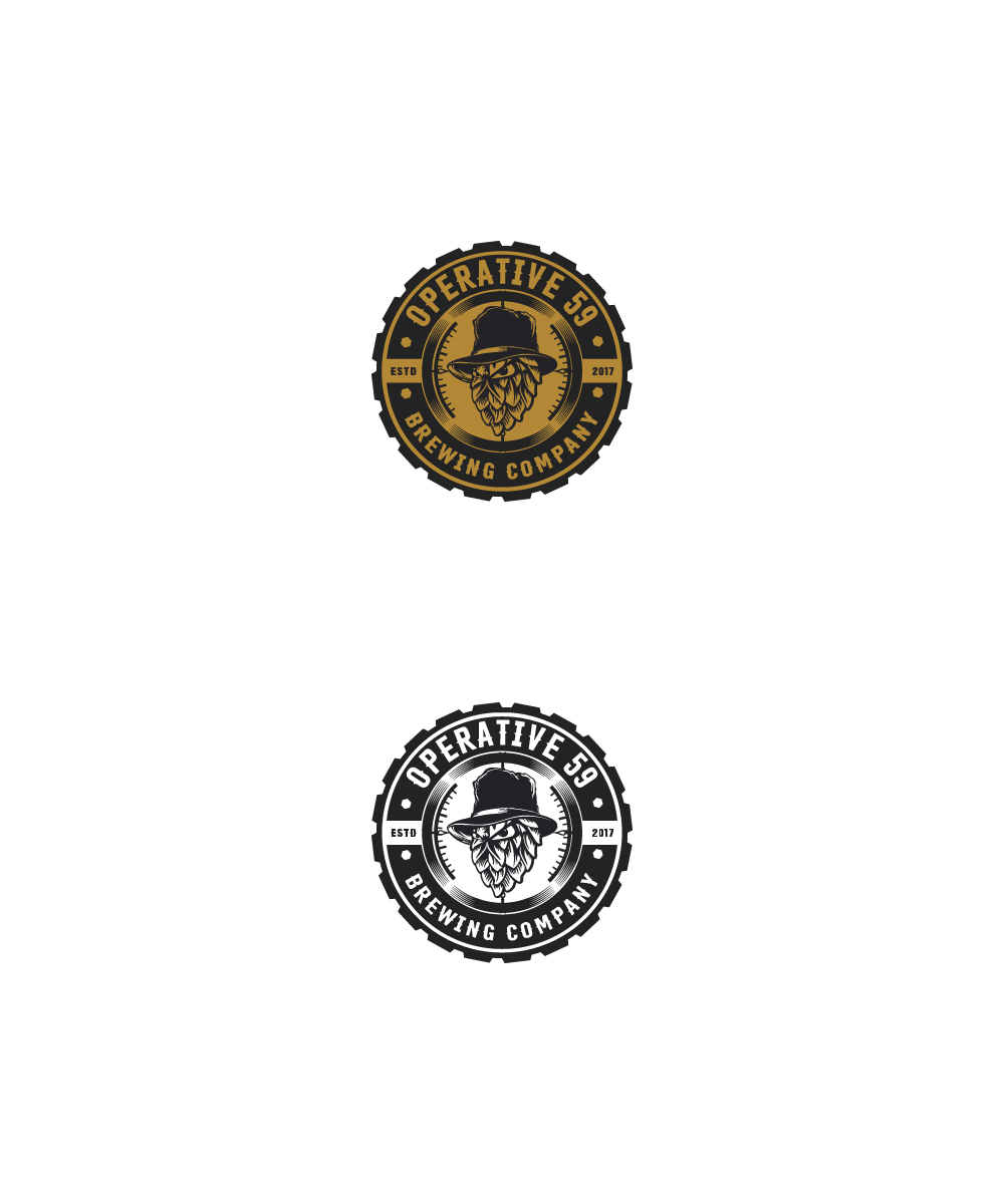
This customer received 99 logo designs from 33 designers. They chose this logo design from ART DEPOT as the winning design.
Join for free Find Design Jobs- Guaranteed
-
 A$250
A$250
-
 99 designs
-
 33 designers
Logo Design Brief
I want a catchy modern logo for my small brewing company. Operative 59 is a derivative from covert technical intelligence, so I would like the logo to maintain that theme, you know spook etc. it needs to look great on merchandise, stickers and kegs (so open to being stencilled). The logo should be specific, however, there should also be a second logo for the first brew 'Sub Rosa Ale'. Technical Intelligence is amongst many other things covertly installing Listening devices, cameras, tracking devices etc
Target Market(s)
Anyone who likes beer, no need to let you know it is a saturated market, so this logo really needs to stand out and be eye catching, making the great taste is up to me to make great.
Industry/Entity Type
Brewery
Logo Text
Operative 59 Brewing Company (or Co) And Operative 59 Brewing Company Sub Rosa Ale
Logo styles of interest
Emblem Logo
Logo enclosed in a shape
Pictorial/Combination Logo
A real-world object (optional text)
Abstract Logo
Conceptual / symbolic (optional text)
Character Logo
Logo with illustration or character
Font styles to use
Colors
Designer to choose colors to be used in the design.
Look and feel
Each slider illustrates characteristics of the customer's brand and the style your logo design should communicate.
Elegant
Bold
Playful
Serious
Traditional
Modern
Personable
Professional
Feminine
Masculine
Colorful
Conservative
Economical
Upmarket
Requirements
Must have
- Ability to be stencilled, look great, eye catching, but not overly complicated. Something people would but the t shirt because of the logo, not necessarily the beer. Masculine, chunky, bold, a little bit of secretiveness, insignia (ish) if possible. Company can be abbreviated if it suits the logo. The beer name 'sub rosa ale' could be designed to look like a 'secret' ink stamp and placed.across the bottom corner of the logo, this logo stamp must be used changeable so I can change the name of the beer for each brew. This is a late edition, however, there will need to be a hop which will have the 'no fear' style eyes and the wording 'Reap what is sown' under it.
Nice to have
- Not sure yet, but great design is a must.. Must be catchy, dark humour maybe? Ironic?
Should not have
- Must not be child like. It is a brewery not a funeral home.