Health Food Company Needs Label Revamp of Green Drink
Want to win a job like this?
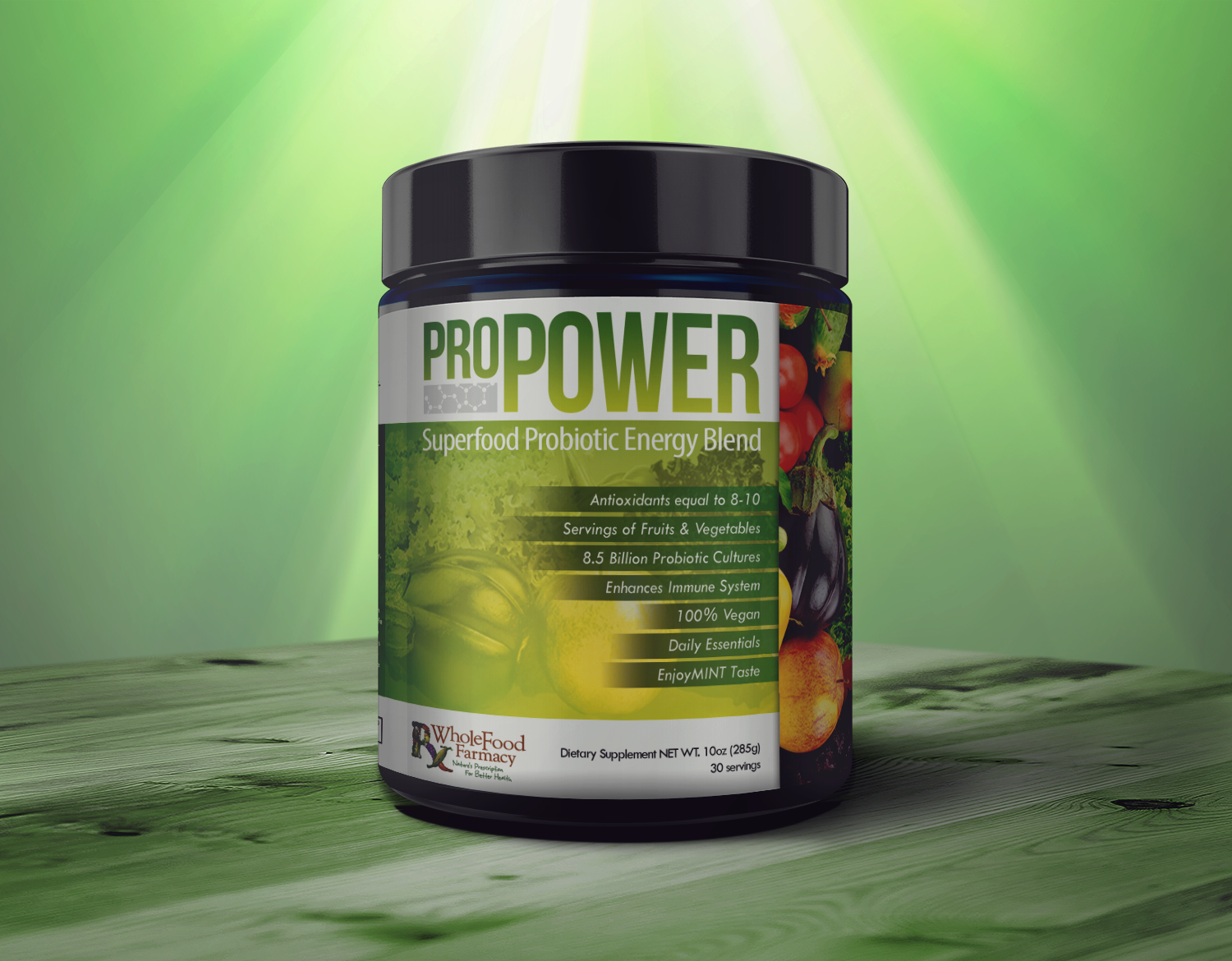
This customer received 27 packaging designs from 10 designers. They chose this packaging design from jaycobbb as the winning design.
Join for free Find Design Jobs-
 US$150
-
 27 designs
-
 10 designers
Packaging Design Brief
Key Fact
Pro Power has been a trusted product for many for a long time. We are now updating the label to give it an updated, fresh, professional look that better communicates the key benefits. We also want the new label to entice customers to try it if they haven't already.
Target Market (Who are they/what are their current beliefs?)
Current customers who have been buying the product - we are looking for a more professional, updated look. However, we don't want them to think the product has changed. Same great product, just different look!
Also, people currently buying green drinks from retail stores. The new label needs to give potential customers the benefits of the product, entice them visually, and instill confidence for them to try it.
What Does The Brand Stand For?
WholeFood Farmacy's Pro Power stands for quality, healthy ingredients, a brand you can trust.
Competition
Health food stores (retail and online) selling green drinks that have a lot of unhealthy ingredients. Plus, they are a lot more expensive.
Problem the Communications Must Solve
The current customer base should feel confident that the product hasn't changed, just the label.
Communication Objective
We want the audience to see the connection between highly nutritious green drink and how they feel and perform throughout the day.
What Single Benefit Should the Communication promise?
If you put bad fuel in your body, you get poor performance - good fuel in and you get more energy and a healthy body and mind.
Why Should the Target Market Believe the Promise?
The ingredient listing says it all...pure ingredients.
Other Considerations
The picture will be key to the selling of this product, but the following key attributes are also very important and worth noting/calling-out: 8.5 billion probiotic cultures, antioxidants equal 8-10 servings of fruit and vegetables, 100% vegan, enhances immune system, no preservatives, no artificial ingredients, Fresh mint taste.
Label Size
Label dimension need to be 11X4.25 as label dimensions. Label will be applied to a canister like those shown in the photo.
Uploaded Files
We have uploaded several photo's. We would like a fresh clean design to have the same feel as the photo's. We have included a pdf file of our current logo, while we want to go a new direction with the design, a lot of the text on the current label will need to be on the new label. Also, the label text fields must be easily updated should revisions be needed. We are going to drop the word Farmacy from the label, so the product name should be called "Pro Power". Product container will have white container with green lid.
Target Market(s)
Target Market (Who are they/what are their current beliefs?)
Current customers who have been buying the product - we are looking for a more professional, updated look. However, we don't want them to think the product has changed. Same great product, just different look!
Industry/Entity Type
It Company
Colors
Colors selected by the customer to be used in the logo design:
Look and feel
Each slider illustrates characteristics of the customer's brand and the style your logo design should communicate.
Elegant
Bold
Playful
Serious
Traditional
Modern
Personable
Professional
Feminine
Masculine
Colorful
Conservative
Economical
Upmarket
Requirements
Must have
- See product description above. It should have the text from the previous label, however, their layout does not have t be the same.
Nice to have
- Fresh new look.
Should not have
- Images from previous label design.