Weight Training Blog Needs a Logo Design
Want to win a job like this?
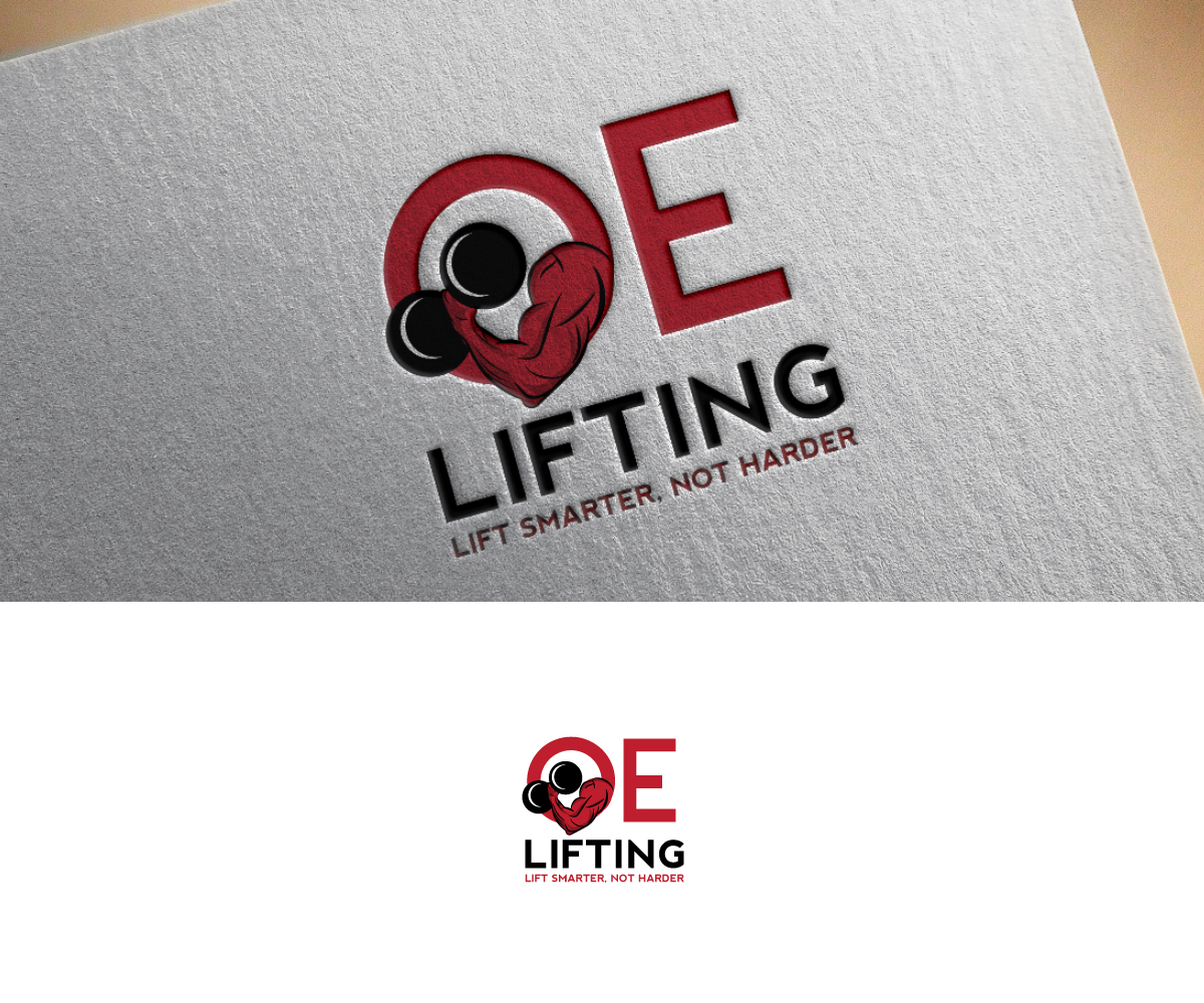
This customer received 9 logo designs from 4 designers. They chose this logo design from Anekaa as the winning design.
Join for free Find Design Jobs- Guaranteed
-
 US$150
-
 9 designs
-
 4 designers
Logo Design Brief
Need a logo for oelifting.com which is short for officially efficient lifting. oelifting is a health and fitness brand centered around providing information on how to lift with better form and use better methodologies to increase the efficiency of people's workouts. The company slogan is "Lift Smarter, not Harder." The focus is primarily on weight training, but also includes nutrition, supplementation, and other forms of workout. The initial site will be just a blog, but its important that we have an attractive logo as information products are in the works and depending on demand, apparel, equipment, and supplements may be produced and sold.
Target Market(s)
student athletes, serious weight lifters, aspiring weight lifters
Industry/Entity Type
Fitness
Logo Text
oelifting or officially efficient lifting and lift smarter, not harder (optional)
Logo styles of interest
Pictorial/Combination Logo
A real-world object (optional text)
Abstract Logo
Conceptual / symbolic (optional text)
Font styles to use
Colors
Designer to choose colors to be used in the design.
Look and feel
Each slider illustrates characteristics of the customer's brand and the style your logo design should communicate.