Bikes Mean Business - Two sided invitation to encourage bike friendly businesses
Want to win a job like this?
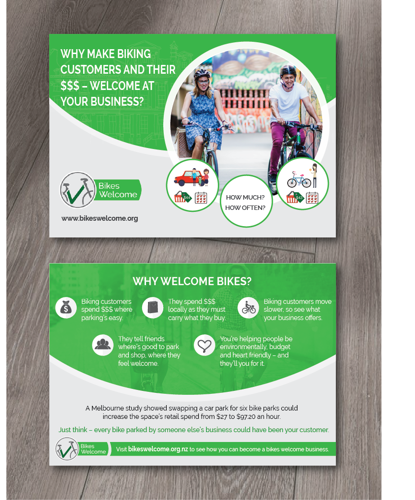
This customer received 63 flyer designs from 12 designers. They chose this flyer design from alex989 as the winning design.
Join for free Find Design Jobs- Guaranteed
-
 NZ$140
-
 63 designs
-
 12 designers
Flyer Design Brief
Bikes Welcome is a charitable trust who want to grow everyday bike use. One way to do that is help businesses understand that 'Bikes Mean Business'. We want a postcard sized 'invitation' that bike users can give to their favourite businesses, inviting them to find out more about all the benefits of attracting bike users to their business and becoming a 'Bikes Welcome Business'. We are currently finalising copy, so the attached is indicative but not final copy. The docx file is the words, the png is indicative of the type of infographic we might want to feature.
I'm also attaching a mock up of our window sticker for businesses, and some social shares featuring photographic images which we have available to use. This will give you an idea of our branding to date. Our extended branding concept (which we will use when we re-do our website) is based on icons, so I'm open to seeing icon focused designs also.
The feel needs to be inviting, credible, enticing, business like, noticeable, with a strong call to action.
Target Market(s)
Small business operators: retail, cafes, etc; also managers of larger chains such as supermarkets, gyms, etc.
Industry/Entity Type
Non Profit
Font styles to use
Other font styles liked:
- Logo is done in Raleway, so need compatible font.
Colors
Colors selected by the customer to be used in the logo design:
Look and feel
Each slider illustrates characteristics of the customer's brand and the style your logo design should communicate.
Elegant
Bold
Playful
Serious
Traditional
Modern
Personable
Professional
Feminine
Masculine
Colorful
Conservative
Economical
Upmarket
Requirements
Must have
- Two Sides
- Use the copy provided
- Strong call to action - visiting website
- Use our colours
- A6 sized cards
Nice to have
- Compelling images and/or infographic
- Consistency with circles / curves used in other branding.
Should not have
- Not bland, not something that will get lost on the recipients desk or counter.