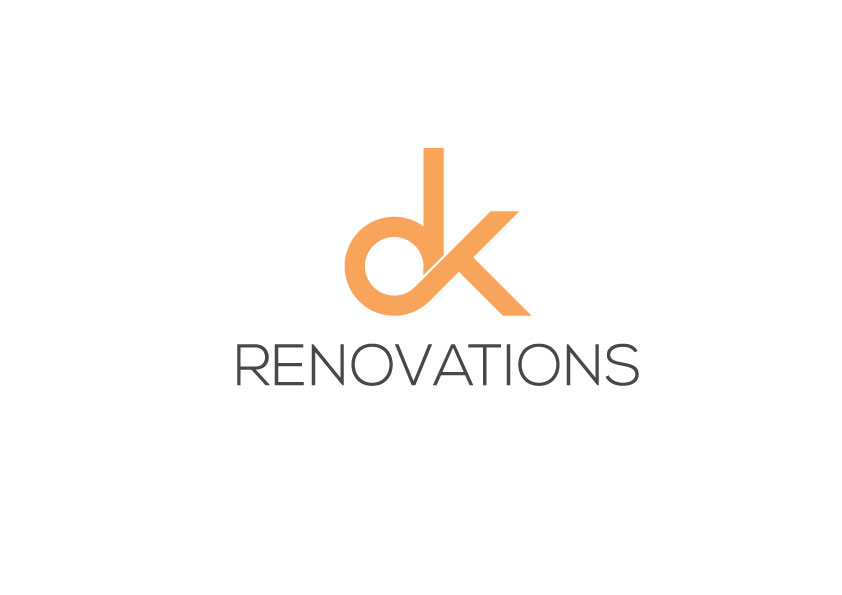
DK renovations logo project. Simple bold design which emphasizes 'DK' 2 simple colors as selected
Want to win a job like this?
This customer received 438 logo designs from 150 designers. They chose this logo design from A Desiner 1992 as the winning design.
Join for free Find Design Jobs-
 A$300
A$300
-
 438 designs
-
 150 designers
Logo Design Brief
After a simple design with only the words/letters (no hammers, roofs ect. ) 'DK' needs to be bold and plain, maybe in a square or circle. 'renovations' to be more subtle. I have a current website Addbuilt.com.au, I would like DK in the orange colour and also incorporate the grey in the logo. I have attached a couple of photos from other businesses to give a better idea of what I am after. We specialize in high end bathroom, laundry and kitchen renovations.
Target Market(s)
Home owners, we specialize in bathroom, laundry and kitchen renovations.
Industry/Entity Type
Construction
Logo Text
DK renovations
Logo styles of interest
Lettermark Logo
Acronym or letter based logo (text only)
Font styles to use
Colors
Colors selected by the customer to be used in the logo design:
Look and feel
Each slider illustrates characteristics of the customer's brand and the style your logo design should communicate.
Elegant
Bold
Playful
Serious
Traditional
Modern
Personable
Professional
Feminine
Masculine
Colorful
Conservative
Economical
Upmarket
Requirements
Must have
- I woluld like 'DK' to be in a surround, square or circle ect. I woluld like DK to be the main part of the logo and renovations to be along side it, smaller maybe lower case but not sure about that. If you look at Addbuilt.com.au, this is what I will be replacing with DK renovations. It will give a good idea what will fit.
Nice to have
- Good colour contrast
Should not have
- Cheesy relevant pictures relating to construction. Examples. Hammers, houses, roofs ect.