Cool Happenings "logo needed"
Want to win a job like this?
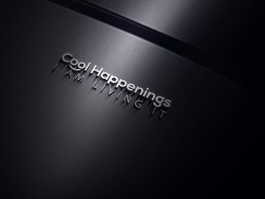
This customer received 81 logo designs from 16 designers. They chose this logo design from Belly Ballot as the winning design.
Join for free Find Design Jobs-
 US$150
-
 81 designs
-
 16 designers
Logo Design Brief
Based in Miami, I recently launched a IG account @CoolHappenings and will share (via Instagram and blog/website) everything "Cool that is happening" in the city from restaurants, bars, products, venues, curiosity, stores, clubs, spas, etc and events (concert, live music, art, sports, food, comedy, wellness) and anything else that is COOL and HAPPENING in the city! The goal is to connect COOL people with COOL places and to SHARE COOL experiences with each other.
* the name is very catchy and everybody loves it! I want the logo to have the same effect
* perhaps it would be good to use of text and symbol
* to be creative and smart
* creative and fun font (like Disney)
* it needs to look good on a small and bigger screen
* should be clear, crisp, clean, easily identifiable when printed in black/white or just one color
* colors of the logo should reflect as fun, creative, energetic, social, entertaining, strong, sophisticated cool, happy, life, gathering, people coming together in cool and happy places
Target Market(s)
male and female, residents and turist and anyone looking for cool places to go and share experience
Industry/Entity Type
Entertainment
Logo Text
I am living it! (slogan)
Logo styles of interest
Pictorial/Combination Logo
A real-world object (optional text)
Abstract Logo
Conceptual / symbolic (optional text)
Font styles to use
Other font styles liked:
- creative and fun font like ^Disney^
Look and feel
Each slider illustrates characteristics of the customer's brand and the style your logo design should communicate.
Elegant
Bold
Playful
Serious
Traditional
Modern
Personable
Professional
Feminine
Masculine
Colorful
Conservative
Economical
Upmarket
Requirements
Must have
- i would like to see the exactly design but on the gray color with the black background
Nice to have
- hello....sorry for the delay here.
- I just uploaded my idea of how i would like to make the "i AM LIVING IT" underneath the logo.
- I also would like to change it to only "LIVING IT" ....let me know your thoughts on making it right under the H as the example I sent you or another version you think it will look better
- i am also thinking if i should put a question mark or dot at the end of
- LIVING IT!
- LIVING IT.
- LIVING IT
- what are your thoughts?
- in terms of colors...the first one I liked is it gray? with a black background? how would that look on applications (business cards, website, hats, t-shit etc)
- can i have 2 or 3 color versions to apply according to the application at hand?
- Can I also have a version of the logo with just COOL HAPPENINGS and another with the SLOGAN? Nike and other brands, dont use their tagline all the time....being the reason I am asking
- thank you so much...I am looking forward to continue working with you on this and future projects. Best, Renata
Should not have
- dont want a boring or serious logo