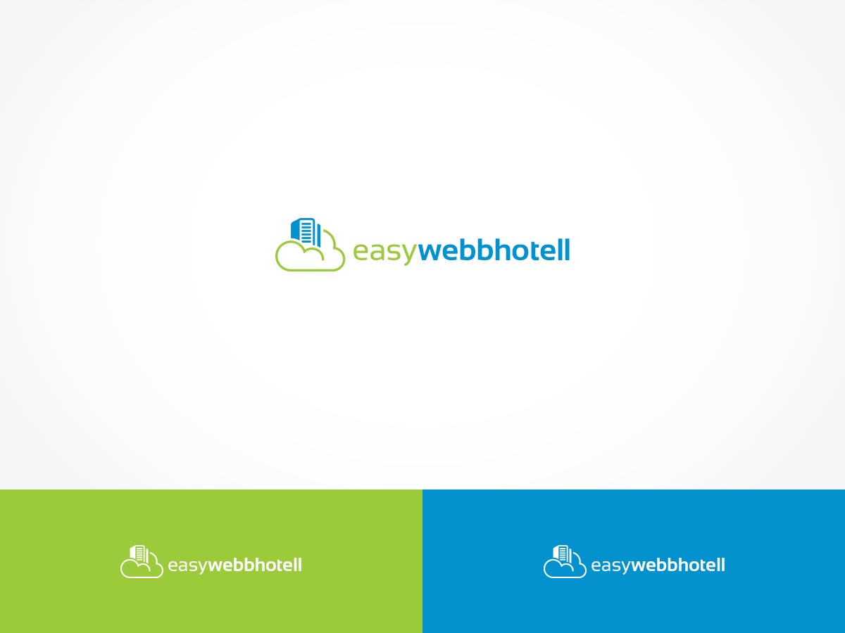
Web Hosting Provider In Need of New Brand & Logo

Want to win a job like this?
This customer received 233 logo designs from 63 designers. They chose this logo design from ArtTank as the winning design.
Join for free Find Design Jobs- Guaranteed
Logo Design Brief
Hello, designers!
I am working with a Swedish web hosting/web services company that is looking to redesign/brand their online image. Step 1 is to get them up-to-date with a fresh, modern logo. The company's name is "Easy Webbhotell".
The company has an overarching brand called "EasyCloud" and would like the logo to be somewhat of a template to use for their other brands. So the logo should make use of a "Cloud" icon in some way. I highly recommend looking at the attached example logos I have supplied so that you can see the general style my client needs.
The client would like a few different concepts to include knockout white, color, grayscale, etc. The color palette used for the design will be:
Blue: #2196F3 (Secondary)
Green: #8BC34A (Primary)
An assortment of grays (light to dark), however, those are the two primary colors to work with.
No particular font family, but something modern and looks professional. Keep technology-based site in mind when thinking of their logo.
Target Market(s)
This is a web hosting provider who targets customers seeking a hand-holding experience in setting up custom hosting solutions.
Industry/Entity Type
Information Technology
Logo Text
easywebbhotell
Logo styles of interest
Abstract Logo
Conceptual / symbolic (optional text)
Character Logo
Logo with illustration or character
Wordmark Logo
Word or name based logo (text only)
Font styles to use
Colors
Colors selected by the customer to be used in the logo design:
Look and feel
Each slider illustrates characteristics of the customer's brand and the style your logo design should communicate.
Elegant
Bold
Playful
Serious
Traditional
Modern
Personable
Professional
Feminine
Masculine
Colorful
Conservative
Economical
Upmarket
Requirements
Must have
- The logo must have an icon of some sort (cloud is highly recommended), the client actually likes outlined clouds. The colors provided in the description should be used and the text should be provided as is. Place the icon next to the text and that should be the general logo structure. Text should be lowercase!
- No particular font is specified, but something for easy reading, soft, yet professional and modern.
Should not have
- No serif fonts, no clip art (this should go without saying)
- Do not place the text underneath the logo, it should to the right of it!