Marketing Agency Logo Needs a Refresh and Update
Want to win a job like this?
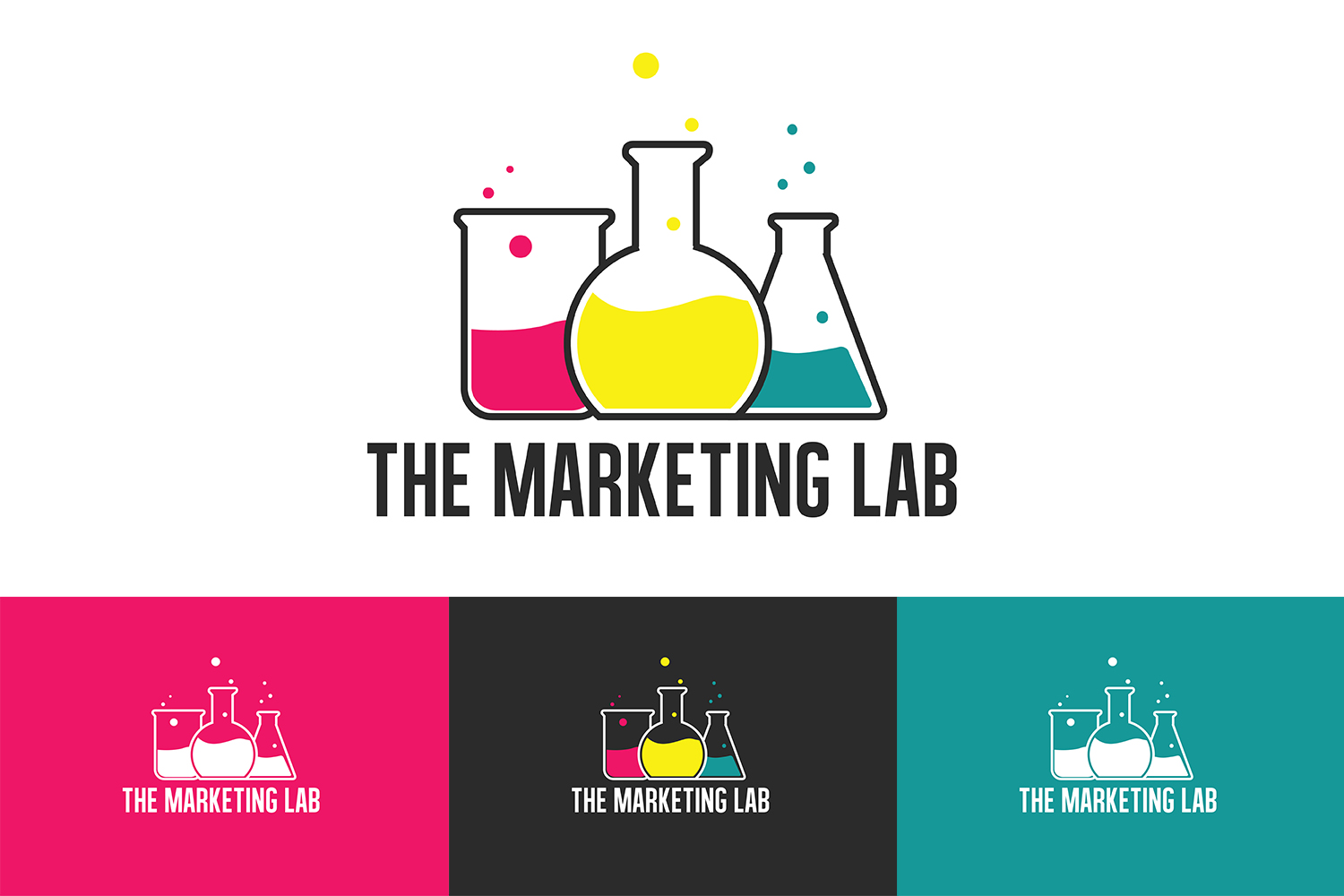
This customer received 79 logo designs from 36 designers. They chose this logo design from TurskisDesign as the winning design.
Join for free Find Design Jobs-
 A$150
A$150
-
 79 designs
-
 36 designers
Logo Design Brief
I have a logo that is a little dated and needs to be brought into line with current design trends and principals.
I am looking to also extend the variations - eg: stacked, horizontal, mono, inverted etc, and be able to use it with and without it's icons, depending on placement.
I love the colours (or at least close variations of them), and in my corporate ID, YELLOW is the lead corporate colour. I do however use the other colours to represent different sections of my business.
My thoughts are to have a predominantly text based logo for the business name allowing it to be stand alone if needed but also working with the icons. and have the icons (perhaps modernised) as a a version. Also, I think the tagline can be removed from the logo, but welcome suggestions.
Really looking for someone with a good idea to make this brand a 2017 and beyond representation of a great marketing agency.
Have included the .ai base files so you don't have to start from scratch. Have also included my current business card so you can see how it is used now with the yellow.
Thanks heaps - can't wait to see what you come up with!
Target Market(s)
Franchise, Multi-Site and Licensed businesses looking for marketing consulting and all of the elements that go with it (strategy, digital, design, copy, etc)
Industry/Entity Type
Marketing
Logo Text
The Marketing Lab
Logo styles of interest
Wordmark Logo
Word or name based logo (text only)
Font styles to use
Look and feel
Each slider illustrates characteristics of the customer's brand and the style your logo design should communicate.
Elegant
Bold
Playful
Serious
Traditional
Modern
Personable
Professional
Feminine
Masculine
Colorful
Conservative
Economical
Upmarket
Requirements
Must have
- The words THE MARKETING LAB
- An option with and without a test tube icon/s, but these should be interchangable
- Needs mono, reversed and stacked versions for all purposes.
Nice to have
- Keep the test tubes and beakers and these look great on a white background.
- Colours for inside the beakers are a good palette - would like to keep similar, bright type colours.
- I have attached a mock up of my future WP site which is what prompted the rebrand - I want that vector as my hero page and it is needs a solid white, clean logo without images to be placed centre.
- Doesn't need to have all of the beakers / test tubes, maybe just 1?
- Open to suggestions.