Layout for location based cityguide with social features
Want to win a job like this?
This customer received 55 web designs from 9 designers. They chose this web design from Teemu Hakala as the winning design.
Join for free Find Design Jobs- Guaranteed
-
 US$1800
-
 55 designs
-
 9 designers
Web Design Brief
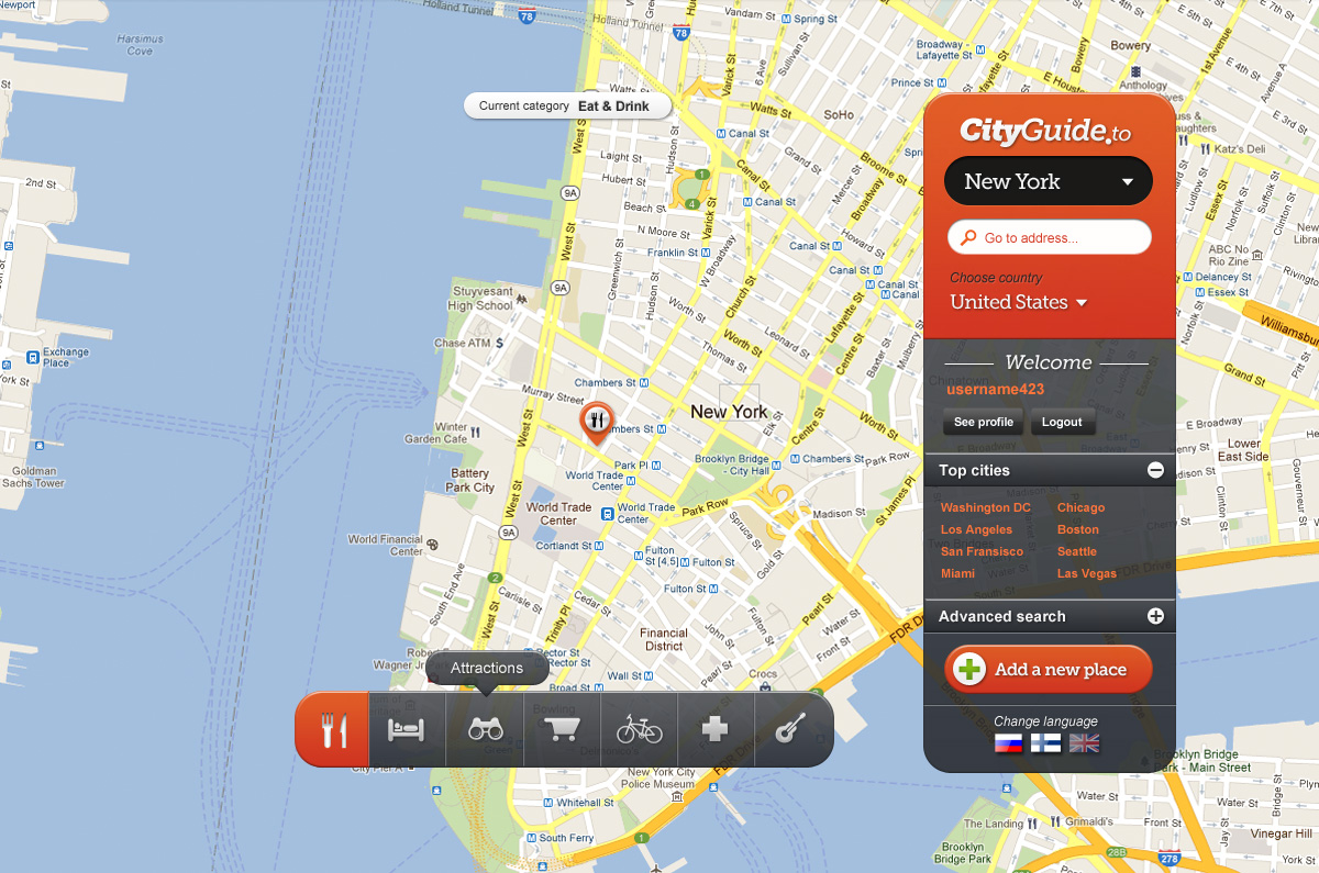
I am building Location Based Social network which is basically a cityguide.
So people would see clearly on map location of places and for each place they can read and write reviews and perhaps add pictures.
Current working version can be browsed in
http://beta.cityguide.to/maps/english/United%20States/New%20York/10182
To see innerpages
login: testi / testi2
Mainly I need:
-first page, with improved category selection bar.
- Rating / review page for business
- settings page for user
+ general infopage for TOS etc.
Updates
Please submit also subpages. Users "home" page and company review page. Review page is the most important one after first page.
Example of review page: http://beta.cityguide.to/rating/index/7912
Remember that you need to submit 4 designs in this competition.
Added Monday, March 26, 2012
Target Market(s)
Tourists or information seekers from the city they are browsing.
Shoppers seeking specific brands from city shops, which are open and can serve them with their desired language (i.e. they are tourists in foreign city)
Industry/Entity Type
Building
Look and feel
Each slider illustrates characteristics of the customer's brand and the style your logo design should communicate.
Elegant
Bold
Playful
Serious
Traditional
Modern
Personable
Professional
Feminine
Masculine
Colorful
Conservative
Economical
Upmarket
Requirements
Must have
- I need four pages in this design contest:
1) First page
-First page must display cityname and categories which are selected to be viewed.
-Language selection, possibility to choose another country/city and search.
-category selection
2) Company information page
-needs: opening hours
-which language they can server customers
-short company presentation
-keyword
-brands which are represented
3) Users home page when he logs in
-link to edit own information
-link to follow people / companies
-list of places added / comments leaved
4) general page for TOS etc.
simplicity is a great plus. I like current layout a lot, mainly because only few colours are used and main focus is in map. All functions needed are in one place and rating was placed in bottom of screen so top5 can be increased if needed.
Logo that fits layout and something I could use in prints etc.
When users first comes to page he will instantly get the wow factor + idea of website.
Call to action style functionality.
Nice to have
- I like the current layout where browsing is done from right and rest of the space is reserved for map.
Information that user has logged in.
Top ratings for selected categories
Typical elements of social networks, sharing and feedback etc.
Should not have
- I have tried layouts where there are lots of stuff in everyside of the map.
Earlier examples, don't make site look like this:
http://1.cityguide.to
http://2.cityguide.to
Map will get lost in the layout, and this is not what I want.