UK based culinary supplies and services business needs a logo design suitable for business cards and
Want to win a job like this?
This customer received 105 logo designs from 26 designers. They chose this logo design from e-graphics as the winning design.
Join for free Find Design Jobs- Guaranteed
-
 £110
£110
-
 105 designs
-
 26 designers
Logo Design Brief
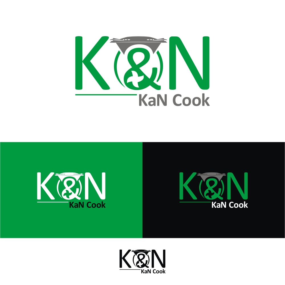
We are a new company, KaN Cook, comprised of two independent Thermomix advisors, Katya and Naaz. Hence the 'KaN'.
We are mainly selling the amazing Thermomix TM5 that is the future of cooking and will serve a purpose for any household. It saves you money on your monthly food bill and lots of time.
These are not for sale in shops, only through personal demonstrations by us.
Thermomix colours are grass green and should feature heavily in our logo along with silver and white.
We are looking for a sleek logo that compliments the high level design and functionality of the product, features an outline shape of the produce using the letters 'K' and 'N', also an '&' if possible.
We will eventually want to introduce cooking classes and catering gigs that we will build into our services.
The company name is transferable across all our potential business lines - We KaN Cook for you, You KaN Cook, Kids KaN Cook
The name of the product "Thermomix" must NOT appear anywhere in the logo (rules of being an Advisor) but a shape/picture of the product can appear in our logo.
Target Market(s)
Households and Businesses
Industry/Entity Type
Catering
Logo Text
KaN Cook
Logo styles of interest
Emblem Logo
Logo enclosed in a shape
Abstract Logo
Conceptual / symbolic (optional text)
Character Logo
Logo with illustration or character
Font styles to use
Other font styles liked:
- Copperplate Gothic Light
Look and feel
Each slider illustrates characteristics of the customer's brand and the style your logo design should communicate.
Elegant
Bold
Playful
Serious
Traditional
Modern
Personable
Professional
Feminine
Masculine
Colorful
Conservative
Economical
Upmarket
Requirements
Must have
- Sleek and simple yet elegant and impactive.
- Thinking of an outline of the product using the letters 'K' and 'N', also an ampersand '&' if possible.
- Green main colouring (see uploaded Thermomix logo for colouring, the colour wheel below does not give the correct green option) with white and silver as the secondary colours
Nice to have
- The blade design - see the 'dot' on the i in the Thermomix logo - incorporated into the logo somehow.
Should not have
- The word "Thermomix" must not appear in the logo at all (rules of being an advisor).
- An outline of the product in the logo is the aim, we do not want the picture of the product being reproduced in the logo - that is provided to give you and idea of the shape of the product.