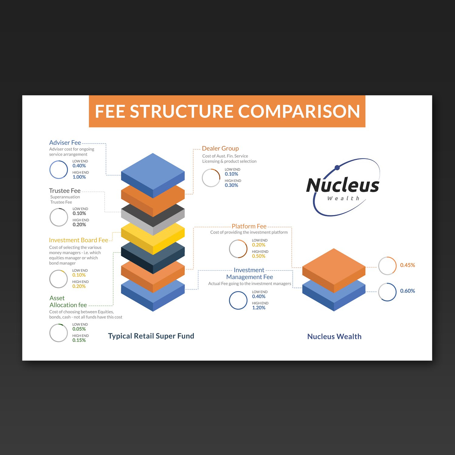
Info graphic to explain a fee hierarchy

Want to win a job like this?
This customer received 17 graphic designs from 5 designers. They chose this graphic design from Kishaloy_D as the winning design.
Join for free Find Design Jobs- Guaranteed
Graphic Design Brief
We need a clean and current feeling graphical representation of what a typical fee structure looks like from our competitors, with an accompanying one highlighting the simplicity and transparency of ours.
We will be using this online on our web page and in blog posts. Solutions that can be animated would be looked upon favourably.
however, ideally would like to avoid any Flash based solutions.
I have provided the fee structure comparison and some notes for each component of a typical fee in both excel and a jpg of the excel file. Not fussed with the graph design however a 'stacked' fee graph could get the point across nicely. Up to you.
I have provided a low and high estimate for our competitors. You don't have to include the figures however the proportions in the graph could be a way around cluttering the design with numbers.
I have also included our logo to give you an idea of colours.
Target Market(s)
Gen X and Gen y, internet savvy, financially competent
Industry/Entity Type
Financial Service
Font styles to use
Look and feel
Each slider illustrates characteristics of the customer's brand and the style your logo design should communicate.
Elegant
Bold
Playful
Serious
Traditional
Modern
Personable
Professional
Feminine
Masculine
Colorful
Conservative
Economical
Upmarket
Requirements
Must have
- Graphical based solution - easy to read and understand
Nice to have
- Potential to be animated, PSD (or similar) with layering so that it is easy to implement for use with HTML 5 or JQuery web pages
Should not have
- Flash solutions