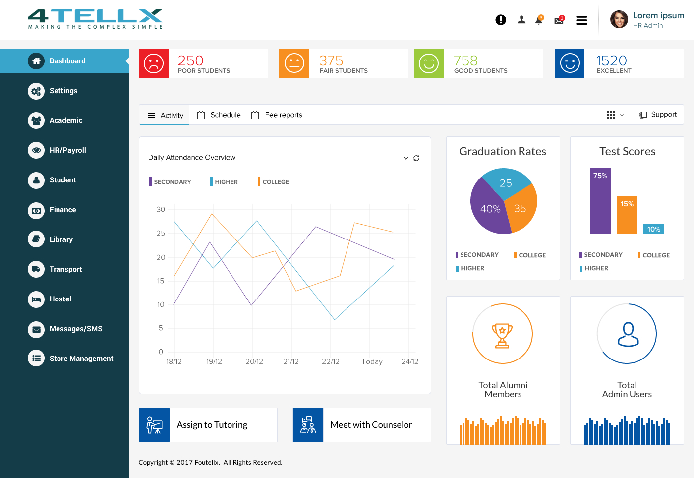
Predictive Analytics User Interface
Want to win a job like this?
This customer received 23 web designs from 6 designers. They chose this web design from Sbss as the winning design.
Join for free Find Design Jobs- Guaranteed
-
 US$350
-
 23 designs
-
 6 designers
Web Design Brief
We need a User Interface for web application to be used by School District administrators in the United States. The software is a Predictive Analytics application that will allow a school district administrators to see Predictions of how a campus will perform in the following categories:
State Assessment Exams (example: Will a specific grade level (3rd, 4th, 5th, etc.) achieve their target test scores in May, 2017)
Graduation Rates (example: Will the 12th grade class graduation rate achieve their goal of 98% graduation rate by May, 2017)
Drop-Out Rates (example: Will the current 9th grade class have a drop-out rate lower than 5% in the next four years (assuming it takes all 9th graders 4 years to graduate from US high schools).
We are looking for sleek but simple. The design must support the data - not detract from it.
Target Market(s)
Public Education in Grades 1-12 and Higher Education for 2-year and 4-year colleges.
Industry/Entity Type
Education
Number of Pages Required
3 page
Font styles to use
Colors
Colors selected by the customer to be used in the logo design:
Look and feel
Each slider illustrates characteristics of the customer's brand and the style your logo design should communicate.
Elegant
Bold
Playful
Serious
Traditional
Modern
Personable
Professional
Feminine
Masculine
Colorful
Conservative
Economical
Upmarket
Requirements
Must have
- Ability to segment student groups into four probability categories: Excellent, Good, Fair, and Poor. Additionally, each student group should have "Action Buttons" that show an activity for each student group. For example, let's say a School Principal looks at their screen and clicks on High School Graduation. They would get students in four groups. If the "Poor" category showed 12% of the school, the Principal would have "Action Buttons" like "Assign to Tutoring" or "Meet with Counselor" to address their needs. The goal is not just to identify student groups but also be able to take action directly from the UI.
Nice to have
- Drill-down capabilities in each group that shows me deeper details. For example, if a School Principal looked at the High School Graduation section and clicked on "Poor" which showed a Student Group with low probability of graduating from high school, it would be nice if the principal could click on a "See Details" and see another layer of data explaining why the Prediction believes these students will drop out. As an example, it could show a report of 10+ absences, 15+ behavior issues reported, and failing 2 classes. It could also show recommendations as to improve their probability with different interventions like "sign up for tutoring" or "assign a mentor".
Should not have
- Small print, small charts and colors difficult to read. Our target audience is people between the age of 50-70, so their eyesight is not always the best. We are looking for simple and clean but bold enough that your grandmother could view it and have a discussion about the data.